


Design Archive Feature, Designer Profiles, Members Only Content, Poster Design
Scanned posters by the great Michele Spera. Many use a strong use of geometric form, often paired with sans-serif typefaces like Helvetica. Their simplification of form and use of colour create timeliness, recognisable posters that would have stood out alongside the posters of the 1970s which tended to have a heavy use of photography.
Read Article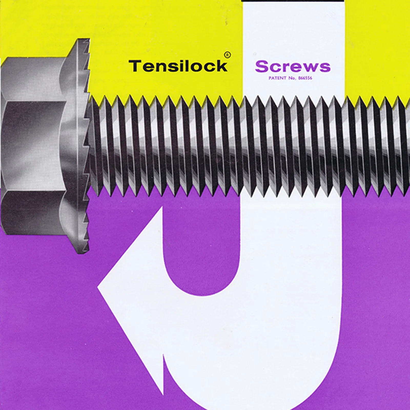
Advertising Design, Design Archive Feature, Members Only Content, Regional Histories
The clear, rational, and functional design of 1960s industrial design brochures.
Read Article
I have long been a fan of Counter-Print, as a student, I would order their newsprint publications, peruse their Flickr albums and now, over a decade later I still buy their latest releases and their site provides our staff with great giftse throughout the year. I interviewed one of the founders, Jon Dowling to find out more about setting up Counter-Print, their favourite books and which publishers inspire them.
Read Article