
Hans Schleger

Zero: Hans Schleger – A Life of Design, Pat Schleger, 2001

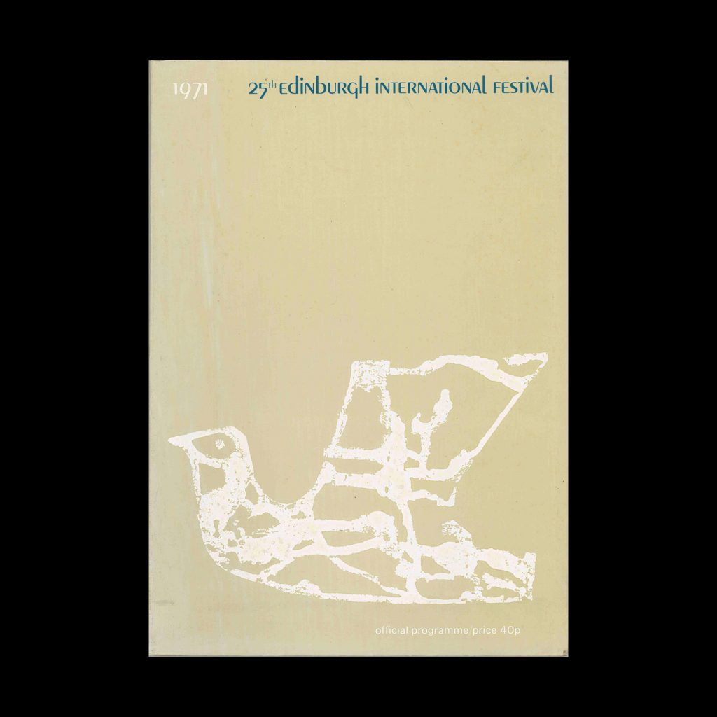
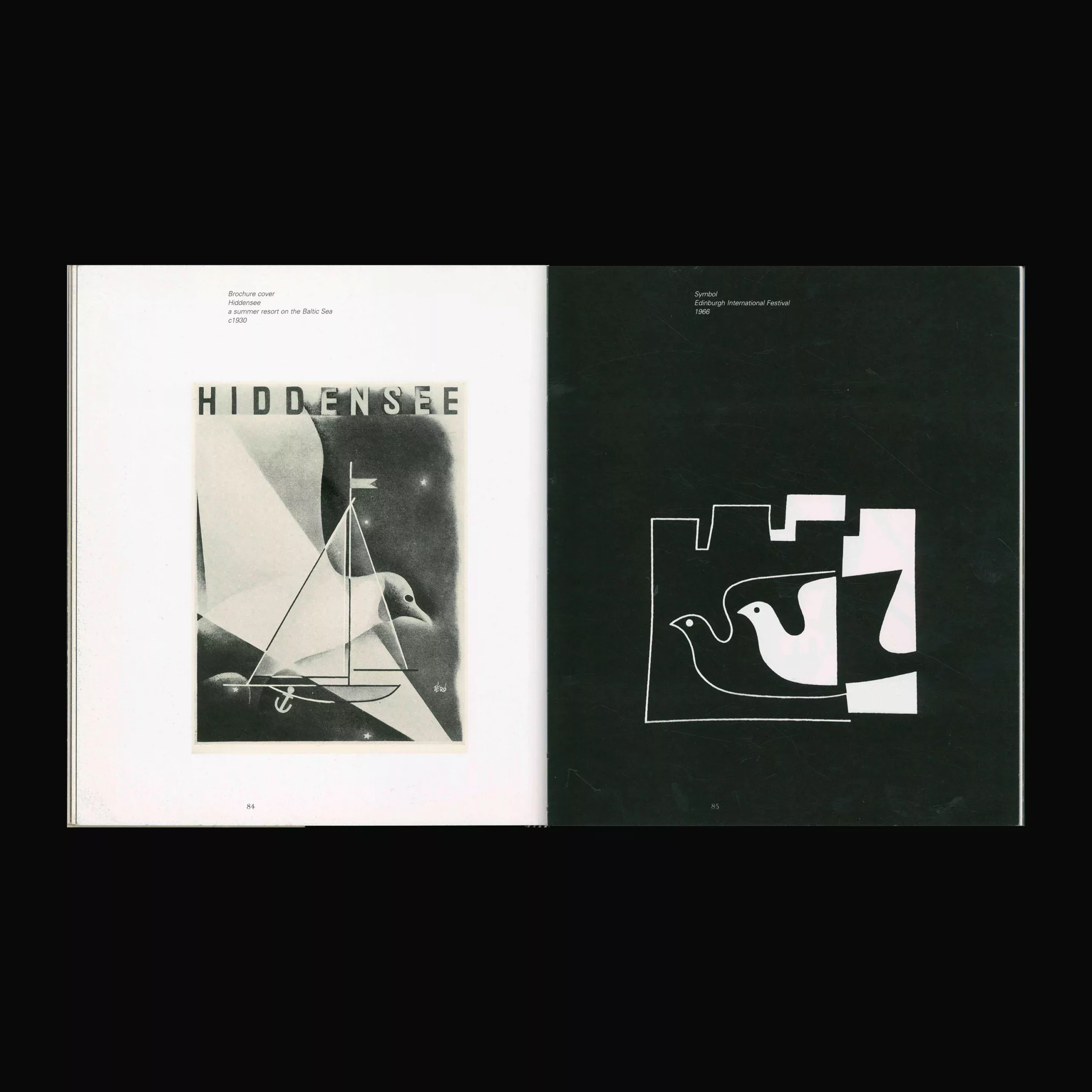
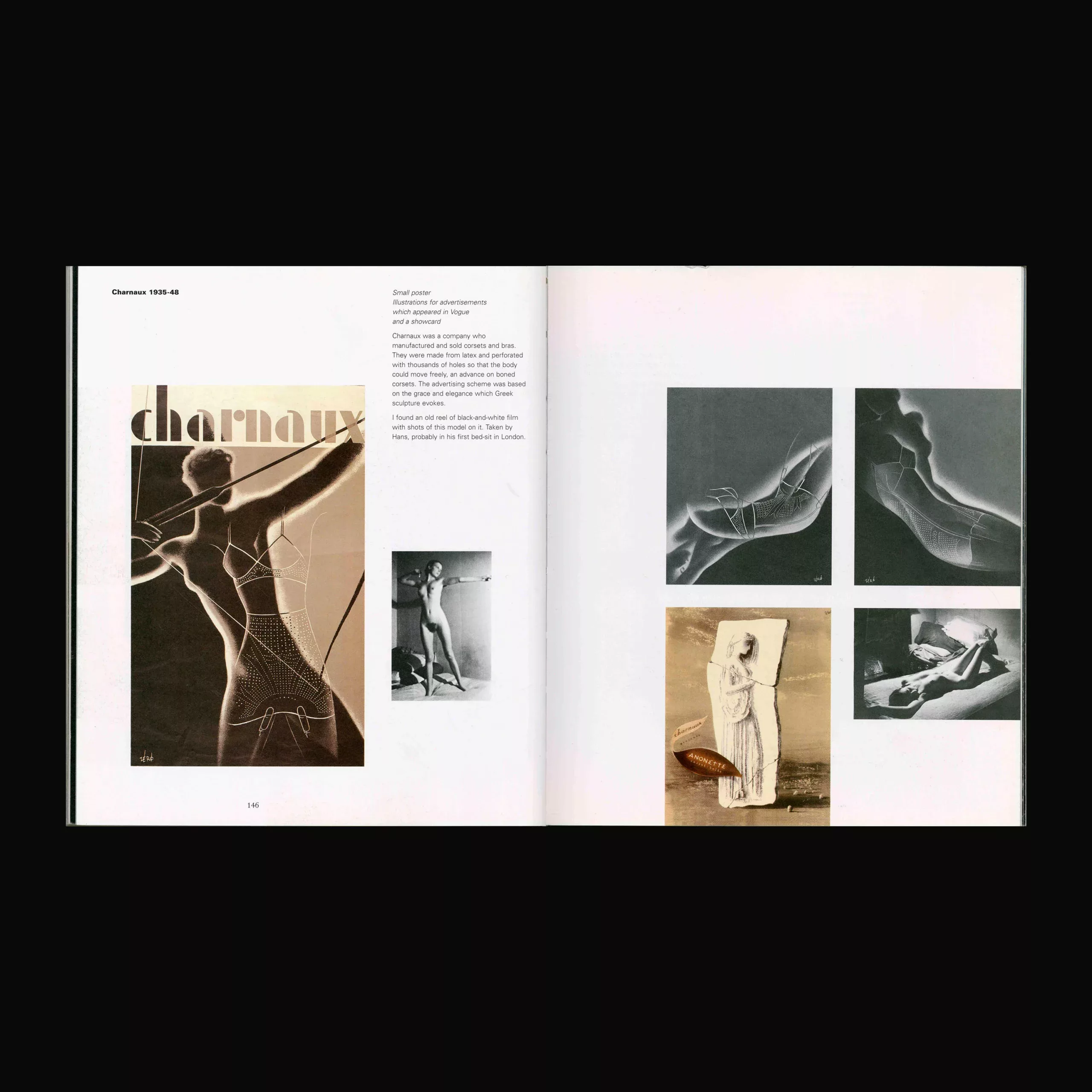
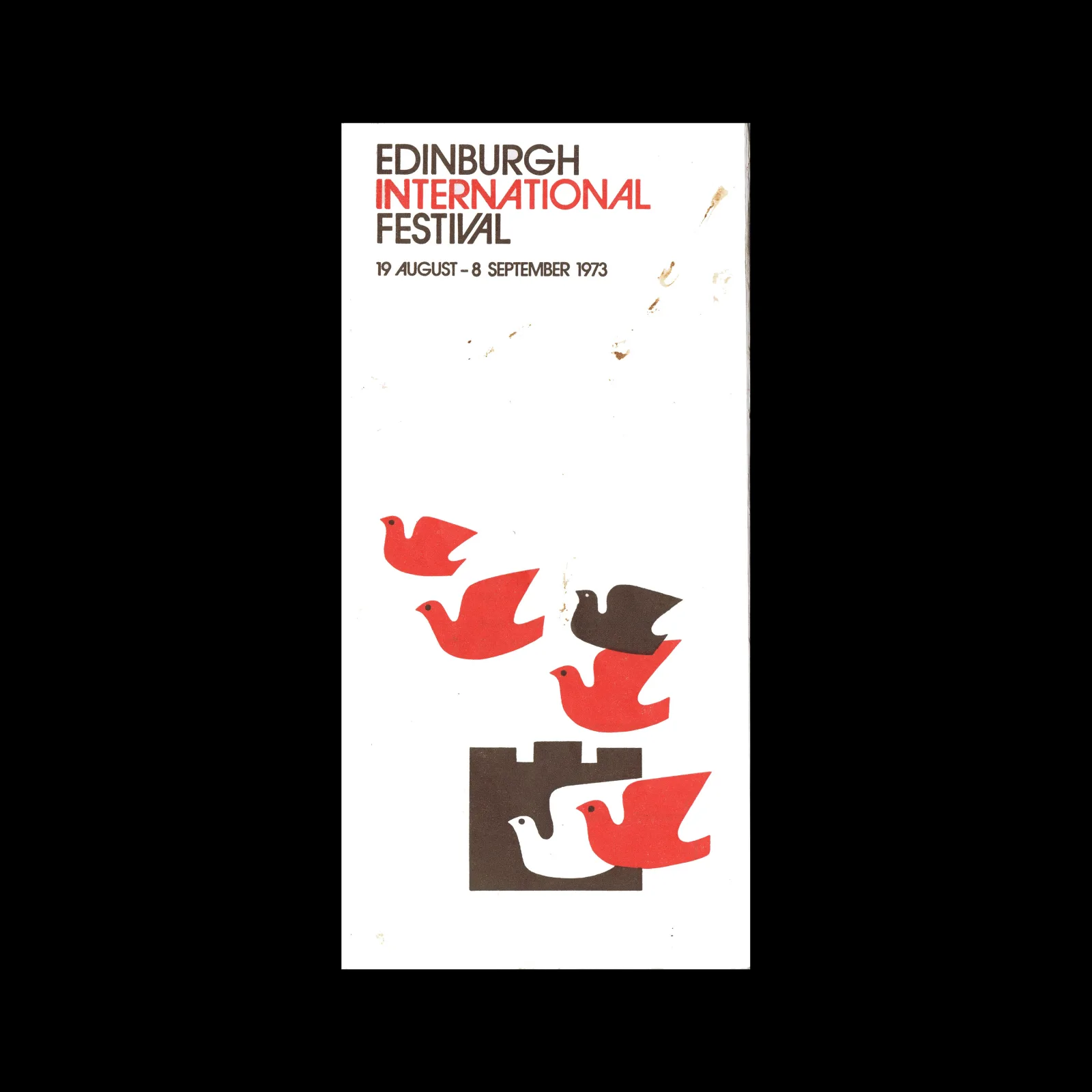
Hans Schleger was a key figure in the history of graphic design. He pioneered the concept of corporate identity, and his work has been hugely influential for subsequent generations of designers. Born in Germany into a Jewish family at the end of the nineteenth century, Hans Schleger began his career in Berlin working for a film company called Hagenbeck, for whom he designed publicity material and some of the film sets. In 1924 he went to New York and was one of a handful of European emigre artists and designers who brought the ‘Modernist’ approach to American advertising. Returning to Berlin in 1929, he worked for the English advertising agency Crawfords as Art Director, emigrating to England after Hitler came to power. He worked in London until his death in 1976. This is the first comprehensive survey of Hans Schleger’s work, and includes drawing, painting and photography as well as the graphic-design work for which he was best known: posters, symbols, advertising and corporate design and packaging. Pat Schleger was married to Hans Schleger and is herself a graphic designer. She worked with Hans for twenty-five years, and has compiled and designed this selection of his work, which includes personal recollections of the man and his working practice, as well as contemporary articles and letters.

Details

  • Format Book
  • Designer/s Hans Schleger
  • Year 2001
  • Client/Publisher Lund Humphries Publishers Ltd
  • Size 220mm x 255mm
Hans Schleger
Hans Schleger signed his work as Zéró. He studied in Berlin and for five years worked as freelance designer the United States. He later set up his own studio in London. He was commissioned by The Council of Industrial Design to design the symbol for their Design Centre in the Haymarket, London. As well as a desiner, he was a visiting lecturer to the Chelsea Polytechnic, the Central School of Arts and Crafts, the Royal College of Art, all in London, and the Regional College of Art, Manchester. Explore related designers including Tom Eckersley and Abram Games. See also British Modernism, British graphic design history, and 1940s graphic design history.

Linked Information

Zero - Hans Schleger - A Life of Design ,Pat Schleger, 2001
Zero: Hans Schleger – A Life of Design, Pat Schleger, 2001


Zero - Hans Schleger - A Life of Design ,Pat Schleger, 2001
Zero: Hans Schleger – A Life of Design, Pat Schleger, 2001


Zero - Hans Schleger - A Life of Design ,Pat Schleger, 2001
Zero – Hans Schleger – A Life of Design ,Pat Schleger, 2001
More graphic design artefacts
More graphic design history articles
60 Examples of Czech Typography from 1909, Typografia

Design Archive Feature, Members Only Content, Regional Histories, Typography & Type Design

60 Examples of Czech Typography from 1909, Typografia

60 examples of Czech typography from Typografia Vol. 20 (1909). Czech commercial printing at the crossroads of Art Nouveau and early modernism, with work by Methoděj Kaláb, Otokar Císař, Karel Dyrink and many more.

Read Article
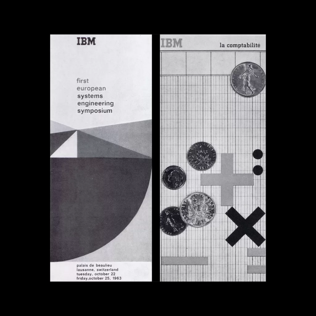
Frank René Testemale’s IBM Advertising in France by Alexandre Alexandre, 1964

Advertising Design, Corporate Identity & Branding, Design Archive Feature, Regional Histories

Frank René Testemale’s IBM Advertising in France by Alexandre Alexandre, 1964

IBM puts a premium on functional design, forms and colours which make it far easier for the potential customer to gain an insight. In this respect the IBM methods are exemplary. The IBM already opened studios of artistic and graphic design for its German and Italian offices and a few years ago another such studio was established in Paris. Frank René Testemale was entrusted with its organisation and was appointed its business and art director.

Read Article
Arrows of Advertising – An Australian Shell Poster Campaign designed by Frank Eidlitz

Design Archive Feature, Members Only Content, Poster Design, Regional Histories, Studios & Collectives

Arrows of Advertising – An Australian Shell Poster Campaign designed by Frank Eidlitz

A total of 24 posters were created for the campaign during 1964, using the arrow symbol as a key features, representing power, motion and speed. The handmade lithographs use up to 19 colours, which were individually printed at large scale. The posters also utilise the brand colours red and yellow from Shells corporate identity.

Read Article