Articles

A selection of graphic design articles based on the design artefacts in the archive. Articles discussing aspects of design such as logos, advertisements, posters and book covers. Explore historical context and its impact on the field of graphic design.

Members Content

Advances in production and 1950s chewing gum marketing. From Wrigley's iconic "Spearman" ads to Hiroshi Ohchi's designs for Harris Chewing Gum.

Members Content

Working alongside André Gürtler and Bruno Pfäffli, Adrian Frutiger designed many logo designs. Here is a selection of the designs which were featured in Der Druckspiegel, December 1961. I have also translated and rewritten the descriptions to provide more depth.

Members Content

The typographic supplement from Der Druckspiegel, October, 1961 features typographic compositions designed by Herbert Bossin. Bossin has solely used the typeface Folio, to illustrate its flexibility and versatility alongside imagery provided by Lothar Blanvalet Verlag.
Helmut Schmid Typography explores the typographer’s oeuvre in its entirety. The book’s generous design allows each image to breathe, and the accompanying texts narrate Schmid’s life and career in an informative and pleasant manner.

Members Content

When perusing vintage publications, I often stumble upon forgotten or undocumented gems. In this article, I compare two remarkable advertisements designed for Sprengel Ltd byHerbert Zumpe and Karl Otto Goetz

Members Content

Crouwel was the successor to Willem Sandberg who used an avant-garde approach in his work, utilising torn-paper montage, mixing of sans serif and old Egyptian typefaces and often off-center positioning. Crouwel steered away from this artistic approach and implemented a cohesive design system and a strong identity that emulated the corporate identity boom of the 1950s and 60s.
I came across two sample books containing printed examples of the work executed by the students in the Composing and Machine Departments of the Polytechnic School of Printing, between 1907 and 1910. I couldn't resist adding these to the archive.

Members Content

These one-colour forms have a playful but structured aesthetic through their geometric forms, they remind me of the abstract line drawings of Picasso blended with Jan Tschichold and the New Typography.
The transformation of Radio Free Berlin's publicity from dark and provincial to striking and imaginative. Cultural announcements and radio programs designed by Hans Förtsch, Sigrid von Baumgarten, and Reinhart Braun

Members Content

Volkswagen commissioned a fantastic range of graphic designers, including Wolf Zimmermann, Hans Looser and Michael Engelmann. The designers amplified the brand image of Volkswagen with strikingly modern designs.

Members Content

He designed stamps from around 1955 and in the book Karl Oskar Blase, Briefmarken-Design, Verlag für Philatelistische Literatur, 1981, he was described as one of the most influential stamp designers in Germany.
IBM puts a premium on functional design, forms and colours which make it far easier for the potential customer to gain an insight. In this respect the IBM methods are exemplary. The IBM already opened studios of artistic and graphic design for its German and Italian offices and a few years ago another such studio was established in Paris. Frank René Testemale was entrusted with its organisation and was appointed its business and art director.

Members Content

Beyond being mere artefacts of design, these examples encapsulate the dynamic changes Japan was undergoing during this period. The design output of this era not only served commercial purposes but also became a powerful medium for expressing these societal shifts.

Members Content

Little is known about the talented designer Günther Glückert. Born during the 1930s, a period that proved less than conducive to nurturing youthful artistic endeavours, did not halt Glückert's path of becoming a talented designer.

Members Content

The 1960s was an era characterised by political, social, and cultural shifts. The counterculture movement emerged as a response to the perceived failures of the mainstream establishment, sparking a wave of activism and alternative ideologies. And with these an array of printed matter. Counterculture publications, often referred to as the "underground press," became powerful platforms for dissent, expression, and the exploration of new ideas.

Members Content

Victorian Graphic Design left a mark on both British and American design history. In Britain, the ornate embellishments served as a symbol of prosperity and cultural values. Meanwhile, America embraced the combination of various design elements to navigate the complexities of a rapidly changing society driven by industrialisation and consumerism.
The background of Kamekura's mark designs is his boldness in eliminating all the waste, combining simplification derived from Japanese traditional family crests and Western intellectual mechanics of formation with a sharp modern sense of composition.

Members Content

Collected Japanese ephemera From the late 1920s to the mid-1930s, from Japan's transformative period, with its robust industrial force accompanied by an increase in consumer culture.

Members Content

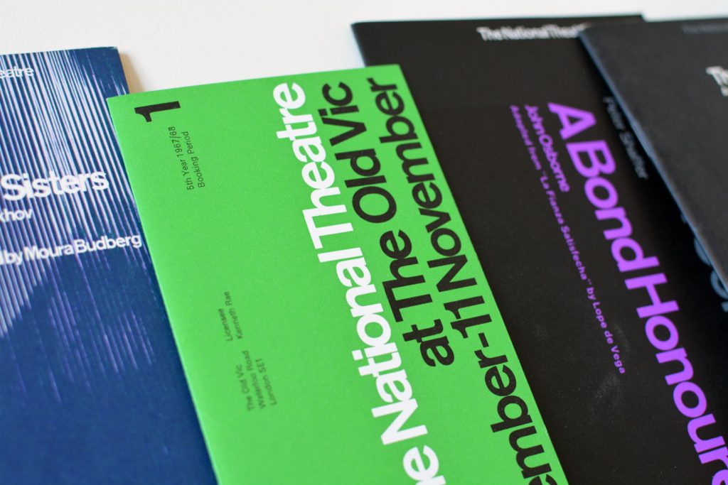
Many influential British designers have made their names in the history books. Abram Games, Alan Fletcher, Tom Eckersley and Derek Birdsall, to name a few. But one designer that has always influenced me, not only as inspiration from their design output, but as an example of the role of a designer and the importance of having strong ethics, is Ken Garland. He is known for his innovative and socially responsible approach to graphic design and his involvement in the design community through his teaching, writing and activism. In the second instalment of this series, I will discuss Ken Garland's magazine work from my collection.
Armin Hofmann's publicity for the Stadttheater Basel. The client, in this case, the Municipal Theater of Basel, refused to listen to narrow-minded critics, in spite of the fact that as a state-subsidized enterprise it is accountable to public opinion.
The versatility of the arrow sign knows no bounds – from thin lines exuding delicacy to thick, heavy-set lines conveying stability and weight. Depending on its construction, the arrow sign can speak with individuality, even possessing psychological and emotional expression.
Graphic design continues to be documented and an increase in individualised documentation and curated social media accounts are furthering our knowledge of design from a worldwide historic standpoint. I would not feel complete without the collected design that spans the shelves of my archive. It’s my identity, my passion and my hobby.
Oskar Reiner advertisements for Opel distinguish themselves by clarity and visually appealing conception.
Among the young graphic artists of Berlin, who set to work after the war, Hans Adolf Albitz and Ruth Albitz-Geiß can claim special attention. In a short time, at a period when economic conditions were pretty unfavourable, they worked themselves so to the fore that their names came to mean something in Berlin publicity, and in western Germany their posters are known and appreciated, too.

Members Content

The advertising has a certain contrast of hand-drawn and mechanical. Produced entirely in black, it reminds us that the absence of colour can be highly effective. Hans Michel and Günther Kieser's illustrations bring a sense of both playfulness and a stylistic approach to a corporate client.

Members Content

A fantastic example of Swiss design for brand systems is the brand and advertising by Siegfried Odermatt commissioned by Grammo Studio in Zurich.
A review of the memorial exhibition of Edward McKnight Kauffer at the Victoria and Albert Museum in 1955 by F.H.K. Hernion
House style can give identity to the diverse products or activities of a firm. It stimulates loyalty, helps to reduce costs, and has advertising value.
My lectures and workshops also help bridge the gap between academia and industry. Through my lectures and collecting, I strive to promote design as a ever-changing dynamic industry that has the power to shape and improve the world we live in.
Every year the 20 best posters are selected in Germany and once more brought to the attention of the public. We do not publish all the twenty posters today; instead we add some which failed to be distinguished and which nevertheless are distinguished.
A few years ago the publicity department of Siam di Tella found a collaborator who early in his studies of architecture was attracted by the problems of visual art. His name is Guillermo González Ruiz he was born in Chascomus (Province of Buenos Aires) in 1937. Between 1957 and 1960 he received 18 awards in poster competitions, some of which were of particular importance.
The graphic designer had to create a series of ads whose new publicity effects were to confirm or accentuate the already existing • image • of the paper. In this case, the planning was not based on a would-be psychological analysis of the reading public.
The covers of the periodical ALMANAQUE, which was published in Lisbon, are perfect examples of this pleasure in the unusual and the force of with which all sorts of foreign influences are assimilated.
When Fritz Gottschalk and Stuart Ash joined forces in Montreal, it was a partnership ideally suited to the city's hybrid environment. Gottschalk's training in graphic design in Switzerland, Paris and London was rigid, his background European; Ash, Canadian born and educated, was trained in the North American fashion, though he was influenced by his work with European designers
In minor printed matter we constantly meet the new typography, but it is relatively rare to find posters designed on the new lines. And yet poster-designing is a field where new typographical methods might be employed with great effect.
A country is never dead so long as it has an art. Austria is a proof of this maxim. Its liveliness since the war is liveliness which has displayed itself in the arts to a remarkable extent : it deserves the world's admiration and respect.
In Rau's case, the combination of graphic design and photo produces a particularly positive result, since he uses the photo not so much as an object of representation but rather as a suggestive means of expression.
Theo Häussler's commercial art is distinguished by its clear and disciplined form and its distinct advertising message.
An advertising programme is fully integrated only when its effect is powerful enough to play a major part in determining a corporate image. Geigy advertising is an example of this successful integration.

Members Content

As a chemist, I have an obligation to be curious – I grab a stack of our chemical journals and start with the advertising section. I start it, the walk through the sand. I don’t want to deny some oases. But soon I’m bored and tired.

Designer Profiles