Category: Poster Design

Articles on the history of poster design rom German Sachplakat to Polish school posters, Swiss modernist typography, and the great poster designers of the twentieth century.

The poster is one of graphic design’s most enduring and celebrated formats. These articles explore the history of poster design through the collection from the German Sachplakat tradition and Swiss modernist typography to the Polish school and the great poster designers of the mid-twentieth century.

Articles Related to Poster Design

Membership from £2.49/month unlocks articles researched and inspired by the artefacts in the collection.

Become a member →

Members Content

One of the main features in Gebrauchsgraphik 08, 1962 is focused on the 1961/62 annual poster awards in Germany. Over 400 posters were submitted to the awards.

Members Content

One of the main features in Gebrauchsgraphik 08, 1963 is focused on the 1962/63 annual poster awards in Germany. Over twenty posters were awarded by the Association of German Commercial Artists.

Members Content

Gebrauchsgraphik 08, 1964 features a selection of the German Posters entered into the 1963/64 awards. 22 posters were awarded by the Association of German Commercial Artists and the awards showcased some of the best poster designs of the year, that still remain effective and stylish today.

Members Content

A brief summary of a poster designer’s tasks from the late 1930s. I have illustrated the article with a selection of scanned posters from Cooper’s book.

Members Content

In 1949, the Bund Deutscher Gebrauchsgraphiker held the first Die besten Plakate des Jahres competition to showcase top German poster design. Hanns Lohrer was one of eight award winners. Designs scanned from Gebrauchsgraphik, 01, 1951.

Members Content

Scanned posters by the great Michele Spera. Many use a strong use of geometric form, often paired with sans-serif typefaces like Helvetica. Their simplification of form and use of colour create timeliness, recognisable posters that would have stood out alongside the posters of the 1970s which tended to have a heavy use of photography.

Members Content

In 1997 Tadanori Yokoo showcased 31 new silkscreens at the Ginza Graphic Gallery in Tokyo. Many of these works were previously unseen, and I was fortunate enough to discover a feature in a back issue of Idea magazine that showcased the full collection of silkscreen posters. 

Members Content

Gebrauchsgraphik 06, 1956 features a selection of the German Posters entered into the 1956 awards. It is unknown how many entries were submitted to the 1956 awards but a total of 21 posters were awarded.

Members Content

Joseph Binder established his studio, Wiener Graphik, in Vienna. One of the first clients was the City of Vienna’s Music and Theater Festival, followed by many other posters and logos for clients in Austria and beyond.

Members Content

“Der Druckspiegel” typographic supplement May 5, 1967, was focused on a selection of the winning entries from Die besten Plakate des Jahres featuring over fifty winning entries.

Members Content

The 1960 awards presented 420 poster entries from Swiss designers. Notable winners included Robert Büchler's typographic poster for the Museum of Applied Arts Basel and J. Müller-Brockmann’s Der Film poster for the Museum of Applied Arts and Gerstner + Kutter's asymmetric typographic poster for National-Zeitung SA Basel.

Members Content

As part of an ongoing series showcasing Swiss poster designs from the 1950s and 1960s, this article features 1961 poster entries of Die besten Plakate des Jahres (The Best Posters of the Year) 1961. Originating in 1941, Die besten Plakate des Jahres initially served as a platform for the evaluation and showcase of Swiss posters.

Members Content

Forward and a selection of poster designs entered to the Die besten Plakate des Jahres 1963. Featuring the work of Hans Hartmann, Jörg Hamburger, Jost Hochuli, and Armin Hofmann.

Members Content

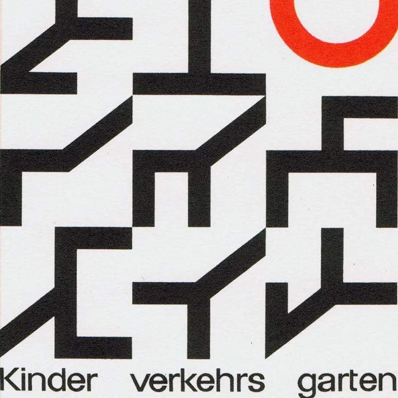
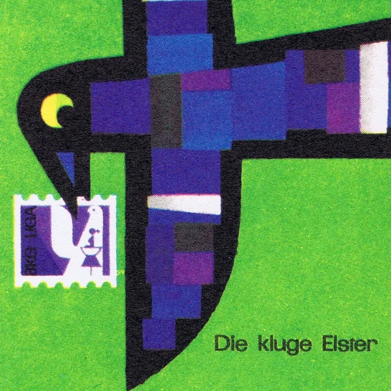
A selection of poster designs from Die besten Plakate des Jahres 1958 with a translated foreword by Maria Netter. Featuring the work of Müller-Brockmann, Celestino Piatti, Donald Brun and Armin Hofmann.

Members Content

The best poster designs from Die besten Plakate des Jahres 1957 with a translated foreword by Walter Kern. Featuring the work of J. Müller-Brockmann, Gottlieb Soland, Mary Vieira and Celestino Piatti.

Members Content

The best poster designs from Die besten Plakate des Jahres 1956 with a translated foreword by Jakob Rudolf Welti. Featuring the work of Herbert Leupin, Carl B. Graf, Carlo Vivarelli and Emil Ruder.

Members Content

Blase’s long-term clients were Staatstheater Kassel (Kassel State Theater) and Atlas Films. Karl Oskar Blase produced countless posters for these two organisations. It’s not surprising considering Blase designed posters for the Staatstheater for twelve years between 1966 and 1978. 

Members Content

Armin Hofmann's publicity for the Stadttheater Basel. The client, in this case, the Municipal Theater of Basel, refused to listen to narrow-minded critics, in spite of the fact that as a state-subsidized enterprise it is accountable to public opinion.
Every year the 20 best posters are selected in Germany and once more brought to the attention of the public. We do not publish all the twenty posters today; instead we add some which failed to be distinguished and which nevertheless are distinguished.
In minor printed matter we constantly meet the new typography, but it is relatively rare to find posters designed on the new lines. And yet poster-designing is a field where new typographical methods might be employed with great effect.

Members Content

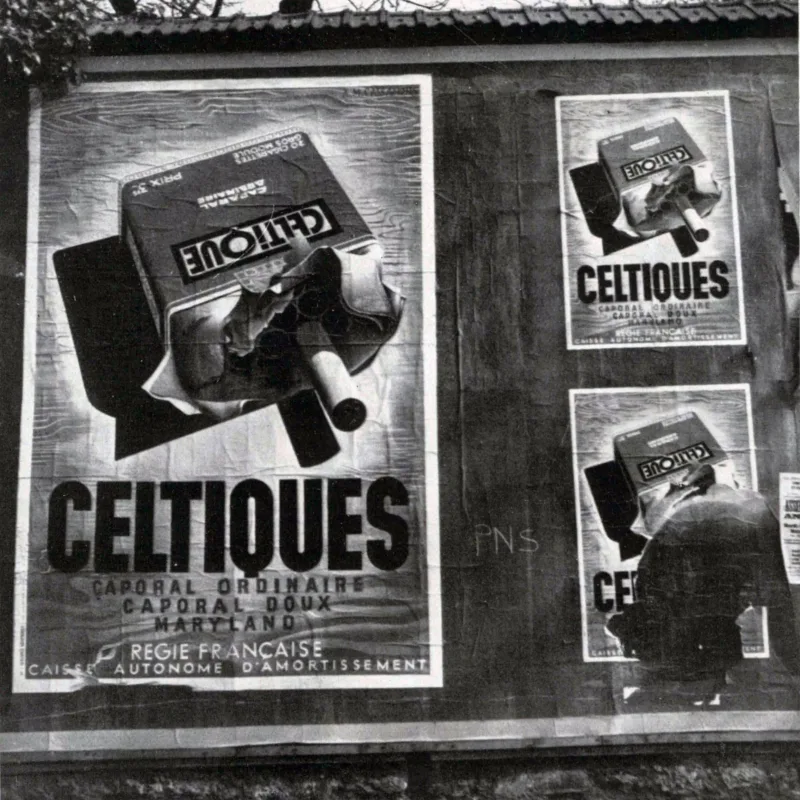
The Paris Poster Hoardings of 1938. Posters gleam forth accentuating the melody of this city as they direct the eye to articles of everyday use and above all to people who are the talk of the hour.

Members Content

The Best Swiss Posters Award was an annual competition, judged by a Swiss Jury. They selected a range of posters, showcasing a range of poster styles from completely typographic designs such as the work of Robert Büchler, to the illustrated posters of Donald Brun.

Members Content

Juan Carlos Distéfano is an Argentinian artist, designer and teacher. He designed a range of posters, programmes brochures and book covers alongside Juan Andralis, Humberto Rivas and Roberto Alvarado for the Instituto di Tella, Buenos Aires.

Members Content

Ian McLaren and Ken Briggs produced exceptional work for a range of clients in the arts and culture sector. Their client included CND (Campaign for Nuclear Disarmament), The National Theatre and the Arts Council.

Members Content

A total of 24 posters were created for the campaign during 1964, using the arrow symbol as a key features, representing power, motion and speed. The handmade lithographs use up to 19 colours, which were individually printed at large scale. The posters also utilise the brand colours red and yellow from Shells corporate identity.


More from Design Reviewed

Members Content

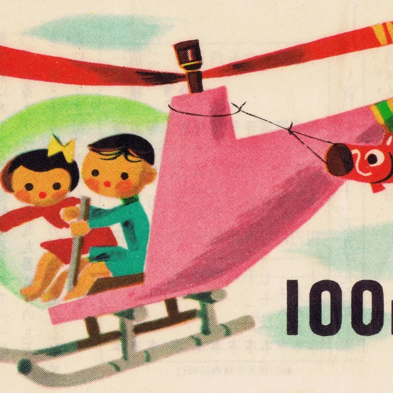
A mixed set of tickets from various Japanese lotteries dating from 1956 to 1985, including the Tokyo Metropolitan, West Japan and National Local Autonomy lotteries.

Members Content

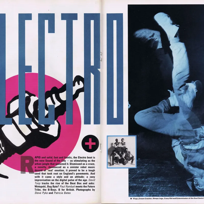
The Face shocked the world of magazines, and the design industry, with its revolutionary design by Neville Brody.

Members Content

A 1939 article on American designer, Walter Frank Bomar, published in The Inland Printer, Vol 104, No. 03, 1939.