
I’ve always been wary of books like one is wary of an addictive substance.
I went to art school at the age of 18 and I still have a distant relationship with publishing, but after my first graphic design courses, it became clear to me that books are the inner world, while magazines are more human. After graduating in illustration and becoming an art director for an agency, I cultivated impostor syndrome… But the trigger was the discovery of the past through objects that fascinate for their relationship between form and content. My goal has always been to accumulate knowledge, not a thousand objects on a shelf. My collection starts with a handful of issues of Graphis from the 1960s, cut to shreds and ready to be thrown away, which I picked up at my first job. I began to search for their value and continued to find others. For almost 10 years, my quest was to unearth all the issues, until one day I found these 280 issues (from 1944 to 1986). The price was symbolic on condition that I kept the collection intact: 120 kg of paper handed down by a 60-year-old man who had inherited it from his father. “It was either that or the garbage.
In spite of myself, I also became a seller, selling what I had in duplicate thanks to purchases of lots, reselling to finance my purchases, sometimes to set some free space for my bookshelves. After 5 years of collecting, I opened the website designers-books.com (now closed). I show and chronicle my readings, then write to learn more. Advertising revenues allow me to make monthly purchases and I sometimes look for bargains that don’t fit in my collections for contacts.
Because when a bibliophily starts, more themes appear: the Graphis collection, the issue #1 of the greatest graphic design magazines, ABC Verlag collection, some masterpieces of illustrated children’s books. I forbid myself to buy just for the object, so I read all the books (in french, English, Spanish or Italian) before putting them away.
Finding a book is not difficult, it is neither work nor self-denial since there is the excitement of the investigator. I have about 50 queries registered on several sites. I’ve learned that sometimes I can find things on the internet via images, or that not all nationalities on eBay are related, that some titles are accessible if you add a typo, and that a Turkish second-hand site can be more efficient than an American antiquarian bookseller.
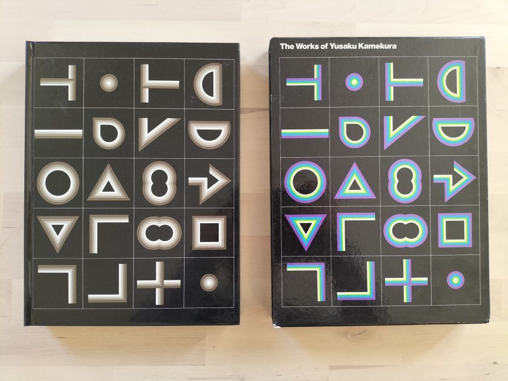
And if this quest seems all-consuming and limitless, there is a fair return. For each purchase I have, I often had the satisfaction of holding in my hands an object that was waiting for me. I was looking for the first issue of the German magazine Gebrauschgraphik (1924). I got in touch with its publisher, now called Novum. He told me he had only seen it in a museum, but the week after, I found a copy of Gebrauchsgraphik on eBay. Several times mid-priced purchases arrived autographed by their authors, whether it was Yusaku Kamekura or Wolfgang Schmittel, designer for Braun for 30 years. I still sometimes buy a lot just for one book. In some cases, the surprise is total, like discovering the books of ABC Verlag, a small Zurich publisher whose collection is a precious resource. The real gift was to receive an e-mail one day from one of the publisher’s sons, following a blog post about him. Our exchanges allowed me to complete the article I was writing.

Sure, there’s always books and magazines I would like to find and to read. I’m still deeply interested in the books published by the pioneers of Graphic Design, like Ladislav Sutnar or László Moholy-Nagy. But my interests are focused on my main research, the history of logos. So, I’m purchasing and reading books on semiotics, history, archaeology and sociology. The collections kept are constituting another corpus. I would like to collect graphic design magazines from 1900 till now, from Commercial Arts, Wendingen, Arts et Métiers Graphiques, Gebrauchsgraphik, Graphis, Graphic Design, Neue Graphik, etc. I also would like to collect the whole set of 100 issues of Japanese magazine Graphic Design, because it’s for me the perfect balance between Graphis & Neue Grafik, between the modernity of tradition and the tradition for modernism. The real problem is also to read all the books. I don’t like looking at pictures, reading the captions then putting the book on the shelf. I’m surprised to see that I can read in the day a small book about the poems of Anna Akhmatova, and not being able to read Vision in Motion by Moholy-Nagy. I need to find the right mood for the right book. It’s another meeting between a book and its reader. Looking at my bookshelves is seeing the various moments of all these readings.
From being a collector, I slowly became an independent researcher, this atypical being who, by chance and his tastes, started his quest. My research has been published in a first article for TheShelf Journal about 4 issue #1 of modernist magazines, followed by an article on ABC Verlag, which allowed me to do my homework. One of my latest quirks has no specific editorial purpose: writing a 35 pages dissertation on the history of square books. Why was this format so rare in the past when it abounds with the emergence of modernity in art? These are the reasons for my interest in medieval architectural design, the arithmology of Pythagoras or ancient esotericism. Two years ago, I gave a lecture about this topic, and a short article was published during the pandemic in Etapes:, the biggest french graphic design magazine.
The designer anchors signs in the material in order to bring out the meaning: a work of alchemy in short.
The impostor syndrome is still active, but my love of books and graphic design does not prevent me from meeting other enthusiasts. Thus, almost all of my readings today are followed by exchanges with their international authors. The book opens onto another reality that has been transposed into the binding of the pages. But they are nothing if not shared with others.
For a few years, I have not worked as a graphic designer, but as an art teacher. If I’m not practising anymore, I continue my personal research on the history of logos. I’m doing some lectures for graphic design schools and I’m signing some articles for Etapes:. Few year ago, I was happy to sign one article every year. In 2022, I’ll sign perhaps 15 to 18 papers, for various publications or for websites.
Collecting books is drawing my personal evolution of reading: it was useful for my professional skills, it was a cultural source of knowledge, and now it’s my research’s bibliography.


, c. mid 1970s")


