Designer: Adrian Frutiger

Known for Univers and Frutiger typefaces
Adrian Frutiger
Born 1928
Died 2015
Nationality Swiss
Roles Type designer, Typographer

Adrian Frutiger was born in Unterseen, Switzerland, in 1928 and trained as a compositor before studying at the Kunstgewerbeschule in Zurich. Moving to Paris in 1952 to work at Deberny & Peignot. He developed Univers, released in 1957, a systematic family of twenty-one variants using a numerical classification system that became a model for subsequent type families. Commissioned to design signage for Charles de Gaulle Airport in 1968, the humanist sans-serif he developed was released commercially as Frutiger in 1976 and became one of the most widely used wayfinding typefaces in the world. Later work included Avenir in 1988.

Explore related designers including Emil Ruder, Armin Hofmann, and Max Bill. See also International Typographic Style and Swiss graphic design history.

The archive is free to explore

Membership unlocks 250+ articles researched and inspired by the artefacts in the archive. From £2.49/month.

Become a member

Articles Featuring the Work of Adrian Frutiger

Membership from £2.49/month unlocks articles researched and inspired by the artefacts in the collection.

Become a member →

Members Content

Working alongside André Gürtler and Bruno Pfäffli, Adrian Frutiger designed many logo designs. Here is a selection of the designs which were featured in Der Druckspiegel, December 1961. I have also translated and rewritten the descriptions to provide more depth.

Artefacts Featuring the Work of Adrian Frutiger

Signs and Symbols: Their Design and Meaning, Watson-Guptill Pubns, 1998

From the graphic design archive:

Signs and Symbols: Their Design and Meaning, Watson-Guptill Pubns, 1998

  • Format: Book
  • Designer/s: Adrian Frutiger
  • Year: 1998
Symbole Zeichen. Wanderungen, Syndor Press, 1996

From the graphic design archive:

Symbole Zeichen. Wanderungen, Syndor Press, 1996

  • Format: Folded Guide
  • Designer/s: Adrian Frutiger
  • Year: 1996
Adrian Frutiger – Typefaces, The Complete Works, 2014

From the graphic design archive:

Adrian Frutiger – Typefaces, The Complete Works, 2014

  • Format: Book
  • Designer/s: Adrian Frutiger
  • Year: 2014
Adrian Frutiger, Forms and counterforms, 1999

From the graphic design archive:

Adrian Frutiger, Forms and counterforms, 1999

  • Format: Book
  • Designer/s: Adrian Frutiger
  • Year: 1999
Adrian Frutiger, Words for Line Drawings, 2009

From the graphic design archive:

Adrian Frutiger, Words for Line Drawings, 2009

  • Format: Book
  • Designer/s: Adrian Frutiger
  • Year: 2009
Univers, 21 Variations Specimen, Deberny & Peignot, 1960

From the graphic design archive:

Univers, 21 Variations Specimen, Deberny & Peignot, 1960

  • Format: Type Specimen
  • Designer/s: Adrian Frutiger, Rémy Peignot
  • Year: c. 1960
Univers Specimen, Deberny & Peignot, 1964

From the graphic design archive:

Univers Specimen, Deberny & Peignot, 1964

  • Format: Type Specimen
  • Designer/s: Bruno Pfäffli, Rémy Peignot, Adrian Frutiger
  • Year: 1964
Graphismes by Frutiger, Monotype House, 1964

From the graphic design archive:

Graphismes by Frutiger, Monotype House, 1964

  • Format: Exhibition Catalogue
  • Designer/s: Adrian Frutiger
  • Year: 1964

More from Design Reviewed

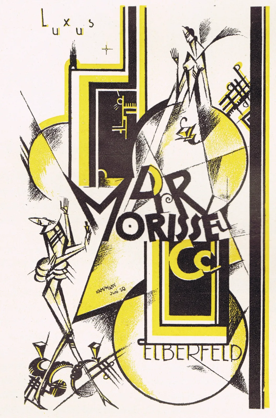
Walter Kampmann by Adolf Behne (1921): Design Translated

Design Translated, Designer Profiles, Members Only Content

Walter Kampmann by Adolf Behne (1921): Design Translated

A 1921 article on Walter Kampmann, originally in German, published in Das Plakat, Vol. 12, No. 6, in 1921.

Read Article
Saul Bass and the Modernist Movie Titles

Designer Profiles, Illustration, Members Only Content

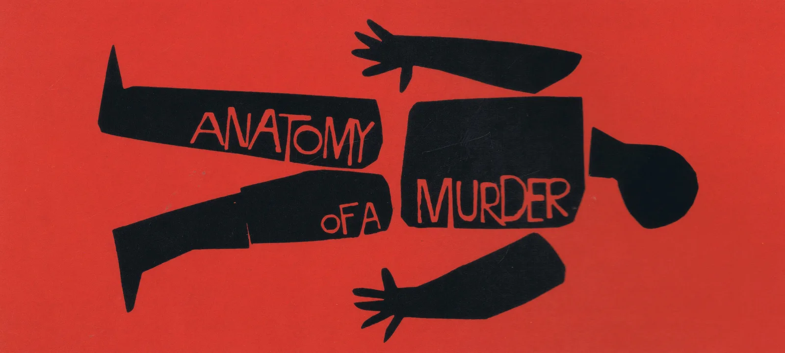
Saul Bass and the Modernist Movie Titles

How Saul Bass turned opening credits into a design discipline, from The Man with the Golden Arm to Vertigo and Psycho, with quotes and title sequences.

Read Article
Typographische Jahrbücher, 1906: The Printed Inserts

Typography & Type Design, Magazines & Publishing, Members Only Content, Regional Histories

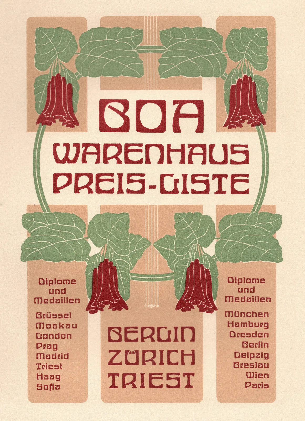
Typographische Jahrbücher, 1906: The Printed Inserts

Letterheads, menus, tickets and specimens tipped into Typographische Jahrbücher in 1906. 56 Jugendstil printing samples, scanned and featured.

Read Article