The archive creation process didn’t take place overnight. First, I started visiting our National Library to discover, photograph, and then share on an Instagram account flyers from the late 19th and early 20th centuries. The first image was posted on August 23, 2018.
This decision was made due to my limited knowledge on the matter and the desire to learn about how Uruguayan printers communicated different social events.
I approached the National Library where the following dialogue with a librarian arises:
– Could I please see the ephemeral prints of the collection?
– On what topic?
– All of them.
– How come? Researchers generally come for a particular subject, architecture, medicine, linguistics, etc.
– I’m interested in studying the layout of flyers, that is, how the printer diagrammed what was a copy into persuasive communication.
The eyes of the librarian had a peculiar astonishment.
Luckily, by chance or causality, a flyer that communicated a lottery whose typesetting was unique appeared. This ephemera was the one that helped to develop a relationship with the National Library and the official.

To compose “MIL ONZAS DE ORO”, a 13 letter headline, it was missing 3 letters which the printer had to figure out how to accomplish the job. The most curious case being the last ‘O’ of oro (gold) which is a 6 with a patch.
The amazement that could be seen in the eyes of the librarian quickly turned into fascination of mine. We knew that there was something here and without a doubt there was much more to discover.
Thanks to this emotional impulse and after accepting that I suffer from self-discrimination, that is, perceiving that Uruguayan design is subordinate to British, German or Japanese design. This feeling happens thanks to the little diffusion that Uruguayan design has. So, to shift my way of thinking, I began to work on the dissemination of autochthonous design to make it occupy its rightful place in my mind.
Then, at the beginning of this year, thanks to the kindness and willingness of Leonardo Haberkorn, a prominent Uruguayan journalist, I was invited to a television program to talk about the project. For almost 20 minutes I had the marvelous pleasure of talking about graphic design to an audience that is used to politics and economics. To appear on National TV was a great motor to make me recognize that the tip of the iceberg is just looming. There is much more to explore, work on and to make the Uruguayans and the world know about the value of local design as a communication channel and its connection with the environment.
A couple of months ago, I decided to name the project instead of using a generic name as Graphic Design Archive of Uruguay as this name could be interpreted as a state agency.
The chosen name is ‘La Patria’. The name is taken from ‘El Altar de la Patria’ (The Altar of the Motherland) an oil painting by Juan Manuel Blanes from 1896 in which Uruguay is represented allegorically as a woman.

The choice of name for the archive is due to this personified allegory of the country. This representation communicates through ideograms what Uruguay means, this being the same purpose of the archive, to represent Uruguayan design.
The archive seeks to rescue and revalue our cultural legacy through a look at the various proposals that graphic design produced in Uruguay or by Uruguayans. The objective is to discover and understand the behavior of design as a communication channel and its connection with the environment.
Camelot
I admire this logo designed by Marcos Larghero, a University teacher, as is the kind of synthesis I wouldn’t be able to achieve. The simplification of a knight to just a few lines is outstanding.
Underground
What I idolize about the accomplishment of Edward Johnston, who was born in a small town of Uruguay called San José, is that it is an ever lasting design that has transformed into a symbol of British culture.
Russi y Burastero
There are many logos around where they picture a branch of grapes, but none like the one designed by Fernando Álvarez Cozzi, instead of circles he had the impressive idea of using cups of wine organized as a branch.
Mil onzas de oro
Is easy to say why this one is a favourite of mine, of course it is because of the typesetting, but I have a personal feeling stuck with it as it was the one that opened the initiative to build the archive.

Palindromic bus tickets
I had a soft spot for bus tickets as I enjoy the small amount of design and space they have to communicate. It isn’t common for people to appreciate a printed material that should last a few minutes, so in order to spread this love to others I thought that the best way to do it is with palindrome tickets. By now, I have a collection of over 100 different palindrome tickets.


Enciclopedia Uruguaya
In terms of editorial design, this collection designed during the late 60s, created a series of 126 publications dedicated to the history of Uruguay where the style was developed by using illustrations and a bounded colour palette.
Is easy to say why this one is a favourite of mine, of course it is because of the typesetting, but I have a personal feeling stuck with it as it was the one that opened the initiative to build the archive.

Milonga Brava
My favourite record cover was designed by Fernando Álvarez Cozzi in 1971. A couple dancing milonga is illustrated. Milonga is a musical genre that originated in the Río de la Plata. In This adorable image we can notice the influence of the aesthetics of Picasso, but with a soft touch of naiveness where the legs are exaggerated in a clear metaphor of what dancing stands for.

The posters created by Imprenta AS. This design studio founded in 1954 worked in the same way that Pentagram works today, that is, each partner designs independently with his team, but they signed their works as a collective.


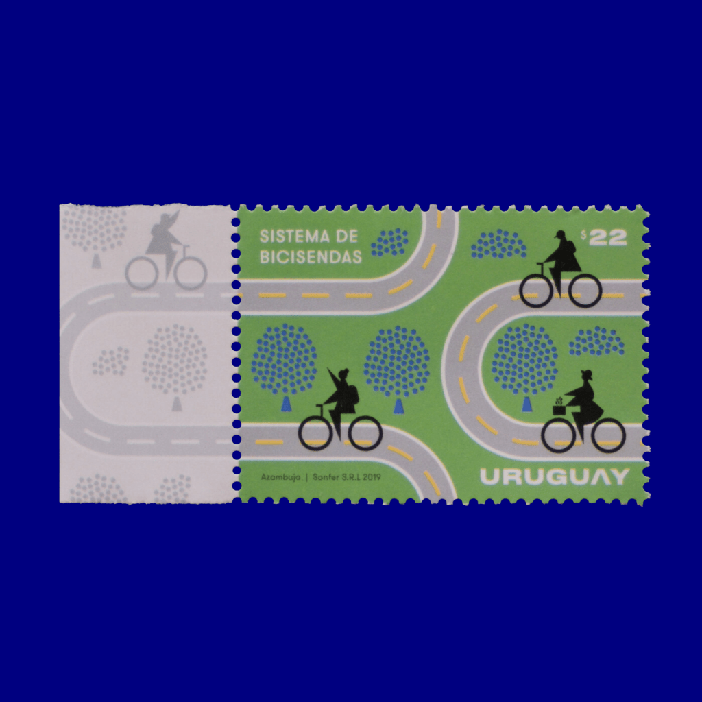
A postal stamp designed by Martín Azambuja from last year. I know Martín personally as we shared the same classroom back when we were at University. He achieved an intellectually elegant and visually powerful design thanks to the interest of our Post Mail system in his contemporary approach to graphic design.
The main consequence is that I acquired references of Uruguayan design. Now, I look at international and local design, which seems incredible, but it is new to me. So, by having references to what was designed in the past, it is possible to influence the present.
For example, a few months ago with a multidisciplinary team where an architect, a writer and sociologist, a type designer, an experience designer and a graphic designer. Jimena Germil, Rosana Malaneschii, Matías Fernández Di Iorio, Juan Martín Lusiardo and myself. A typeface based on the lettering found in the laboratory and substations of the state electricity company was published. This project emerges from the attraction of doing type. The most difficult thing to achieve, in my opinion, in the world of fonts, is to perceive that you are doing a contribution and not a remix. A solid conceptual foundation was able to introduce me to produce my first font.

On the introspective side, I learned to be more receptive of my colleagues’ approach to design. It happens that in design, as in politics, everyone has their own way of doing that differs from what one is and does. What is relevant from this lesson is to spread Uruguayan design and not just design that I like. What would be the sense of spreading Uruguayan graphic design that I find to my liking? The making of the archive helps me to work on my ego and to position myself in a better place where personal interests are left in order to focus on the collective.
All the photographs that make the archive were shot by me. To obtain the materials, purchases were made through the Internet or in flea markets. Also, there are countless contributors who submit their work as well as people who kindly invite me to their homes to photograph their belongings.
These cases apply to all the designs, except for logos, where each one was carefully redrawn since these were created before the computer.
I don’t feel that Uruguayan design is under-represented, I know it is. In my opinion, this happens because there lacks a narration of our history where a tale is constructed.
For example, I learned about our graphic design background when I was in my thirties. This shows that there is a problem where myself and my colleagues didn’t create a report of the history where shared.
The main objective of the archive is to enable design students to be aware of our heritage as soon as they start studying our vocation. La Patria will help to raise awareness of what was designed in our territory.


, c. mid 1970s")


