Have you seen any curious marks on beams and windows in Norwich?
The stories of Norwich’s medieval merchants’ marks is being told in a new book and exhibition.
Often viewed as some of the earliest recorded examples of company logos, the marks can still be found across Norwich city centre today.
Merchants’ Marks can be found at city centre locations including: Colegate, Cinema City, St John Maddermarket church, Museum of Norwich, and Strangers’ Hall.
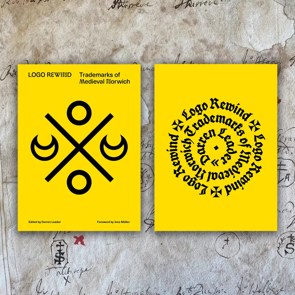
Logo Rewind: Trademarks of Medieval Norwich will explore the fascinating history of these merchants’ marks, which were emblems stamped onto goods and carved into the facades, beams and windows of buildings across the city in medieval times.
During the 14th–16th centuries, Norwich was a centre of regional and continental trade with products defined by these merchants’ marks. Each logo had to be different from its competitor and distinguishable by a mostly illiterate population.

The marks were used to indicate craftsmanship by stonemasons, saddlers, cutlers and goldsmiths and by city artisans such as woollen and tapestry weavers, drapers, tanners, grocers, bakers and brewers. Many of these marks remain carved above door frames, engraved in stone or rendered in stained glass inside churches and on gravestones to this day.
Logo Rewind: Trademarks of Medieval Norwich from UEA Publishing Project in collaboration with CreativeUEA features the work of designer, researcher and educator Darren Leader who has painstakingly collected and digitally remade over 200 of these trademarks, adding biographic detail. The book includes introductions and essays by big names from the world of design, including Minnie Moll, CEO of the Design Council and former Chief Executive of Jarrold, Dr Tim Pestell, Senior Curator of Archaeology, Norwich Castle Museum and Art Gallery and academics from the University of East Anglia and Norwich University of the Arts.
Darren Leader said: “Norwich’s medieval marks are an early example of commercial branding overlooked by contemporary graphic design. The merchants having crafted a visual language based upon angular lines and geometric shapes reminiscent both of 21st-Century branding and logo design and the ‘less is more’ aesthetic of modernism, sharing an intention to create captivating brand symbols that communicate with the minimum of elements. This is a practice previously thought not to have begun in earnest until the late 19th century. Logo Rewind is a great opportunity for Norwich to reconnect with this historic past.”

John Gordon, Academic Lead, CreativeUEA said: “In creating this book, graphic designer, researcher and educator Darren Leader has digitally remade 200 trademarks from Medieval Norwich. These early logo designs are strikingly modern and testament to the spirit of creativity that has always characterised our fine city.
“We hope that this book is a springboard for future research and that it will appeal to and bring the subject matter to diverse audiences through a range of events, exhibitions and workshops. CreativeUEA is very proud to be working with UEA Publishing Project to support this fascinating publication.”
Logo Rewind will be published this October and will be accompanied by a touring exhibition that will initially open on 5 October at the Enterprise Centre on the UEA campus. It is a must-have for anyone interested in UK Medieval history, students of history and design, creatives, and the contemporary design community more broadly, both nationally and internationally. It is also a statement of pride in the richness and depth of Norfolk’s material culture.
Logo Rewind is available for preorder now £35 (£45 RRP) on the UEA Publishing Project website. It will be published on 6 October 2023 by UEA Publishing Project. Please contact Alex Bratt, Executive Officer, CreativeUEA for more information: a.bratt@uea.ac.uk / 07798840876.


