I have known Rob for over a decade and I have been a huge admirer of his work. He specialises in reverse gilded glass sign making, typographic murals and traditional sign-writing. His signwriting started from the age of 14, where he worked as a signwriter in Bradford, (my hometown and studio location), in 1991 and now operates from his own space in Lower Mossley.
His extreme attention to detail, skilled craftsmanship and passion can be seen in the outcomes of his work. I spoke to Rob to find out more about his process, inspirations and plans for the future.
- Precision, Craft and the Love of Letters 1")
Could you introduce yourself and tell everyone a little bit about the work you produce?
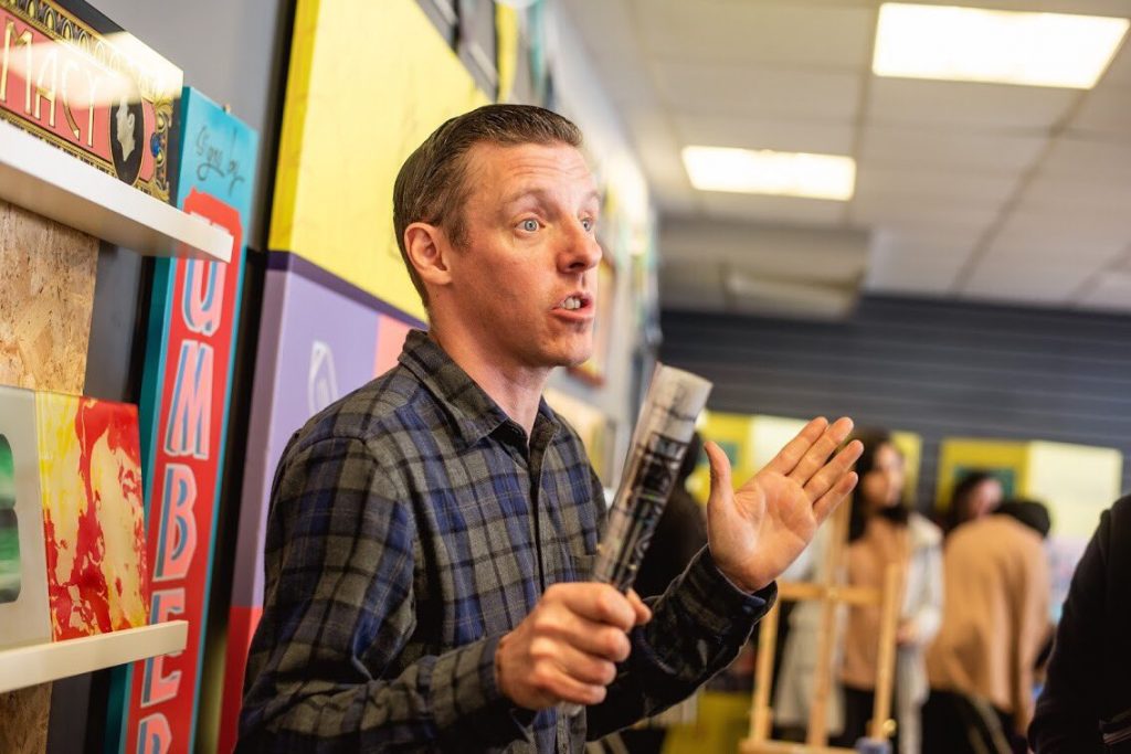
Hi Matt, Thank you for the interview. So – I’m Rob aka Umberto and I run my business, Signs by Umberto, from a studio in Lower Mossley, on the outskirts of Lancashire and near to where I live in Marsden, Huddersfield.
I’m a traditional sign-writer and for anyone who doesn’t know what that means as such, I paint typography. So my clients vary from private clients who would hang a piece of work at home, to retail ventures who wish to have a hand-painted shop fascia instead of vinyl.
I thrive on the precision with a brush and I apply that to any canvas I’m working on, which can vary from 30ft square murals on rough brickwork through to delicate reverse gilded glass signs.
My glass sign work has a multitude of techniques running through them that are placed historically within sign making ephemera. Glue chipping had been at it’s best in Chicago around the mid 1800’s and these techniques are practiced in the present day.
I’ve made large scale glass signs which have historically accurate typographic elements that are embellished with acid etching among other techniques.
Loose gold leaf is applied to the etch in varying carats of gold that illuminate the type and dance light across the room.
There’s a real increase in young people been inspired to learn sign-writing and traditional techniques. What do you think has brought on this revival?
Yes I think that’s right, A younger group of signwriters are very well established in the industry and younger aspiring enthusiasts are keen to follow. I can’t say for sure what the reason might be but presume it’s due to people becoming very tired of a throw-away culture.
Vinyl was revolutionary to the sign industry in the 90’s but almost destroyed the practice of the painted letter. However, we are living in an age now of hyper-awareness of the destruction that plastic causes and that it’s a ‘quick fix’ and has no soul or nuances that hold the human touch within its brush strokes or construction. People are tired of flat, generic pumped out work.
Another example I guess would be to look at the explosion of the craft ale industry. CAMRA set up to promote the campaign for real ale due to the fact that only two good beers existed on the market in good pubs. Now, look at the industry of ale/craft ale. We spend a lot of money on well-designed cans of beer and consume drinks/food that has more care and attention applied to it. I see a similar trend with sign-writing, people like craft, hand made outcomes.
Most of all though, I truly believe that once a person picks up a brush and paints a letter with it, that they are hooked. To see the brush moving around a bowl of a character to finish sharp at a terminal is utter magic.
- Precision, Craft and the Love of Letters 2")
Where do you find inspiration for your work? Have you got go-to resources and material?
References are everywhere, depending on what I wish to make, depending on where I search. So, yes I do have a pile of ‘go to’ references. One of those, in particular, would be the book ‘Shadow Type‘ by Steven Heller and Louise Filli. Extremely well-researched book by two very respected individuals in their field.
I have type catalogues from the 1930’s among other books in the library. If I need to pull references from a particular date and to be placed into a particular geographical position, then I will take a research day out and photograph the typography carved into buildings in a particular area before taking the images to the drawing board.
I then draw the lettering by hand adding refinements to build out the characters I wish to use. I also look in unfamiliar places such as engineering journals depending on what I wish to search for.
- Precision, Craft and the Love of Letters 3")
The recent project for Deco Publique is a large scale mural in the heart of the Yorkshire Dales National Park. The lettering for that mural had all been inspired by lettering from across Yorkshire that can be found in Terry Sutton’s book ‘Yesterday’s Yorkshire. Inspiration comes mostly from books, the word Rise on the mural in Settle came from Sutton’s book and the E in Rise came from a logo of a piano builder in Leeds. the R, I, S were drawn by hand to suit the E.
Graveyards are also another great go-to for reference and of course the tombstone can be dated and placed to the period of typography one is hoping to replicate, for a historical yet contemporary outcome.
I’ve seen lots of photos of your process and admire the great level of detail in your work, have you got a set step by step process for your work?
Thank you, that’s very kind. My biggest bugbear is untidiness. My mind cannot even begin to make a complicated glass sign if my desk or benches are full of items that don’t need to be there. So as simple/daft as it might seem, my first step is always to clear the bench. I then only have on the bench the tool/items I need for the process I’ll be undertaking on that particular day. The processes of glass sign making dictates to me what should be done and when. Loose gold leaf is so fragile that if at any point I rush, then the gold will fold up and float away. I love that. I love that it’s unforgiving and I have to bow to it’s rules-not the other way around.
If I’m making a sign that has a wood base, then the board is prepared first, to be waterproof. Whilst paint dries I then research type, maybe from a Stephen Blake type catalogue. I then begin to draw the desired characters to a grid that is proportional to the sign/board. After refining the type, I then transfer that design to the board and begin painting.
If it’s a glass sign, again I begin with drawing. I’ll draw the design by hand to the size/scale of the desired outcome. I then, as I draw, work through in my mind all of the processes to be implemented into the sign. For example, the type may have oil gilding on the bottom half and water gilding on the top half. One is matt and one is mirrored. A band of abalone shell may be placed through the type to separate the two bands of gold. All of these details are refined in my mind as I draw, the drawing will also visualize these thoughts as a plan.
- Precision, Craft and the Love of Letters 4")
Who are your favourite designers and artists?, Have you got a particular art movement that inspires you, or ideology?
That’s a VERY difficult question to answer. I adore typography, the form of lettering. However, this admiration is not exclusive to historical type. I feel inspired by lettering full stop. So I admire the digital output of studio’s such as Three Dots Type, Studio Build and Neubau to name a few. My mentor and friend David A Smith MBE constantly inspires me with his hand-drawn typography. I genuinely love painters/painting and looking at brush strokes and movement in work. In one way or another, all of this seeps through into the work I make. Ideology – not sure this answers that do the best you can, and the rest will follow. I’ve always felt that If I’ve truly given all I can and ploughed that into the project, that the rest will fall into place. Do one job well and another will come. When I say ‘job’ I mean the piece, the work, the art, the outcome.
What are your plans for the future with Signs by Umberto?
I hope to be the only studio in the North of England that can offer the array of techniques associated with reverse glass gilding from one studio. I’ve begun to practice only a fraction of what can be achieved. I’ve recently been awarded a scholarship from the Queen Elizabeth Scholarship Trust, that will help to make this happen. In late 2021 I will train with David A Smith MBE in Brilliant Cutting and Silver Chemical Mirroring. I would like to open two showrooms, one that is part of my workshop and one that is external, showcasing the glasswork similar in image to the storefronts of the early 1900’s. However, really – I’ll be happy to just keep learning this beautiful craft and hope that it continues to bring joy to people when they see it.
- Precision, Craft and the Love of Letters 5")


, c. mid 1970s")


