

Design Archive Feature, Members Only Content, Regional Histories, Typography & Type Design
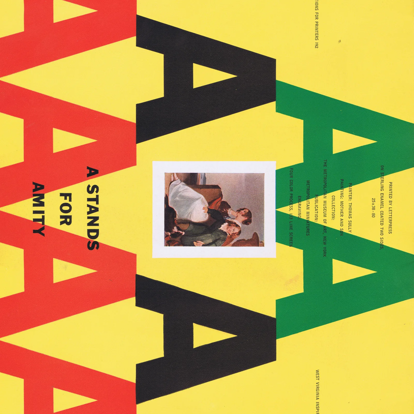
While gathering all my type catalogues, brochures, and instructions on print processes, I found a little book titled 43 American Typographic Designers. I have included biographical notes from the designers featured in the exhibition accompanied by artefacts I have collected that they designed.
Read Article
Design Archive Feature, Advertising Design, Members Only Content
Advances in production and 1950s chewing gum marketing. From Wrigley's iconic "Spearman" ads to Hiroshi Ohchi's designs for Harris Chewing Gum.
Read Article
Design Archive Feature, Magazines & Publishing, Members Only Content, Regional Histories
A great way to visualise these stylistic variations and their progression is by looking through magazine covers and interior pages produced during the movement. The covers of Typografia that best represent the Czech Secese style of Art Nouveau were produced between 1907 and 1911.
Read Article
Design Archive Feature, Members Only Content, Regional Histories, Typography & Type Design
40 examples of Czech typography from Typografia Vol. 18 (1907). Czech commercial printing at the crossroads of Art Nouveau and early modernism, with work by Otokar Císař, Method Kaláb, and Mořic Novotný.
Read Article