


Corporate Identity & Branding, Design Archive Feature, Designer Profiles, Members Only Content, Regional Histories
Crouwel was the successor to Willem Sandberg who used an avant-garde approach in his work, utilising torn-paper montage, mixing of sans serif and old Egyptian typefaces and often off-center positioning. Crouwel steered away from this artistic approach and implemented a cohesive design system and a strong identity that emulated the corporate identity boom of the 1950s and 60s.
Read Article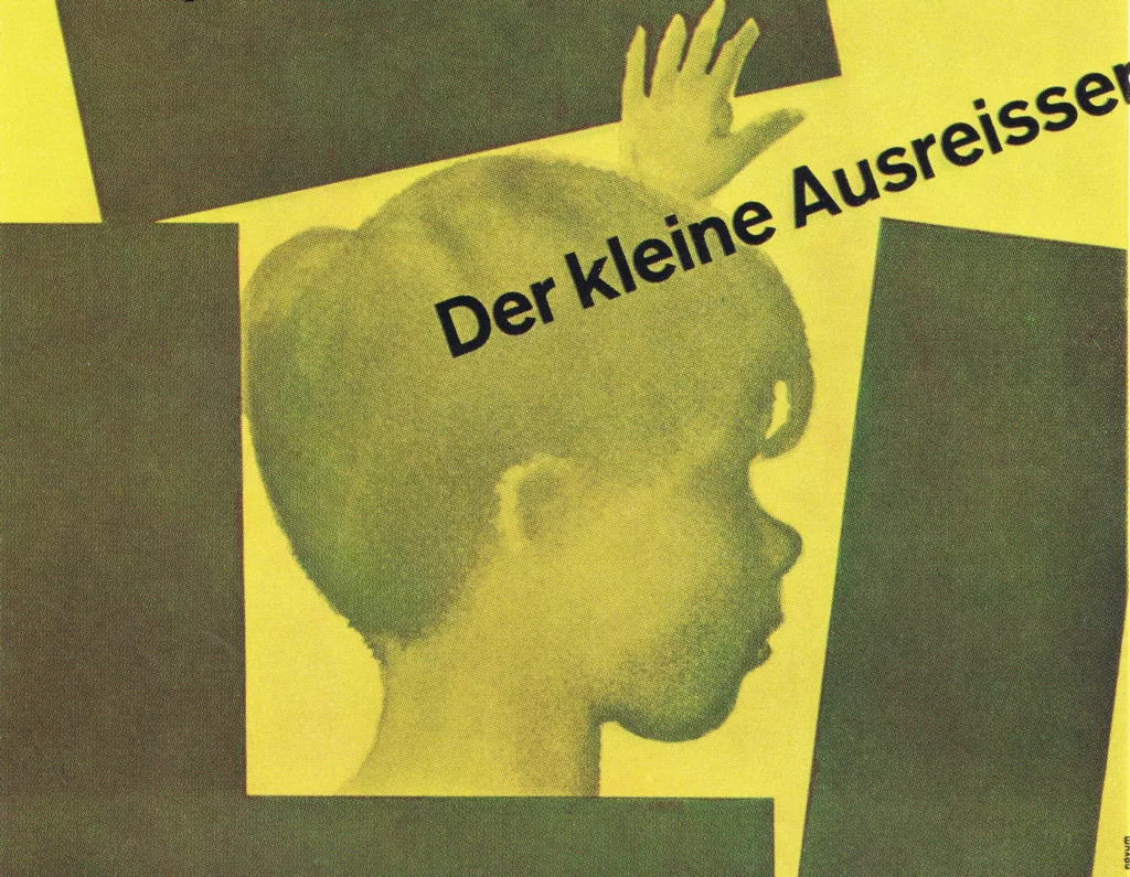
Design Archive Feature, Poster Design, Regional Histories
Every year the 20 best posters are selected in Germany and once more brought to the attention of the public. We do not publish all the twenty posters today; instead we add some which failed to be distinguished and which nevertheless are distinguished.
Read Article
Design Archive Feature, Members Only Content, Typography & Type Design
The typographic supplement from Der Druckspiegel, October, 1961 features typographic compositions designed by Herbert Bossin. Bossin has solely used the typeface Folio, to illustrate its flexibility and versatility alongside imagery provided by Lothar Blanvalet Verlag.
Read Article
Advertising Design, Design Archive Feature, Designer Profiles, Members Only Content
Joseph Binder translated machine-age aesthetics into refined Art Deco compositions. These magazine covers have become prime examples of American commercial modernism.
Read Article