

Design Archive Feature, Illustration, Members Only Content, Studios & Collectives
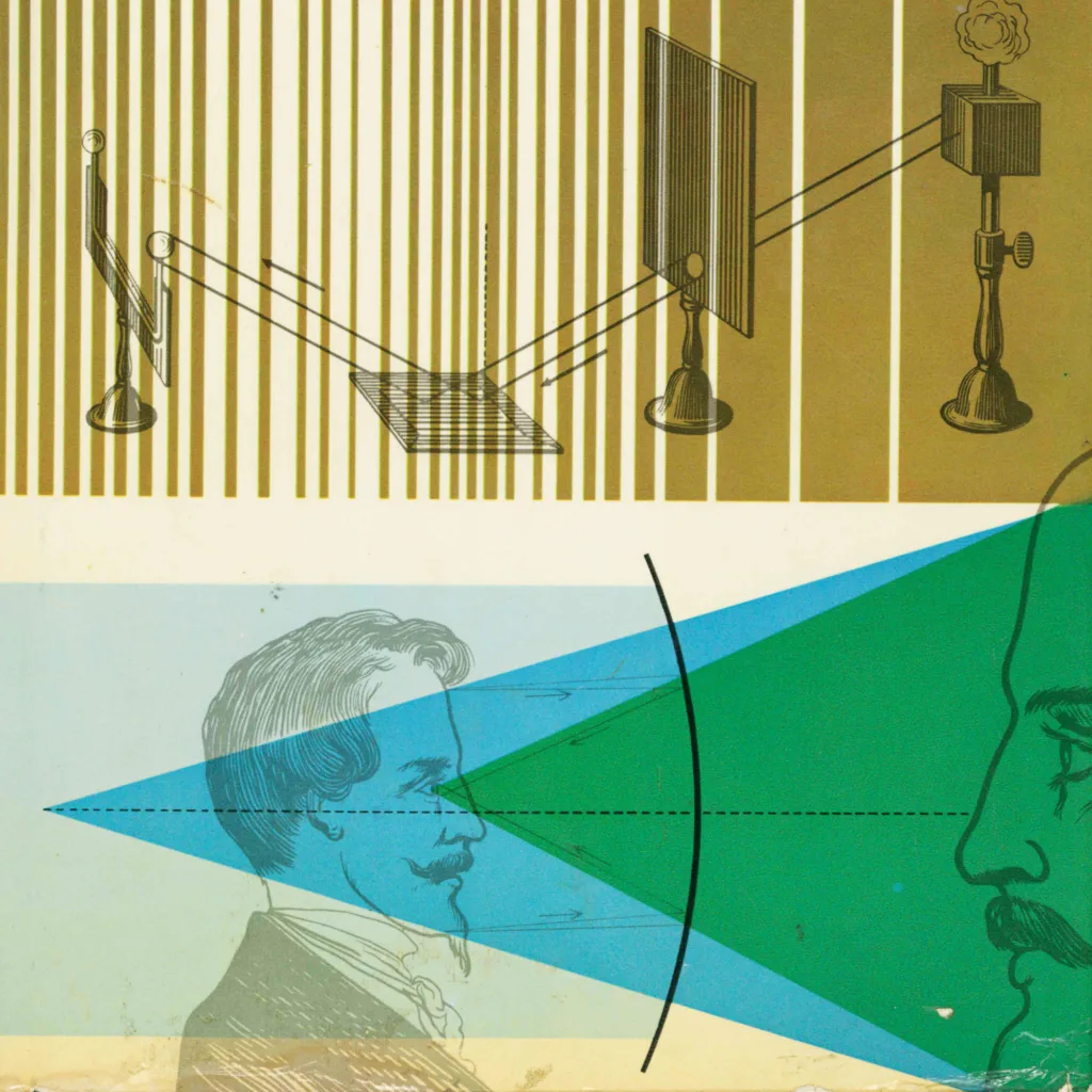
Winter + Bischoff’s work blends fine art and graphic design and is a fine example of commercial design featuring a heavy use of stylistic illustration. In fact a lot of German graphic design in the 1960s has this strong relationship of commercial and professional typographic layout with the roughness and organicness of art.
Read Article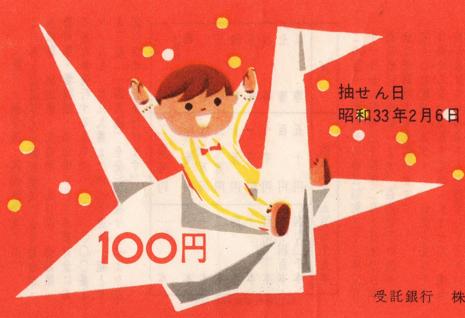
Ephemera, Illustration, Members Only Content, Regional Histories
50 tickets from Japan spanning nearly 50 years (1956–2004).
Read Article
Design Archive Feature, Designer Profiles, Members Only Content, Regional Histories
Matthew Leibowitz was born in Philadelphia in 1918 and was a pioneering American graphic designer known for his innovative use of typography, illustrations, and photography. Over his career, he worked with clients like IBM, AT&T, and Paramount Pictures, received over 150 international awards, and his designs are featured in the collections of major museums, including MoMA in New York and Paris.
Read Article
Design Archive Feature, Magazines & Publishing, Members Only Content, Regional Histories
A great way to visualise these stylistic variations and their progression is by looking through magazine covers and interior pages produced during the movement. The covers of Typografia that best represent the Czech Secese style of Art Nouveau were produced between 1907 and 1911.
Read Article