Images and text scanned from Gebrauchsgraphik, 4, 1962
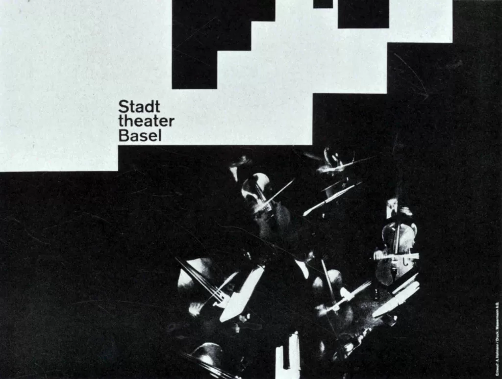
The designs published here offer a cross-section of the publicity of the municipal theatre of Basel within the past eight years. It is rare indeed that such a harmony between client and graphic designer has existed over so long a period. The client, in this case the Municipal Theater of Basel, has refused to listen to narrow-minded critics, in spite of the fact that as a state-subsidized enterprise, it is accountable to public opinion. The management has loyally supported the artist and that even in so-called secondary matters: the design of letterheads, envelopes, visiting cards, etc. In this way, a uniform style was preserved.

Consider it worthy of note that it was not the artistic director of the theatre (there were three managers in eight years), but the commercial director who, undaunted by all the changes and criticisms, advocated the opinion that in the long run, artificial and facile publicity would only harm the theatre, and that he was spontaneously supported in this by his superior board of commissioners. It is therefore not by accident that Armin Hofmann was also invited to design two stage sets: both were masterful. There is no need for a long comment on what is visually distinctive in Armin Hofmann’s graphic designs.

What seems to me to be of importance is the poster-like eye-catcher which spiritualizes the subject or should anybody prefer to put it this way the subject is translated, heightened, and rendered visible in this artist’s work. The arrogance of certain professional colleagues who consider a mere colored square to be a modern nirvana is absent in Hofmann’s designs. He is an artist who seeks genuine, spontaneous, and forceful contact, be that an encounter with an artistic problem or with another human being. And is not the genuine encounter which characterizes above all our own time, the modern time in other words?


