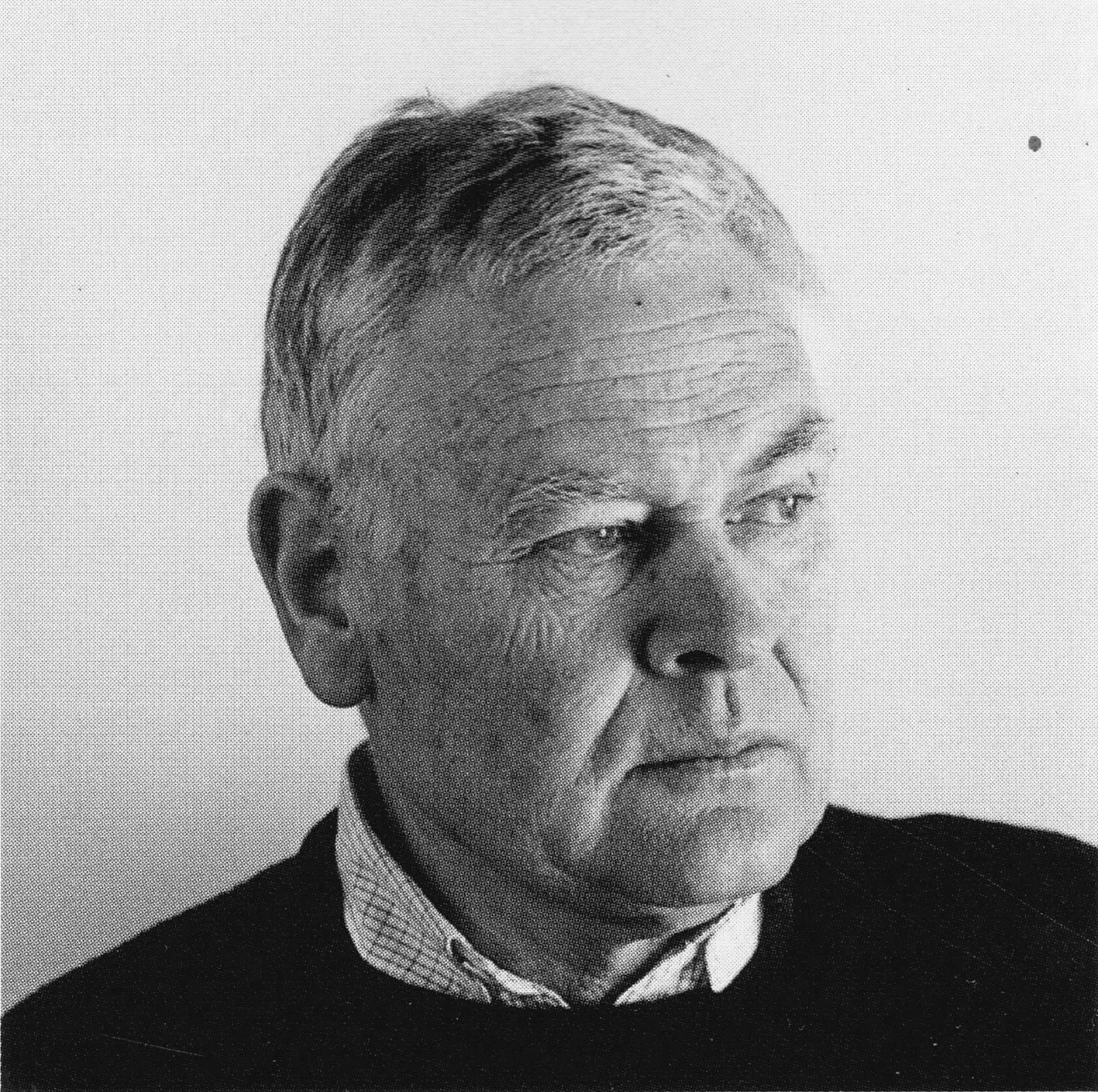
Siegfried Odermatt - Graphic Designer - Switzerland

100+3 Swiss Posters: Selected by Siegfried Odermatt, 1998

Information

100 + 3 Swiss Posters: The Odermatt Collection highlights a rich array of Swiss graphic design, featuring works by Max Bill, Karl Gerstner, Bruno Monguzzi, Fritz Buhler, and Emil Ruder. These pieces have been carefully selected from Siegfried Odermatt’s personal archive.

Details

Linked Information

100+3 Swiss Posters: Selected by Siegfried Odermatt, 1998
100 + 3 Swiss Posters: The Odermatt Collection highlights a rich array of Swiss graphic design, featuring works by Max Bill, Karl Gerstner, Bruno Monguzzi, Fritz Buhler, and Emil Ruder. These pieces have been carefully selected from Siegfried Odermatt's personal archive.
More graphic design artefacts
From the design archive:
More graphic design history articles

Members Content

The 1960s was an era characterised by political, social, and cultural shifts. The counterculture movement emerged as a response to the perceived failures of the mainstream establishment, sparking a wave of activism and alternative ideologies. And with these an array of printed matter. Counterculture publications, often referred to as the "underground press," became powerful platforms for dissent, expression, and the exploration of new ideas.

Members Content

Franco Grignani (1908-1999) was one of the twentieth century’s most important Italian graphic designers. Scanning the inner pages of Gebrauchsgraphik 04, 1962, I have managed to collate a selection of the advertisements created in the 1950s and early 1960s, showcasing his groundbreaking design work.

Members Content

Gregory Vines' design and process behind the Typographische Monatsblätter 1978 covers. From the initial inspiration drawn from Bellinzona's gate to the process of film montage, resulting in six stunning cover masterpieces.

Members Content

Wolfgang Weingart's artistic design delved into the intricacies of Swiss typography, skillfully dissecting its elements while venturing into texture and type experimentation. His layered montages radiated dynamic kinetic energy, standing in stark contrast to the minimalist approach of his instructors, embracing a more maximalist aesthetic.