Hans Arp, Hatje Cantz Verlag, 1994

Information

‘Hans Arp is one of the great sculptors of the 20th century, a “modern classic” and at the same time a “topical contemporary”. His fame is based primarily on his sculptures with their organically rounded forms which appear to have been developed according to the principles of nature, yet without seeking to imitate nature itself. However, his work also contains reliefs, collages, poems and drawings. These forms of expression combine to create a deeply personal oeuvre in which change, destruction and regeneration form a constant productive cycle. This publication is a work of reference which traces the history of the artist’s development, illustrated by examples of selected works and elucidated by Arp’s own texts, essays on his sculptures, reliefs, poetry and reception.’

Details

Linked Information
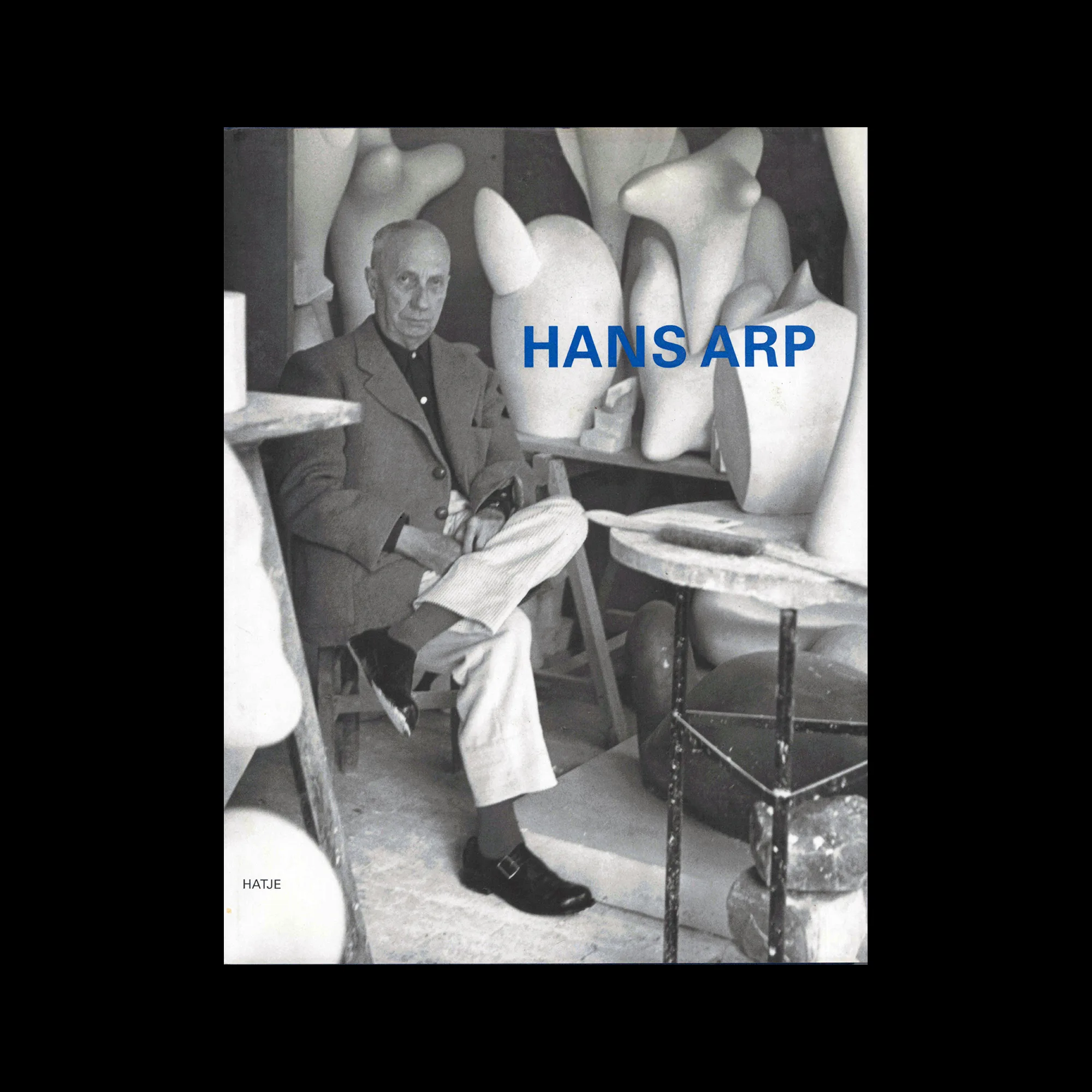
Hans Arp, Hatje Cantz Verlag, 1994
More graphic design artefacts
From the design archive:
More graphic design history articles

Members Content

Ryuichi Yamashiro (山城隆)  was a Japanese graphic designer and artist, born in Osaka in 1920. He belonged to the same generation of pioneering Japanese designers as Kohei Sugiura, Kiyoshi Awazu, Yoshio Hayakawa, Yūsaku Kamekura, Kazumasa Nagai, and Ikko Tanaka.  
Marin Lorenz has had an amazing career, designing for clients such as ESPN and Nike, teaching at some of Europe's leading design schools and publishing books, such as Flexible Visual Sytems, documenting his research and approach to design practice.

Members Content

Beyond being mere artefacts of design, these examples encapsulate the dynamic changes Japan was undergoing during this period. The design output of this era not only served commercial purposes but also became a powerful medium for expressing these societal shifts.

Members Content

The designer is unstated on these postcards, which were designed during the mid to late 1970s, but these playful illustrations alongside what looks to be Frankfurter Bold definitely fit the criteria of friendliness and efficiency