Share:
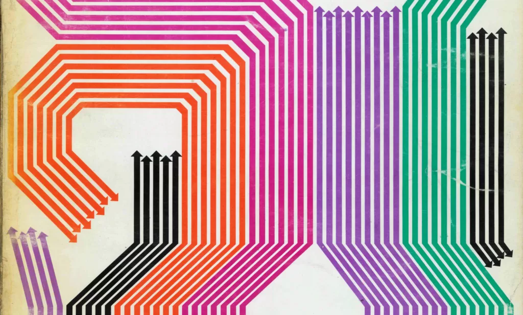
Text and images from Idea 118, 1973-5 Accompanied by coloured collected artefacts from the graphic design archive.
The arrow is widely recognised more as a sign rather than a figure. It is the only form which possesses the quality of a visual language in that it has the nature of indicating direction and movement. It is because of this characteristic that the arrow has been used widely as a technique of expression, such as in visual art and visual communication.
The origin of the arrow sign, judging from its functional shape, can be traced back to the hand axe used in primitive hunting during the Stone Age. It can be seen on the relics of sharp instruments, such as the saw or needle, stone spear and stone knife made from the bones of wild and domestic animals, of those days.
The arrow sign, which forcefully expresses the functions of the arrow as tool, has a great advantage even in the modern sense and as an explicit sign. The interesting point about the arrow sign is that it has a history as long as the arrow which was instrumental for mankind to survive. And it is widely used even today in its direct and applied forms in visual art and visual communication (symbol, mark and sign).

The image of the arrow sign is almost limitless, according to the form of construction. In other words, the arrow sign can be varied freely. An arrow drawn in thin lines appears weak, delicate and somewhat unreliable in indicating direction. On the other hand, an arrow with thick and heavy-set lines with obtuse angles gives a sense of weight and slowness, but at the same time, sense of stability.
The arrow sign, depending on the way it is expressed, seems to speak out with individuality. The arrow, originally created as an illustration for appeal to the senses as to space and time, has the possibility of possessing the quality of psychological emotional expression.
Most representative of such a quality are the arrow signs depicted by Saul Steinberg, an American well-known for his philosophical cartoons, and French illustrator Jean Michel Folon. To them, the arrow sign is not just a sign to indicate direction. It goes further. The arrow signs they depict seem to conceive man’s spiritual unrest as intellectual pathos.

The arrow sign, having community importance as a symbol and as a mark, quite naturally appears as a symbol mark or trade mark in the industrial society, as a fundamental element of graphic design concept to contribute to the advance, enhancement, progress and expansion of that society. There are many instances of the arrow sign being used as a means to express the scale of progress of enterprises and allied industries. The arrow sign is a dynamic, a component factor for initials or letters. The arrow sign, as an element, thus plays a very active role in the formative art world.


It is believed that the arrow when it transcends its original sense, increases its functional possibilities. It can be said that the arrow sign is latent with unknown appeal, much more than the utilisation value it has now. Another interesting thing about the arrow sign is that it cannot be found anywhere in Japan’s traditional crests. To be sure, the arrow is taken up in forms of variations such as the arrow wheel, overlapping arrows, arrows pointing in different directions, etc., but there is not one traditional crest which depicts the quality of direction or movement.
From this phenomenon, it may be possible to explore the significance of the origin and the raison d’etre of the arrow sign in Japan. As a symbol of never-ending turbulent human society, the arrow sign is expected to appear more and more as an element of graphic designs. That is why it is the time now to discern also the existing direction of the arrow.


