Original images and text scanned from Gebrauchsgraphik, 8, 1962
Anyone familiar with the problems of graphic design will conclude from the entire conception and arrangement of the examples published here that they were created by an artist who has a very special knowledge of typography. This conclusion is entirely correct for Oskar Reiner, whose series of advertisements for Opel we publish here for the first time, has not only inherited a knack for typography from his father but has also received a very thorough training as a compositor which he concluded with a master’s diploma. Practical tasks later on rounded off and perfected his special skill and knowledge.

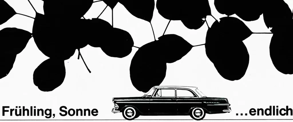
He describes his working method in the following words: « When – designing ads always endeavour to produce a serial character and a house image. I try hard to find a basic typographic conception and only when have found it do I add the pictorial elements. When designing a lay-out, I first make a draft, cut out the several compositional elements and arrange them in different ways so as to achieve a harmonious and yet exciting impression. When I design an ad – want to understand the theme and object thoroughly and strive for an artistic and publicity effect which does not distort the object but puts its beauty and usefulness in the proper light. try to keep my graphic message realistic and avoid cheap effects.» These descriptions of the artist’s aims and methods are borne out by his practical work which distinguishes itself by a clear and visually appealing conception.
Oskar Reiner works today as the director of the layout and typographical department of the H. K. McCann Company Frankfort on Main. He supervises the typographical work of this agency and personally designs entire series of advertisements. In addition, however, he has for many years done freelance work for graphic enterprises and trade journals.


 SA Zürich designed by Ernst Hiestand, Zürich in 1961")