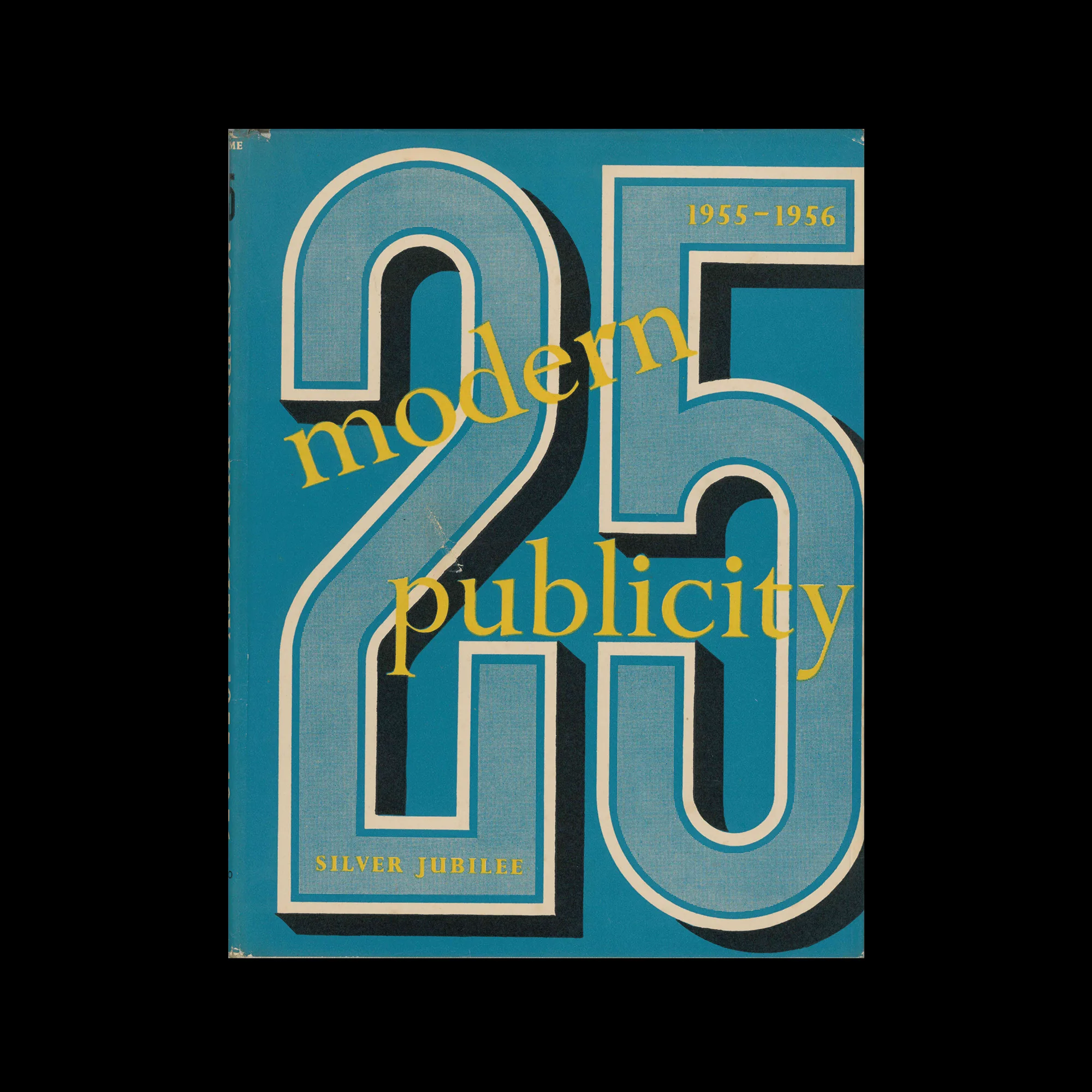
Modern Publicity Vol 25, 1955-56, Studio Publications, 1956

Information

Details

Linked Information

Modern Publicity Vol 25, 1955-56, Studio Publications, 1956
More graphic design artefacts
From the design archive:
More graphic design history articles

Members Content

Wolfgang Weingart's artistic design delved into the intricacies of Swiss typography, skillfully dissecting its elements while venturing into texture and type experimentation. His layered montages radiated dynamic kinetic energy, standing in stark contrast to the minimalist approach of his instructors, embracing a more maximalist aesthetic.
The background of Kamekura's mark designs is his boldness in eliminating all the waste, combining simplification derived from Japanese traditional family crests and Western intellectual mechanics of formation with a sharp modern sense of composition.
Why Graphic Culture Matters is a compilation of 46 thought-provoking essays by renowned design critic Rick Poynor, delving into the realms of art, design, and visual communication.

Members Content

The typographic supplement from Der Druckspiegel, October, 1961 features typographic compositions designed by Herbert Bossin. Bossin has solely used the typeface Folio, to illustrate its flexibility and versatility alongside imagery provided by Lothar Blanvalet Verlag.