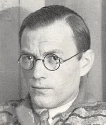
Paul Schuitema

De 8 en Opbouw, 07e jaargang No 03, 8 February 1936

Information

Special Issue on Photography
Important Dutch avant garde periodical on architecture designed by Paul Schuitema

Details

Paul Schuitema was a Dutch designer and artist and was a member of the Circle of New Designers, a group that included Moholy-Nagy, Herbert Bayer, and Jan Tschichold. He was a pioneer in modern typography in mass communication and quickly adopted the principles of Constructivism and Bauhaus after studying in Rotterdam.

Linked Information

De 8 en Opbouw, 07e jaargang No 03, 8 February 1936
De 8 en Opbouw, 07e jaargang No 03, 8 February 1936. Designed by Paul Schuitema
Important Dutch avant garde periodical on architecture designed by Paul Schuitema

Paul Schuitema was a Dutch designer and artist and was a member of the Circle of New Designers, a group that included Moholy-Nagy, Herbert Bayer, and Jan Tschichold. He was a pioneer in modern typography in mass communication and quickly adopted the principles of Constructivism and Bauhaus after studying in Rotterdam.

More graphic design artefacts
From the design archive:
More graphic design history articles
Both educators have a keen interest in multiscriptual design, Arabic type design, and graphic design and recently released A History of Arab Graphic Design. I contacted Bahia and Haythem to find out more.
An article by Jan Tschichold illustrated with examples of publicity produced by Brann of Zürich.

Members Content

Kiyoshi Awazu (粟津) was a renowned Japanese graphic designer, known for his contributions across various creative fields including poster design, architecture, set design, filmmaking, and illustration. His unique style was commissioned by theatre groups, design and architecture magazines and various organisations for the covers of book covers and posters.

Members Content

Crouwel was the successor to Willem Sandberg who used an avant-garde approach in his work, utilising torn-paper montage, mixing of sans serif and old Egyptian typefaces and often off-center positioning. Crouwel steered away from this artistic approach and implemented a cohesive design system and a strong identity that emulated the corporate identity boom of the 1950s and 60s.