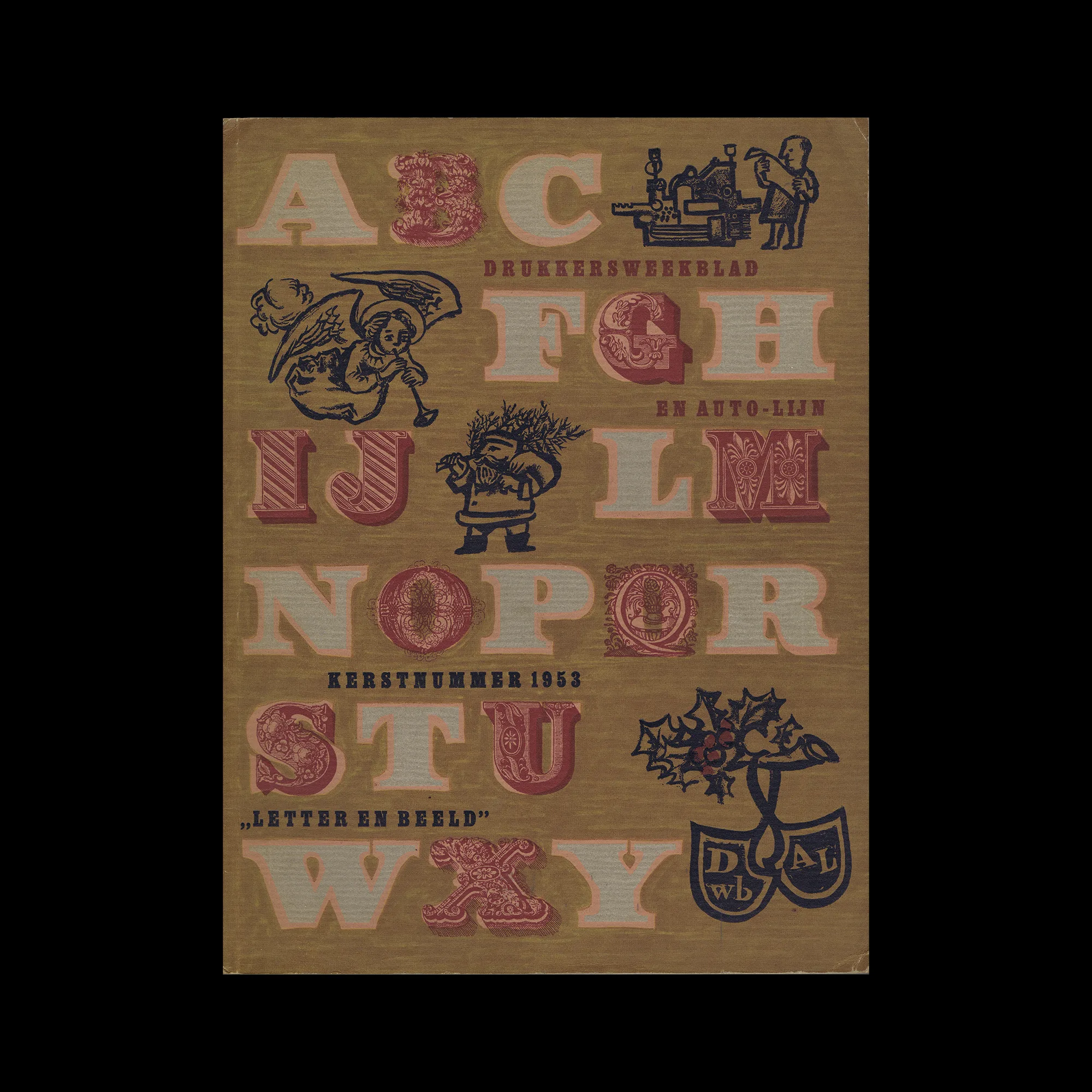
Drukkersweekblad en Autolijn Kerstnummer 1953, 1953

Information

Details

Linked Information

Drukkersweekblad en Autolijn Kerstnummer 1953, 1953. Design by Mart Kempers
More graphic design artefacts
From the design archive:
More graphic design history articles
I have always loved the design work created for Olivetti. The colourful midcentury designs by Italian designer Giovanni Pintori, the minimal typographic poster by Swiss designer Walter Ballmer and my personal favourite the 1959 poster for Olivetti designed by Herbert Bayer. I recently found out Triest Verlag released a new book, Visual identity and branding at Olivetti which contains further work by Xanti Schawinsky, Renato Zveteremich, Ettore Sottsass, Hans von Klier, Egidio Bonfante and Walter Ballmer.
Members Content

Crouwel was the successor to Willem Sandberg who used an avant-garde approach in his work, utilising torn-paper montage, mixing of sans serif and old Egyptian typefaces and often off-center positioning. Crouwel steered away from this artistic approach and implemented a cohesive design system and a strong identity that emulated the corporate identity boom of the 1950s and 60s.
Triest Verlag für Architektur, Design und Typografie are a Swiss independent publisher producing specialist design books in the realms of typography, graphic design and architecture. Their books provide valuable insights and the print production is of exceptional quality. I interviewed the founders, to find out more about their books.

Members Content

Wolfgang Weingart's artistic design delved into the intricacies of Swiss typography, skillfully dissecting its elements while venturing into texture and type experimentation. His layered montages radiated dynamic kinetic energy, standing in stark contrast to the minimalist approach of his instructors, embracing a more maximalist aesthetic.