

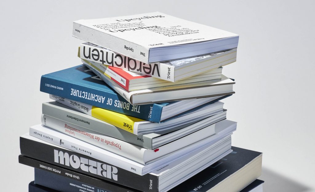
Triest Verlag für Architektur, Design und Typografie are a Swiss independent publisher producing specialist design books in the realms of typography, graphic design and architecture. Their books provide valuable insights and the print production is of exceptional quality. I interviewed the founders, to find out more about their books.
Read Article
Design Archive Feature, Advertising Design, Designer Profiles, Members Only Content, Regional Histories
Nikon commissioned Yusaku Kamekura to design numerous posters, packaging designs and advertisements for Nikon. He used abstract forms, an impactful use of colours, along with his skilful reduction of messaging.
Read Article
Just like people, cities are complex systems. Planners and designers play a key role in making them function smoothly through well-designed signage systems and visual identities. These elements must not clutter the environment but instead serve to inform, direct, and warn the public effectively.
Read Article