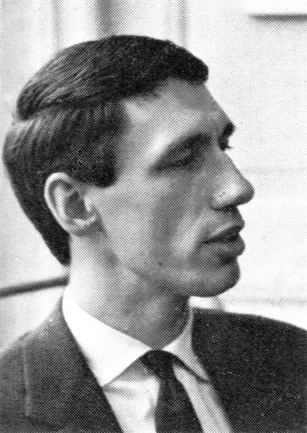
Wim Crouwel - Dutch Graphic Designer

Kieler Woche 1998, Offizielle Programm

Information

“Kieler Woche is a festival that takes place each year in Kiel, Germany. The festival includes nautical competitions as well as cultural events. Each year 5 designers are invited to submit 3 sketches for the event’s poster. The rules are simple. The text on the poster must be limited to only Kieler Woche and the year. The type for Kieler Woche must be set in Adrian Frutiger’s Univers. Lastly the the image must give equal weight to the sailing competition as to the cultural aspects of the festival. Designers that have contributed to this event include: Wim Crouwel, Michael Engelmann, Celestino Piatti, Anton Stankowski, Waldemar Swierzy, Otto Treumann, Hans Schweiss, Jean Widmer, Ruedi Baur, Ben Bos, Siegfried Odermatt and Rosemarie Tissi.” (source) Dave Cuzner, Grain Edit

Details

Willem Hendrik Crouwel was born in 1928 in Groningen, Netherlands. He studied at the Academy of Arts and Crafts in Groningen and took evening classes at the Institute of Arts and Crafts, now the Rietveld Academy. His teacher, Charles Jongejans, was trained by notable Dutch designers Paul Schuitema and Gerard Kiljan. In 1952, Crouwel began his design career at Enderberg, designing exhibitions and trade stands, gaining valuable experience. After leaving Enderberg in 1956, he founded a studio with industrial designer Kho Liang Ie, working on various projects across design disciplines, including graphic and exhibition design. Influenced by mid-century Swiss typography, Crouwel explored letterforms and graphic systems, using fonts like Helvetica and Univers. His early clients included the Van Abbe Museum, where he designed catalogues and posters. In 1963, he co-founded the influential design agency Total Design and also started working for the Stedelijk Museum, collaborating with Edy de Wilde until 1986.

Linked Information

Kieler Woche 1998, Offizielle Programm. Designed by Wim Crouwel
Willem Hendrik Crouwel was born in 1928 in Groningen, Netherlands. He studied at the Academy of Arts and Crafts in Groningen and took evening classes at the Institute of Arts and Crafts, now the Rietveld Academy. His teacher, Charles Jongejans, was trained by notable Dutch designers Paul Schuitema and Gerard Kiljan. In 1952, Crouwel began his design career at Enderberg, designing exhibitions and trade stands, gaining valuable experience. After leaving Enderberg in 1956, he founded a studio with industrial designer Kho Liang Ie, working on various projects across design disciplines, including graphic and exhibition design. Influenced by mid-century Swiss typography, Crouwel explored letterforms and graphic systems, using fonts like Helvetica and Univers. His early clients included the Van Abbe Museum, where he designed catalogues and posters. In 1963, he co-founded the influential design agency Total Design and also started working for the Stedelijk Museum, collaborating with Edy de Wilde until 1986.
More graphic design artefacts
From the design archive:
More graphic design history articles
Ken was born in 1929, in Southampton and grew up in a small market town in North Devon. He was a principled man, with strong values and views against the hyper-consumerism we live with today. Ken studied at the London Central School of Arts and Crafts in the 1950s and was taught by Herbert Spencer, Anthony Froshaug and Jesse Collins. Whilst at the School he studied alongside designers Ken Briggs, Alan Fletcher and Colin Forbes.

Members Content

Perusing an issue of Der Druckspiegel from 1962, I found these fantastic examples of Swiss Design, produced for the University Ball at the University in St. Gallen, Switzerland, in 1961. The advertising matter included posters, newspaper advertisements, cinema slides, invitation cards and a booklet. 

Members Content

Wolfgang Weingart's artistic design delved into the intricacies of Swiss typography, skillfully dissecting its elements while venturing into texture and type experimentation. His layered montages radiated dynamic kinetic energy, standing in stark contrast to the minimalist approach of his instructors, embracing a more maximalist aesthetic.
Every year the 20 best posters are selected in Germany and once more brought to the attention of the public. We do not publish all the twenty posters today; instead we add some which failed to be distinguished and which nevertheless are distinguished.