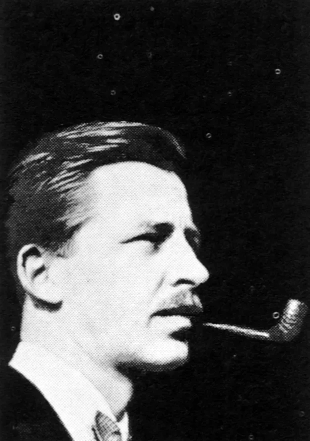
Bob Noorda - Italian Graphic Designer

Ottagono 08, 1968

Information

Compasso d’Oro ADI 1967
A. G. Fronzoni – Genoa: new classrooms at Palazzo Balbi
Pier Luigi Spadolini –
In Florence: a congress hall
Cini Boeri – Bobo: monobloc armchair
Alberto Salvati Ambrogio Tresoldi – Artwork design for a furniture, Lighting suggestions
Albert Leclerc – One cube for many pieces of furniture
Marco Zanuso – A stay on the city
Tobia Scarpa – For the young people
Gae Aulenti – A store
Joe Colombo – For men’s fashion, Hotel furnishing proposals
Luciano Buttura Luigi Massoni – The «E 15» colorful kitchen
Giulia Veronesi – The artificial light coefficient of the architectural space
Pier Carlo Santini – Aspects of architecture: Architectures by Edoardo Detti
Guido Ballo – Encounters with art: Towards the primary structures
Franco Mazzucchelli Tartaglino – Stand with modular elements
Production review
Where to buy
Shops abroad
Four graphic designers at Arflex

Direction: Sergio Mazza
Editing: Giuliana Gramigna
Graphics: Bob Noorda / Unimark
Photos: Ballo, Casali, Clari, Industrial Color, De Benedetti, Faggioli, Gigipi, Masera, Monti, Salvati
Direction, editing, administration, advertising: Milan, via Melzi d’Eril, 26, tel. 315407-315508
Publisher: CO.P.IN.A. s.r.l.

Details

Linked Information

Ottagono 08, 1968. Design by Bob Noorda / Unimark
More graphic design artefacts
From the design archive:
More graphic design history articles
Mark Bloom has designs for globally recognised brands, produces some of the finest, most accessible modern typefaces and heads up Mash Creative and CoType Foundry. His type foundry has always been a port of call for our studio's brand projects and he continues to develop these, each with a fantastic print specimen.
“They’ll never stand for that” and “It’s too modern” are, as George Plante aptly puts it, the restraintive thoughts which beset a commercial artist who tries to let himself go.

Members Content

Wolfgang Weingart's artistic design delved into the intricacies of Swiss typography, skillfully dissecting its elements while venturing into texture and type experimentation. His layered montages radiated dynamic kinetic energy, standing in stark contrast to the minimalist approach of his instructors, embracing a more maximalist aesthetic.

Members Content

The Best Swiss Posters Award was an annual competition, judged by a Swiss Jury. They selected a range of posters, showcasing a range of poster styles from completely typographic designs such as the work of Robert Büchler, to the illustrated posters of Donald Brun.