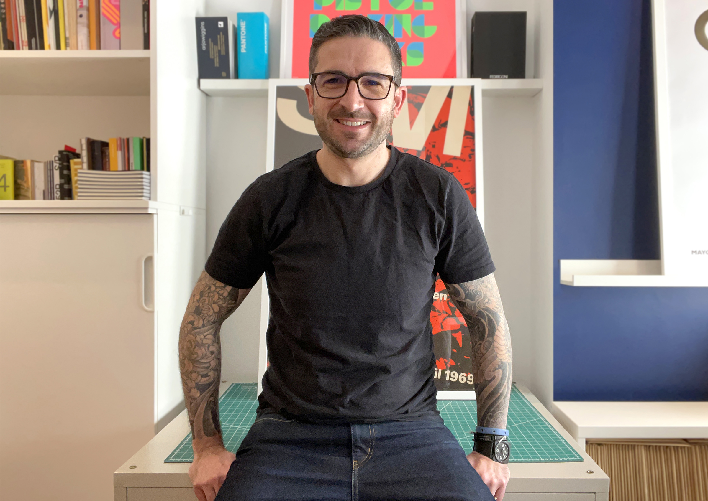
Mark Bloom has designs for globally recognised brands, he produces some of the finest, most accessible modern typefaces and heads up Mash Creative and CoType Foundry. His type foundry has always been a port of call for our studio’s brand projects and he continues to develop these, each with a fantastic print specimen.
First of all, could you tell me a bit about yourself? Have you always worked in design? What’s your journey in the field?
I graduated from Middlesex University in 1998 with a degree in visual communication design and was fortunate enough to land my first full-time role as a junior graphic designer just two weeks after graduating.
Early on in my career, I designed nightclub flyers and various work for the music industry which I continued to do for another 10 years. In 2008 I had a slight career change and started working in a small branding agency. It was whilst working there that I found my passion for brand identity design.
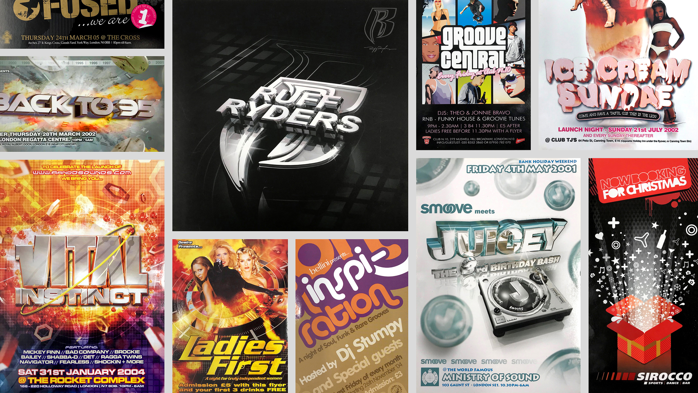
In 2009, during the global recession, I was unfortunately made redundant. This left me with a difficult decision to face: either find another job or try and set up my own design business. I chose the latter and one month later launched my own design studio – Mash Creative – where I continued to specialise in brand identity design.
Mash Creative is now 13 years old and during this time I have been fortunate enough to work with some amazing clients and globally recognised brands including Nike, Sonos, Coca-Cola and HP to name a few. Whilst running Mash Creative, I found another creative passion in type design and in 2011, I released my first commercial font ‘RM Regular’. Over the years, my love for type continued to grow and my ‘RM Regular’ evolved into RM Pro – a completely redrawn version of the original, available in 3 weights with matching italics.
Whilst I was fairly happy with this one typeface for a while, I always believed I could do better so I started sketching out ideas for a follow-up release called Aeonik. For this typeface, I partnered up with an old work colleague (Joe Leadbeater) and we continued to develop this typeface until it was eventually released in 2018 through its own mini-site www.aeonik.co.uk. Fortunately, Aeonik was (and continues to be) a great success, so this spurred me on to start my own type foundry – www.cotypefoundry.com – which launched in 2019 with 4 typefaces: Aeonik, RM Neue (another evolution of RM Regular/Pro), Coanda and Ambit.
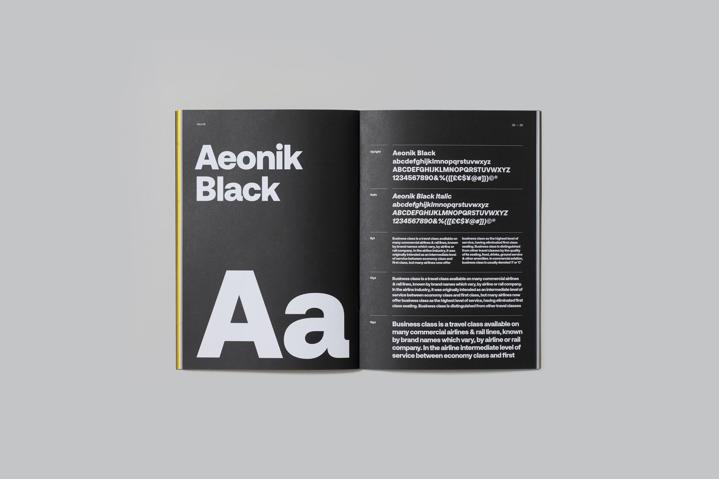
Fast forward to present day (March 2022), CoType Foundry now has 11 typefaces within its library and has become my main business. Shortly after launching the foundry, it became clear to me that there simply weren’t enough hours in the day to run both a design business and a type foundry so I made the conscious decision to no longer take on paid design work through Mash Creative. Whilst I still love graphic design, I must admit that having been in the design industry for 20+ years, I was growing tired of working with increasingly difficult clients.
Being a graphic designer that runs his own type foundry has many advantages – I still get to design things like specimen books and marketing material, but I am my own client. I believe it also gives me a different approach to typeface design as I’m constantly thinking about its usage from a graphic designer’s perspective.
It’s been an interesting career journey to date, full of highs and lows, but I’m now happier in my day-to-day than I have ever been.
Do you collect printed matter and is there a key publication that remains an influence in your work?
Like most graphic designers, I’m definitely a sucker for a lovely piece of print in any shape or form – whether that be a book, poster or even a paper swatch!
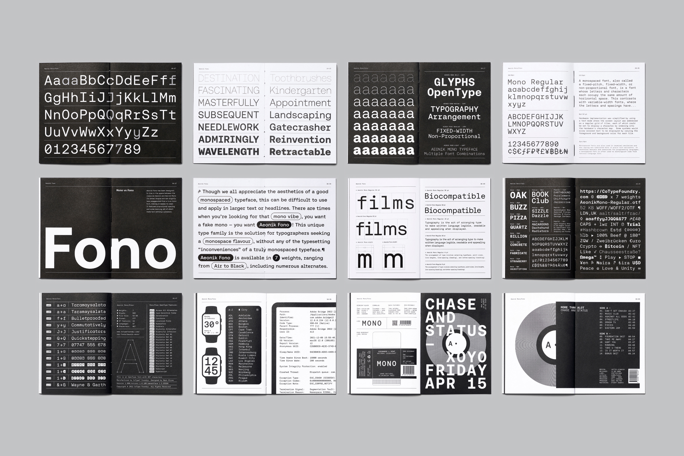
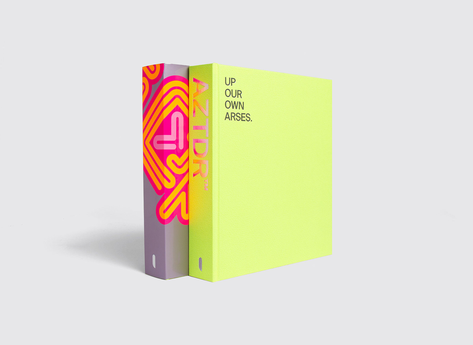
I believe my love for print is also clearly visible in my work for CoType Foundry, since all our typefaces include free type specimen books on selected purchases. Each book is designed to a particular theme and features a range of special print techniques, from fluorescent ink to exposed binding.
I have a healthy library of books and magazines that I’ve collected other the years. Since career switch to Type Design, I tend to purchase more type-related books. I’m a big fan of the Shoplifters ‘New Type Design’ books, which showcase the latest and greatest type designs from around the world. I actually just purchased volume 2 the other day. It’s nice to be able to check out new type trends and see what other type foundries/designers have been working on.
The Designers Republic were a huge influence to me when I started my career in 1998, especially since they were designing nightclub flyers like me. They were also one of the few design studios to have an on-line portfolio of their work. When Unit Editions announced in 2019 that they were trying to raise funds through Kickstarter for an A to Z of The Designers Republic work, I – like a lot of other TDR fans – was very excited at the prospect of a printed TDR retrospective. As you would expect, it quickly got funded and I purchased a copy for my collection. I can’t say that the book itself directly influenced my work, however, the projects contained within – showcasing 30 years’ worth of work – most certainly did. For that reason, it’s definitely a key publication.
What are your favourite/stand-out pieces from your collection?
I have several books and posters I’m proud to own and for different reasons.
In terms of books, one of my favourites would have to be ‘Twenty-six characters — An alphabetical book about Nokia Pure’ published by Gestalten. I remember visiting the Design Museum in London around 2011/12, where it had been shortlisted for (and ultimately won) the ‘Design of the Year Award’ for Graphic Design. This particular book appeals to me on so many levels – it’s beautifully designed and printed featuring a mix of special inks; secondly, the typeface itself and the way it’s been presented is fantastic and still mightily impressive some 10+ years after its initial release.
Another favourite book of mine, but only for nostalgic, reasons is ‘An Introduction to Graphic Design’ by Peter Bridgewater. At 12 years of age I was awarded this book at school for being the best artist in my year (a proud moment indeed!). Having always loved art, I always knew that I wanted to go into a creative career, but until then never knew what that might be. After reading the book and getting a brief understanding of what a Graphic Designer was, my career path became clear, I wanted to become a Graphic Designer!
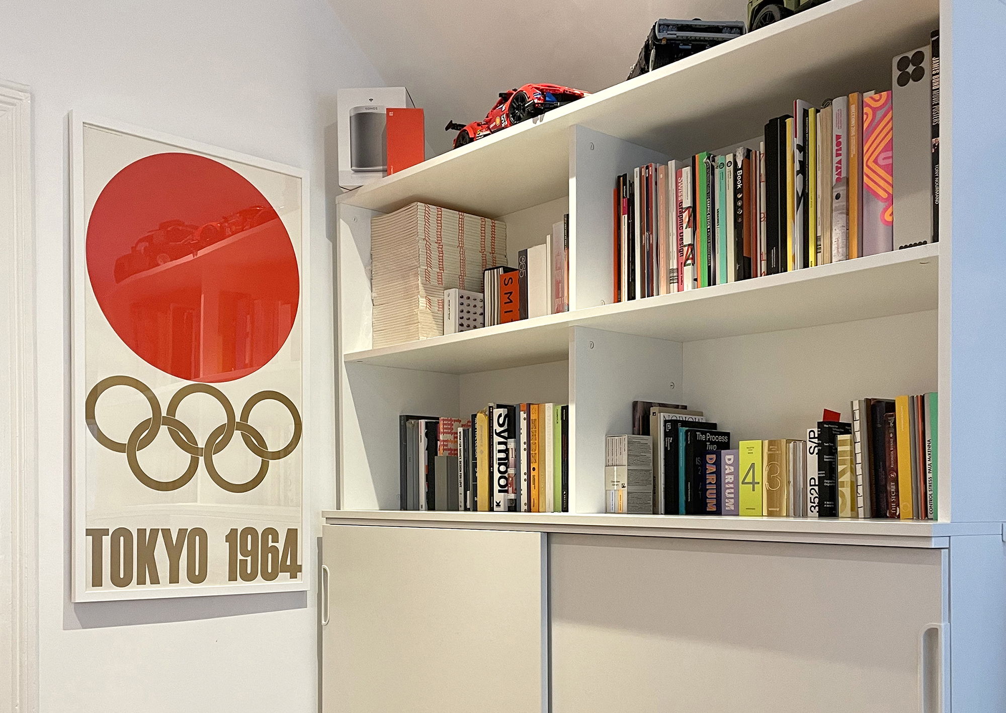
In addition to books and magazines, I also recently purchased an original Tokyo 1964 Olympics Poster designed by Yusaku Kamekura. It is in mint condition and hangs proudly in my home office.
Is there a book or set of magazines you are on the hunt for or would love to be in your collection/studio?
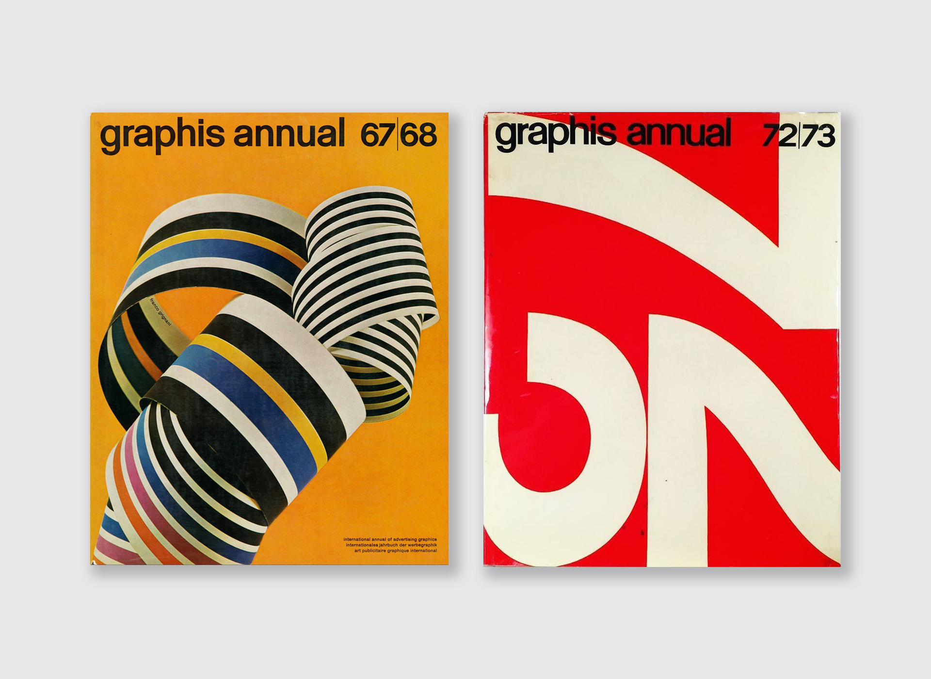
I would love to get my hands on a complete set of ‘graphis’ annuals from the 1960s right through to the end of the ’70s and beyond. I used to find a lot of reference material on Flickr and Pinterest from these publications which I used as a source of inspiration for my own work. The thing is, you can’t beat the real thing.
As I mentioned earlier, I’m also a big The Designers Republic Fan and back in the day they produced several very sought-after publications including ‘3D-2D: The Designers Republic’s Adventures In and Out of Architecture’ and ‘tDR™ X Murray & Vern Catalogue’, both of which fetch big money today. I’ve seen few tatty 3D-2D books for sale but would prefer to own a mint copy, so I continue to keep my eyes peeled for any reasonably priced copies.
Lastly, ‘Noise 4’ was a completely over the top print publication of experimental projects by Attik. One of the studios I used to work for had a copy and I remember being blown away by the design and print finishing on display – god knows what it must have cost to print! It features numerous special inks, spot UV’s and more.
Do you lean towards a period/region of design what’s your favourite and why?
I most certainly do: The International Typographic Style – predominantly from the 1950’ to the 1970’s – made notorious by the likes of Josef Müller-Brockmann Hoffman, Rudolph de Harak, Wim Crouwel and Massimo Vignelli.
Wim Crouwel’s work has undoubtedly been a huge influence on my own, in terms of Graphic, Logo and Type Design. His work was way ahead of its time and still looks relevant today. I’ve always tried to take a similar, minimalist typographic approach to a lot of my graphic design work whilst utilising a grid system. Inspired by the timelessness of Crouwel’s work, I sway away from designing to a particular trend, looking for my work to have longevity to it.
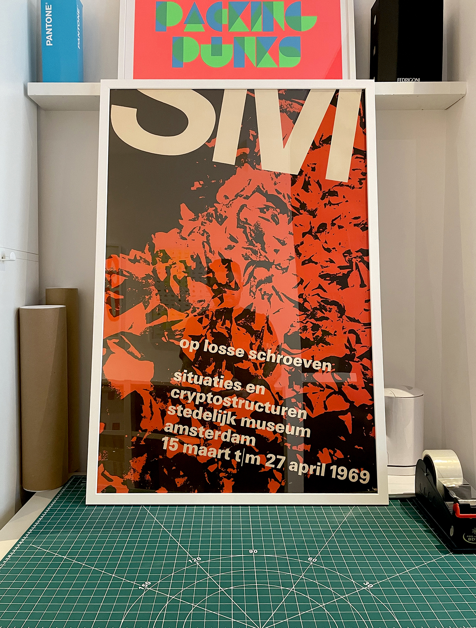
This is also true of my typeface designs and was one of my main goals when creating Aeonik. Our plan was to create “The Next Helvetica” – a massive goal, but I’ve always believed in setting my sights high. High on the agenda was creating a typeface that would be an everyday workhorse, with just the right level of character, and that would not look dated in years to come. I hope that we have achieved that with Aeonik, whose name was actually derived from ‘aeon’, meaning lasting an aeon, age-long.
CoType Foundry / Mash Creative
Twitter: @mashcreative
Instagram: @mashcreative
Twitter: @cotypefoundry
Instagram: @cotypefoundry
www.mashcreative.co.uk
www.cotypefoundry.com
