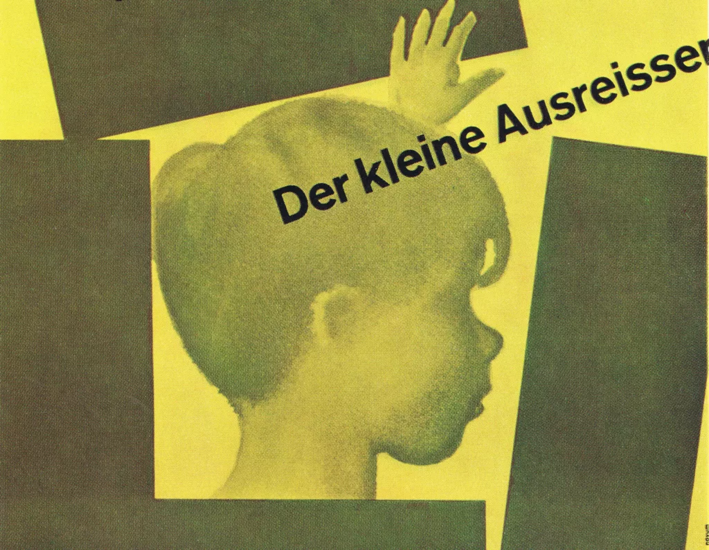
German Posters 1960 by Erich Pfeiffer-Belli

Every year the 20 best posters are selected in Germany and once more brought to the attention of the public. We do not publish all the twenty posters today; instead we add some which failed to be distinguished and which nevertheless are distinguished.
Poster for the film «The Little Truant» designed by Hans Hillmann, 1960

Article and images from Gebrauchsgraphik, 9, 1961

There are mediocre posters which are awarded prizes, and there are excellent ones which a jury passes by without noticing. This is a very human reaction and by no means the exclusive characteristic of jurors. But this same fact probably makes it also very difficult to determine which, among the best posters, is the most «successful» one. Mankind has not as yet lost its individuality to such a degree that in the matters of taste it would react uniformly, i.e., obtusely and as a homogeneous mass. Every poster-style can therefore be chosen, every creative idiom be spoken – where and how their effect will come to bear can hardly be predicted with precision. (Only in Germany the standard poster size frequently tends to impair the effect.) Every year the 20 best posters are selected in Germany and once more brought to the attention of the public. We do not publish all the twenty posters today; instead we add some which failed to be distinguished and which nevertheless are distinguished. We do this because we wish to attempt to show some typical tendencies of style in applied art. It will be seen from these examples that quite generally the artistic level and the creative idiom of the German poster have considerably improved.

Poster for the film «The Little Truant» designed by Hans Hillmann, 1960

The gap which hitherto had separated it from the top-class of international posters now seems finally closed and there no longer appears to be any danger of lagging behind. The lettered poster pure is on the defensive, a situation which may be regretted. Also drawings on posters and those posters which only aim at pictorial effects are no longer very strongly represented, at best it hobbles along on crutches such as those which Gruau (Paris) fashions for it. Mere, monumentally enlarged photographs remain in the background. Photography, on the other hand, is preferred as modified, independent and original artistic medium. Relations are established with modern fine arts – in some cases the poster even makes modern art acceptable to the public. One produces both phantastic and realistic effects without ever gliding off to the level of the genre or that of mere «objectivity» of the purely documentary.

Poster for the film «Puntila and his Coachman» designed by Hans Hillmann, 1960

The economical utilization of lettering enhances the pictorial effect of the poster, the phantastic – such as in Hillmann’s Puntila poster – is heightened to the demoniac. The free treatment of photography produces chiaroscuro effects of a particular note, it yields the finest structural effects of a vividness which modern man feels to be distinctive of himself. The same applies to the precisely calculated mixture of photography and drawing, the lines retraced with the hand (poster « Madame de …, » Bunuel poster by Hillmann). Here the accidental is entirely eliminated, the artistic calculation leaves no remainder. No greater demand can be made even on the best poster.

Kiel Week 1960 designed by Walter Breker, 1960


Poster designed by Hans Jürgen Rau, 1960


Poster for 150 Years of Oktoberfest designed by Ernst Wilde


Poster for a Carnival Ball designed by Franz Wischnewski, 1960


Poster for the film «Professor Hannibaln» designed by Hans Hillmann, 1960


Poster for the exhibition, The Chair designed by Friedmann Lichtwitz, 1960


Poster for the film «Dreyfus» designed by Hans Hillmann, 1960
Related Items from the Archive
From the design archive:
More graphic design history articles

Members Content

The advertising has a certain contrast of hand-drawn and mechanical. Produced entirely in black, it reminds us that the absence of colour can be highly effective. Hans Michel and Günther Kieser's illustrations bring a sense of both playfulness and a stylistic approach to a corporate client.

Members Content

A fantastic example of Swiss design for brand systems is the brand and advertising by Siegfried Odermatt commissioned by Grammo Studio in Zurich.
A review of the memorial exhibition of Edward McKnight Kauffer at the Victoria and Albert Museum in 1955 by F.H.K. Hernion
House style can give identity to the diverse products or activities of a firm. It stimulates loyalty, helps to reduce costs, and has advertising value.