Members Content

Ken Garland and the British magazine, Design

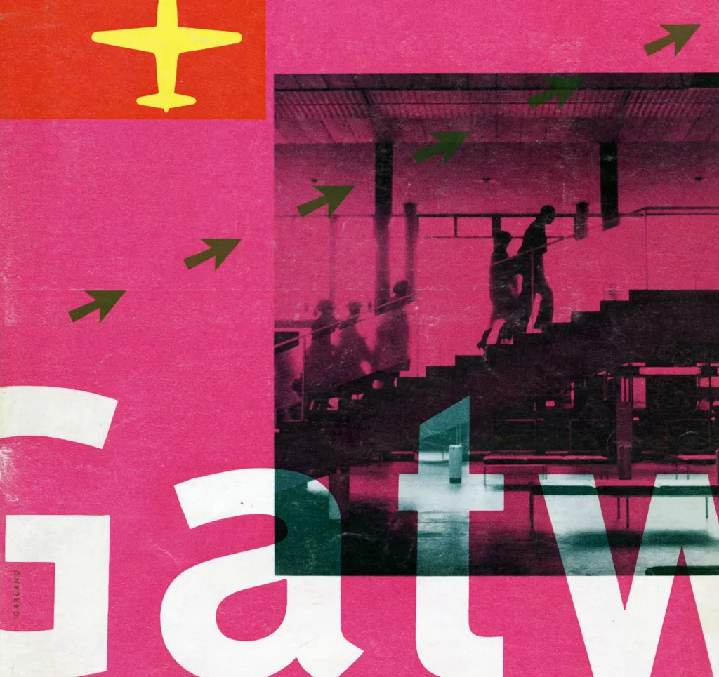
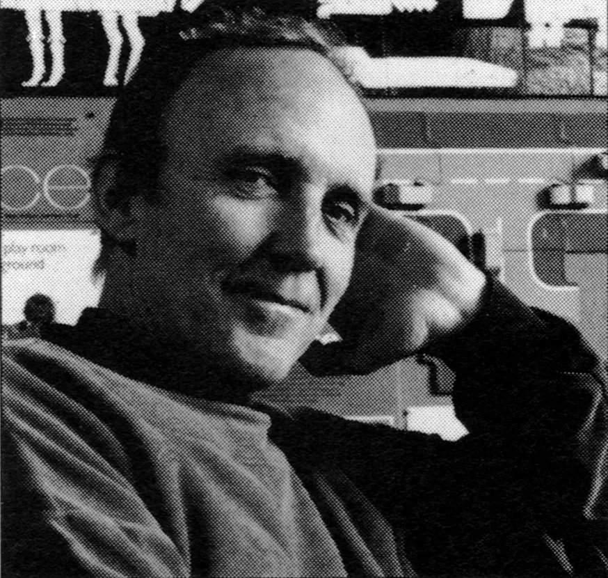
Many influential British designers have made their names in the history books. Abram Games, Alan Fletcher, Tom Eckersley and Derek Birdsall, to name a few. But one designer that has always influenced me, not only as inspiration from their design output, but as an example of the role of a designer and the importance of having strong ethics, is Ken Garland. He is known for his innovative and socially responsible approach to graphic design and his involvement in the design community through his teaching, writing and activism. In the second instalment of this series, I will discuss Ken Garland’s magazine work from my collection.
Share:

Members Content

This is a members-only article, gain access and support the archive for £1.99 a month.
Memberships help grow the design collection and share research on the history of graphic design.

You can sign up here.

Already a member?

Sign in below

Ken Garland - British Graphic Designer
Ken Garland studied at the London Central School of Arts and Crafts in the 1950s and was taught by Herbert Spencer, Anthony Froshaug and Jesse Collins. Whilst at the School he studied alongside designers Ken Briggs, Alan Fletcher and Colin Forbes.
More info about
More graphic design history articles

Members Content

Japan's first foreign film venue, Shochikuza Theatre (1923) is an icon of Modernism. Its Art Deco-influenced advertising, showcased in the 1925 Shochikuza News magazine, offers a glimpse into Japans influences from the West.

Members Content

The designer is unstated on these postcards, which were designed during the mid to late 1970s, but these playful illustrations alongside what looks to be Frankfurter Bold definitely fit the criteria of friendliness and efficiency

Members Content

One of Otl Aicher's lesser-known works was the identity and publicity for the Gastein Valley. Gastein valley was a resort for the elderly, an Austrian Alpine village in the Austrian state of Salzburg

Members Content

The stamps for the 1970 editions were designed by Jan Slothouber and William Graatsma in collaboration with the Centre for Cubic Constructions (CCC) in Heerlen.  Every stamp displays a different corner point of the same block, highlighting eight distinct corner points, with four chosen for their unique identities.