I have long been a fan of Counter-Print, as a student, I would order their newsprint publications, peruse their Flickr albums and now, over a decade later I still buy their latest releases and their site provides our staff with great gifts throughout the year. I interviewed one of the founders, Jon Dowling to find out more about setting up Counter-Print, their favourite books and which publishers inspire them.
When did you set up the shop, and what drove you to start selling design books and magazines?
We set up Counter-Print in 2008. My wife Céline and I were graphic designers working in London and were really in to design books new and old. However, we had a real passion for vintage design books from the 60s and 70s. We had a large collection, as did many of our colleagues at our respective companies. When we would travel, we’d often bring home design books and sometimes take extra copies to sell to people we worked with. My wife’s from Belgium and the secondhand book shops there were filled with classic 20th Century design books. At the time, people were starting to share their design collections on sites like Flickr (a kind of precursor to Pinterest, or even Instagram I suppose). We thought it would be cool to have a Flickr-style website where we could sell vintage design books. Apart from Amazon, no one really sold books online – even book shops. And so, Counter-Print was born – named after one of our favourite design books by Karel Martens. Although we sell physical books, we’ve never had a real shop. We’ve always been more interested in e-commerce and the potential to connect with people of a similar inclination through social media.
Are there any books or pieces of print you couldn’t sell and have kept for your own collection?
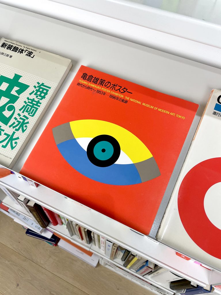
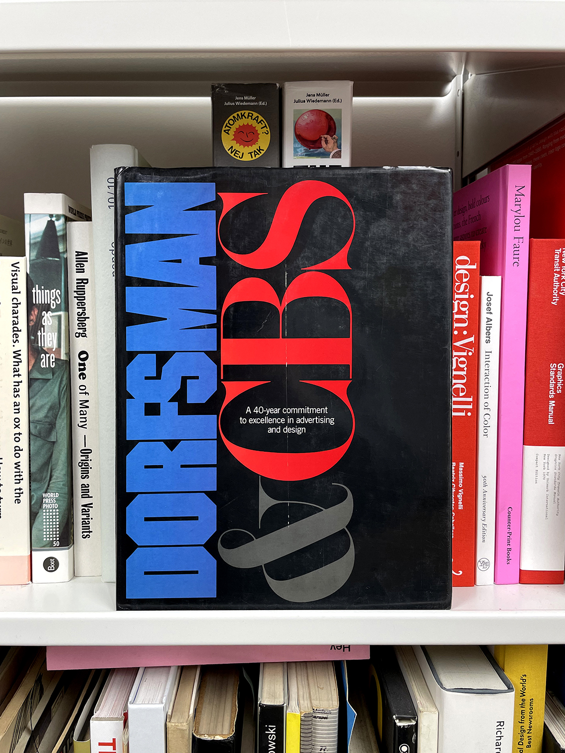
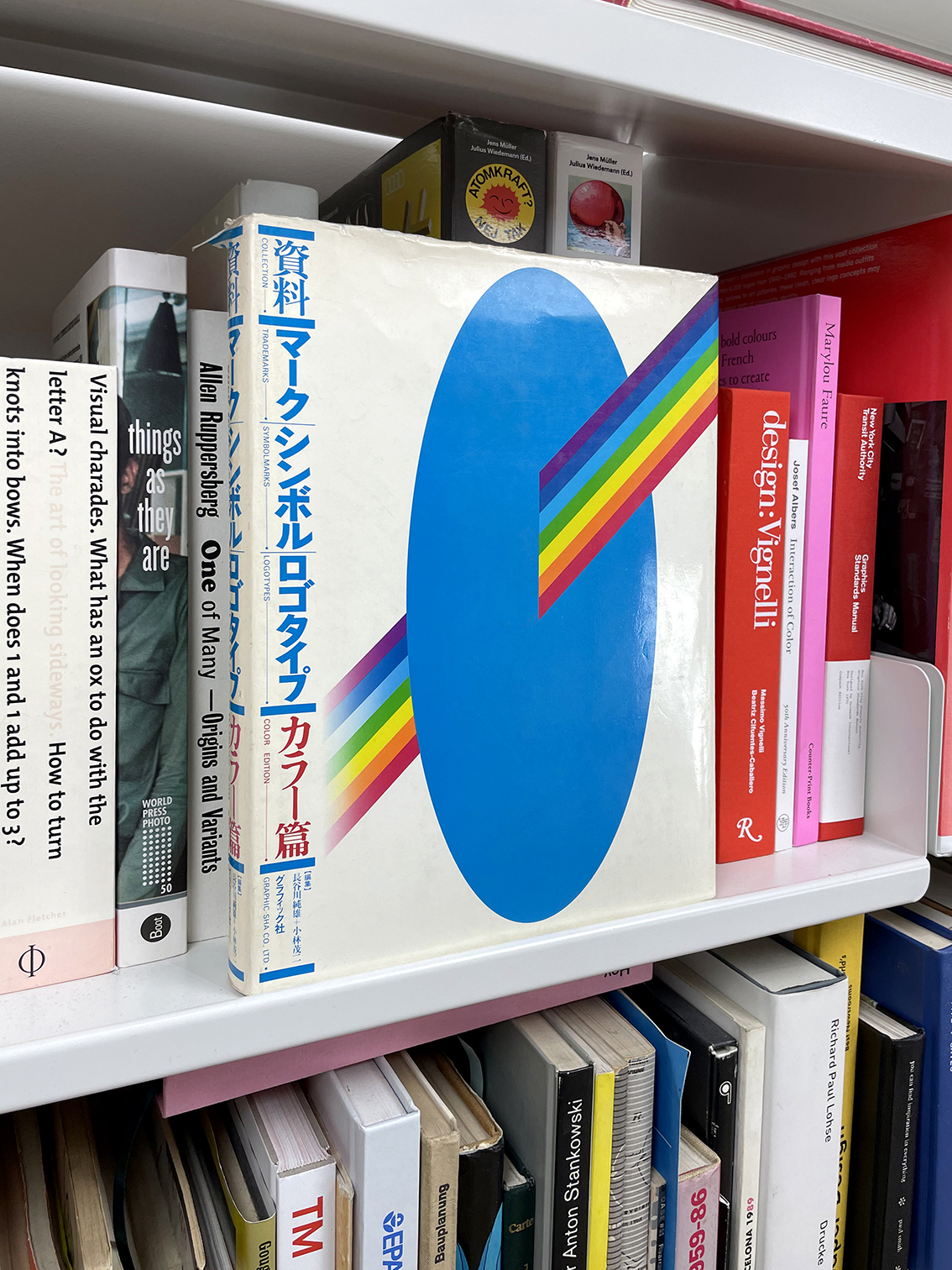
In the beginning, we always had the attitude that if we put something on the site and it didn’t sell it had to be something we would happily keep on our shelf. So really we were curating the site to our tastes. Fortunately, or unfortunately, almost everything sold, so I was forced to put things aside if I really wanted them. I have a first edition of Emil Ruder’s ‘Typographie’. I found a German edition of ‘Milton Glaser: Graphic Design’ in an Oxfam for £5. I kept a copy of ‘Dorfsman and CBS’. We once found a ‘Herb Lubalin: Art Director, Graphic Designer and Typographer’ for ten euros, many Wim Crouwel catalogues for the Stedelijk Museum and lots of logo books from the 60 and 70’s that I just couldn’t part with. My favourites are the ones from Japan. The irony is that many of the books we began to popularise have now been reissued, so I suppose they have depreciated in value. However, when I pick them up I still remember the thrill of discovering them and that is priceless to me. The ones we let go I certainly don’t dwell on, there was a thrill to the discovery, to unearthing a forgotten piece of history – like a metal detectorist – and that was enough. I’m still waiting to find my ‘Mode en Module’, which my wife and joke about every time we enter a charity shop – maybe it’s in here!
What are your favouite/s publishers at the moment?
There are so many publishers that I look up to; Niggli, Phaidon, Unit Editions, Verso, Slanted, Lars Müller, Four Corners, Corraini and Penguin of course. I hope I haven’t missed anyone out. As I look back, one of the real joy’s of Counter-Print’s business model, if you can call it that, is that we have always sold other publisher’s books, as well as titles we have designed and published ourselves. It’s meant that I’ve never felt any rivalry with any of these companies. On the contrary, I’m delighted if their books sell well as it benefits us too. On top of this, I’ve found the process of sourcing, reading and getting feedback from our customers on other people’s titles has improved our own work.
Are there any books you could recommend designers/students from your current stock?
When we were at University, studying design and illustration, we always enjoyed the relationship we had with our tutors. Every few days you would go in with a project for advice and they would recommend you looking at this-or-that designer. So, it’s something we have actively tried to engage with through Counter-Print.
I probably get a message a day from someone on Instagram, asking for us to recommend them a book for their dissertation, or something within a specific remit of design they’re interested in. It’s one of the nicest parts of my job and something I always try to find time for – we’ve even overwritten the algorithm on our site to make sure the books that are recommended under each title are actually picked by us.
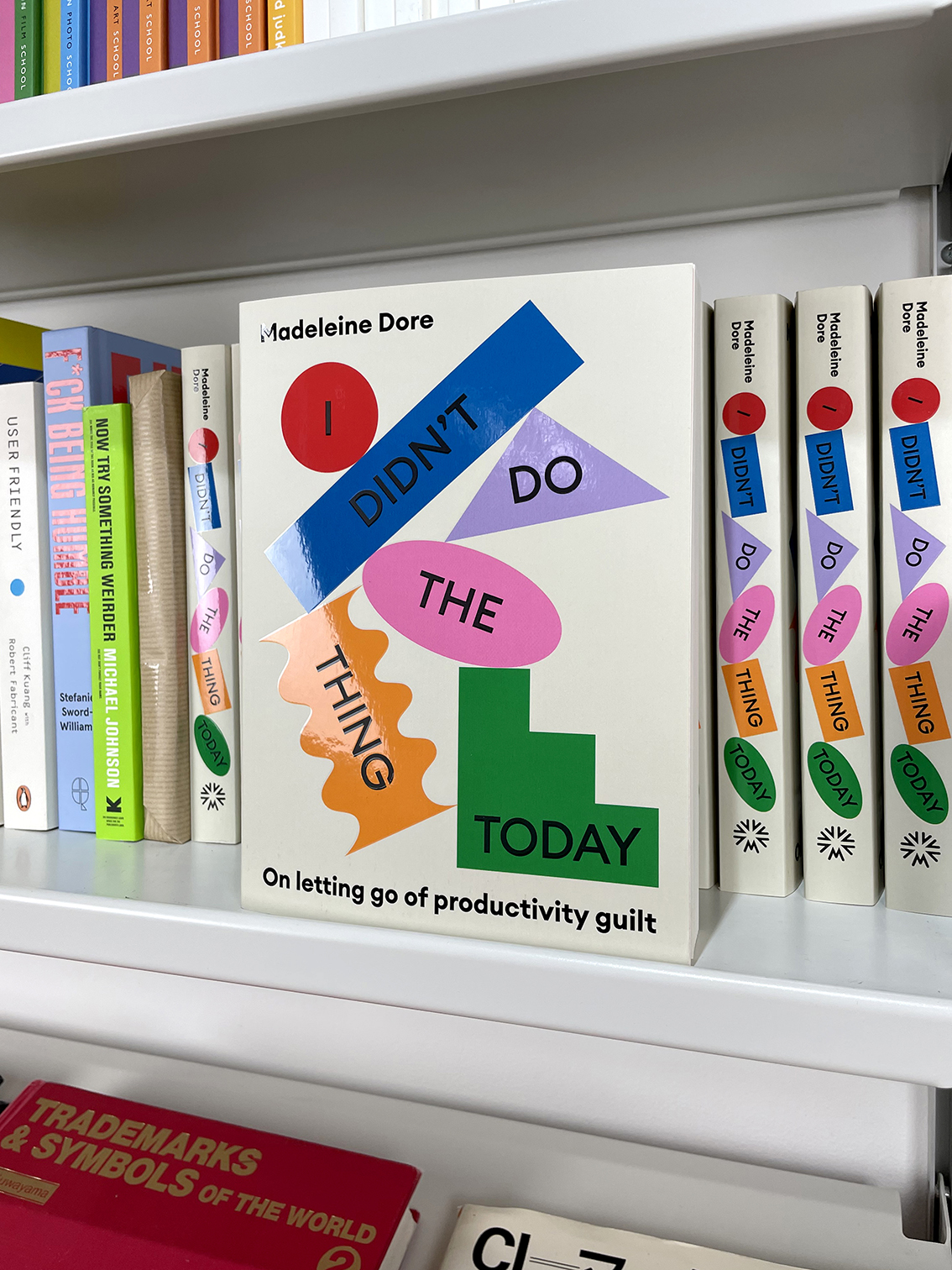
It’s hard to recommend people what to read unless I know what makes them tick! I personally read a lot of non-fiction books that are aimed at creative people. Books like ‘The Creative Curve’, ‘The Art of Noticing’, ‘User Friendly’ and ‘Do Design’ are incredibly popular on Counter-Print and probably aren’t the sort of books we traditionally associate with graphic design publishing. I’ve just finished ‘I Didn’t Do the Thing Today’ which was really quite revelatory. It’s essentially about getting over productivity guilt. I’m very much someone who exists on to-do lists and schedules, so it was great to read a book that suggests more of an intuitive approach – that by relaxing our grip on things, we can leave gaps in our day for the unexpected and unpredictable to creep in. I think that was the right book at the right time and those only come around every few years for me.
What are your personal favourite books, design and non-design related?
I always have two (or more) books on the go – a fiction and a non-fiction book on the nightstand. Unsurprisingly, given the job, I read a lot. The non-fiction books are usually about business, creativity and wellbeing. Running your own company/being self-employed can be exciting, daunting and ultimately exhausting. I’ve always looked for books for the answers to my daily struggles and non-fiction books like ‘Do Purpose’, ‘Company of One’, ‘Feck Perfuction’, ‘Fuck Being Humble’ and ‘Be More Pirate’ have all been very useful for work and motivation.
Meanwhile, the fiction I read is a little harder to categorise. Usually, it works as a counter-point to the non-fiction, so recently I’ve been drawn to pure escapism – ‘Dune’, ‘Klara and the Sun’, ‘The Road’, ‘The Three-Body Problem’. I like books with big ideas – science fiction, fantasy and other unfashionable things.
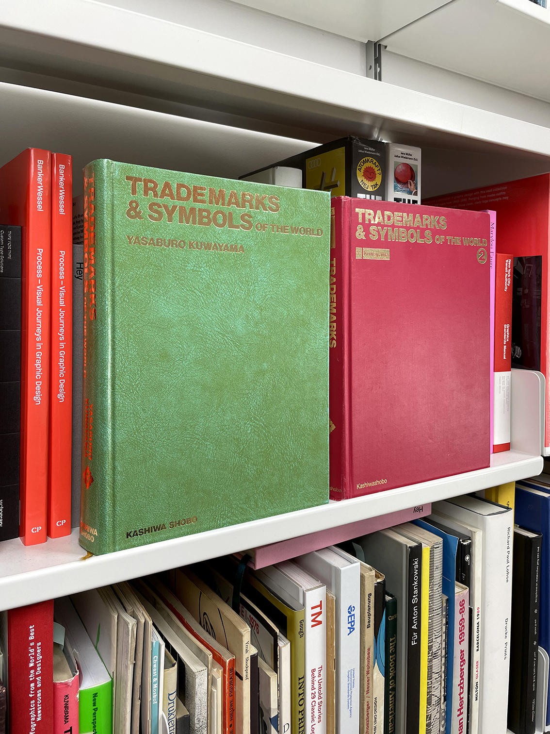
I also have a core collection of design books I’d never part with. I return to them from time to time and they often give inspiration for book covers. The old logo books in particular have been very useful for this. I like our covers to be easily recognisable, work well at a small size – as they are often seen on screen – and immediately give a flavour of what’s inside. Most of the books we’ve designed ourselves have simple geometric 2D covers and much of the inspiration for this has come from vintage logo books. There isn’t anything more simple, direct and recognisable than a logo, so I’ve always looked at those for inspiration when designing book covers. Two of my favourites are ‘Trademarks and Symbols of the World’ volumes 1 and 2. They don’t look like much from the outside but there are so many treasures within their pages.
Counter-Print


