
Postmodernism - Wet Magazine, Vol 4 Issue 2, 1979. Designed by April Greiman
Design Archive FeatureMembers Only ContentMovements 1980s

A New Visual Language: From New Wave to Postmodernism in Graphic Design

A 1,500 essay on the transformative era of graphic design from the 1970s to the 1990s. Moving beyond the constraints of modernism, designers like Wolfgang Weingart and April Greiman redefined visual communication through bold experimentation with type, colour, and early computer graphics. This essay highlights how postmodernism and New Wave design introduced complexity, individuality, and digital innovation in to graphic design.

Share:

Members Only Content. What membership unlocks

This article is one of nearly 200 members’ research pieces, researched and written directly from the physical archive in Bradford.

Join from £2.49/month for full access to this piece, plus every other member article, translated historic texts, and designer profiles researched from the collection.

Become a member from £2.49/month

Already a member? Log in below.

More Graphic Design History

Dick Elffers and his 1972 Holland Festival and Floriade stamp designs

Design Archive Feature, Designer Profiles, Members Only Content, Regional Histories

Dick Elffers and his 1972 Holland Festival and Floriade stamp designs

Dick Elffers, had been the chosen designer for the printed matter of the Holland Festival for much of the festival's years, he used a painterly style for his work with the festival between 1954 and 1965 and later a more abstract style between 1969 and 1972. As well as publicity design, Elffers was commissioned to design the summer stamps to promote the Holland Festival in 1972.

Read Article
House Style – Why it important? by Alec Davis

Corporate Identity & Branding, Design Archive Feature

House Style – Why it important? by Alec Davis

House style can give identity to the diverse products or activities of a firm. It stimulates loyalty, helps to reduce costs, and has advertising value.

Read Article
Herbert Bossin and his Typographic Compositions with Folio

Design Archive Feature, Members Only Content, Typography & Type Design

Herbert Bossin and his Typographic Compositions with Folio

The typographic supplement from Der Druckspiegel, October, 1961 features typographic compositions designed by Herbert Bossin. Bossin has solely used the typeface Folio, to illustrate its flexibility and versatility alongside imagery provided by Lothar Blanvalet Verlag.

Read Article
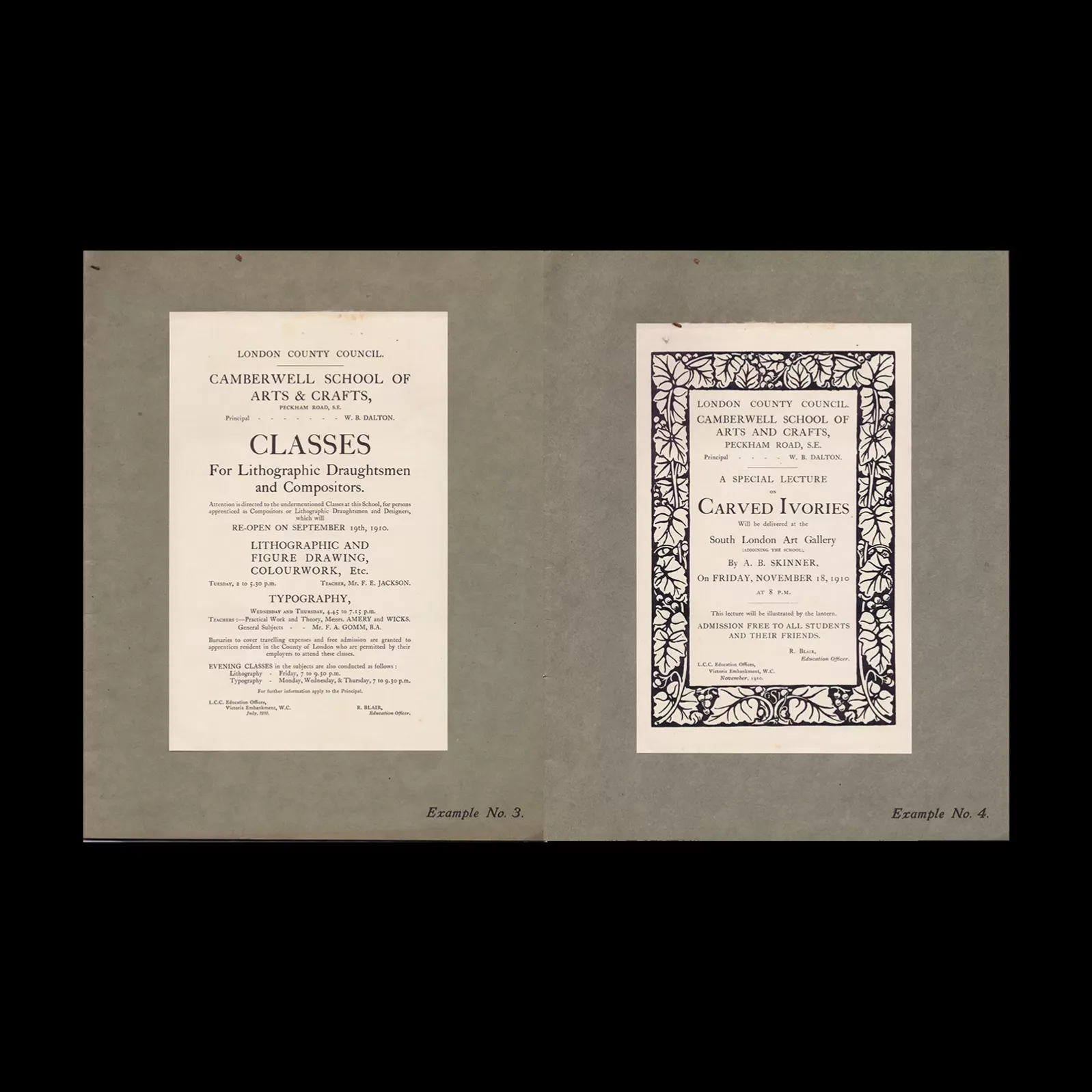
Student Work (1907 – 1910) from The Polytechnic School of Printing, London

Design Archive Feature, Design Education, Ephemera, Regional Histories, Typography & Type Design

Student Work (1907 – 1910) from The Polytechnic School of Printing, London

I came across two sample books containing printed examples of the work executed by the students in the Composing and Machine Departments of the Polytechnic School of Printing, between 1907 and 1910. I couldn't resist adding these to the archive.

Read Article