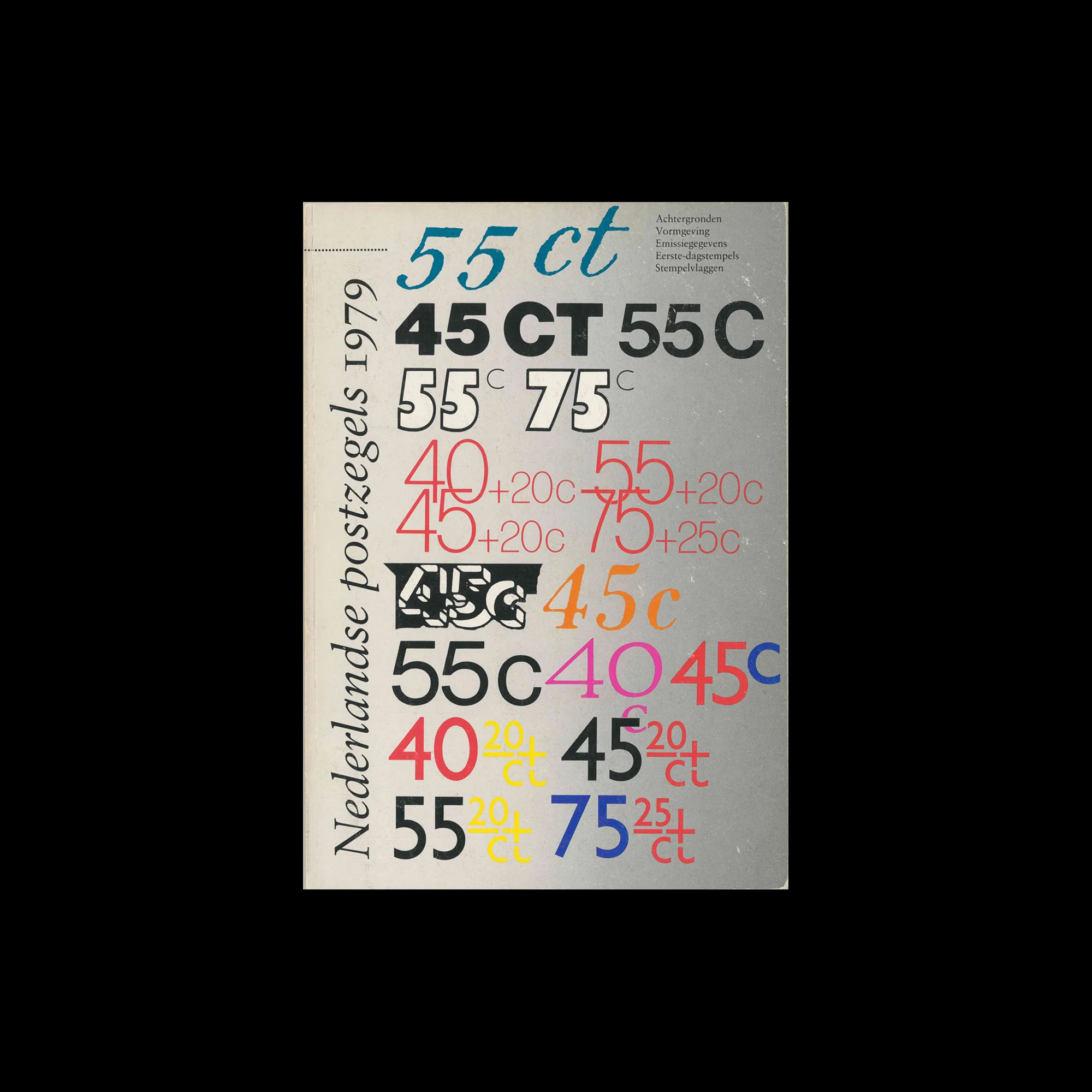
nederlandse postzegels 1979, Staatsbedrij der PTT, 1979

Information

Details

Linked Information

nederlandse postzegels 1979, Staatsbedrij der PTT, 1979
nederlandse postzegels 1979, Staatsbedrij der PTT, 1979. Designed by Walter Nikkels
More graphic design artefacts
From the design archive:
More graphic design history articles

Members Content

The typographic supplement from Der Druckspiegel, October, 1961 features typographic compositions designed by Herbert Bossin. Bossin has solely used the typeface Folio, to illustrate its flexibility and versatility alongside imagery provided by Lothar Blanvalet Verlag.

Members Content

Japanese modern design was heavily influenced by European art movements, particularly modernism and the Bauhaus school. As Japan's advertising industry expanded, it increasingly drew from Western culture, especially television and film, resulting in designs that were eclectic, vibrant, and infused with modernist energy.
Members Content

A total of 24 posters were created for the campaign during 1964, using the arrow symbol as a key features, representing power, motion and speed. The handmade lithographs use up to 19 colours, which were individually printed at large scale. The posters also utilise the brand colours red and yellow from Shells corporate identity.

Members Content

The Bauhaus approach to design emphasised simplicity, functionality, and the integration of modern technologies and materials. A century later, many of the principles taught at the school remain fundamental to contemporary design practices.