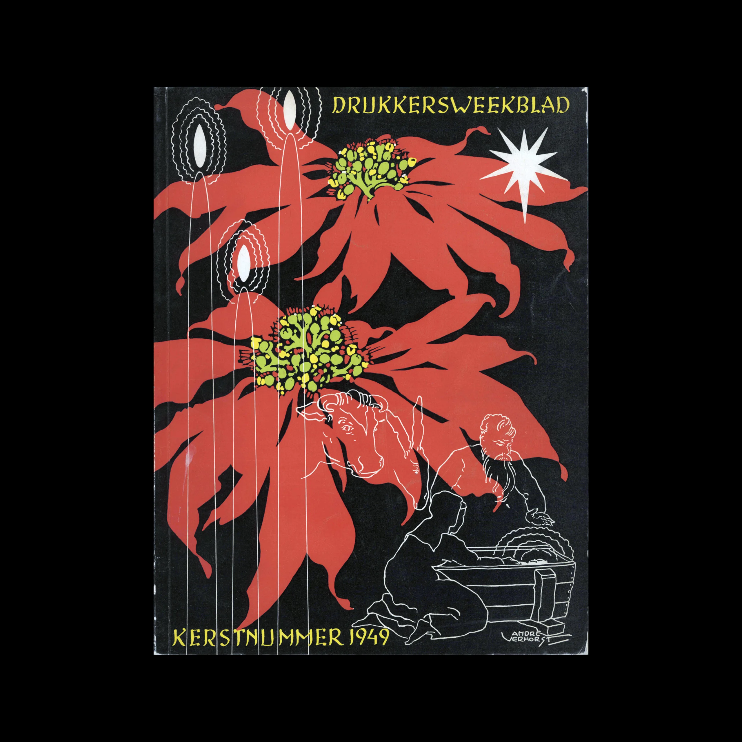
Drukkersweekblad en Autolijn Kerstnummer 1949, 1949

Information

Details

Linked Information

Drukkersweekblad en Autolijn Kerstnummer 1949, 1949. Cover design by G.W. et al Verhorst
More graphic design artefacts
From the design archive:
More graphic design history articles

Members Content

Collected Japanese ephemera From the late 1920s to the mid-1930s, from Japan's transformative period, with its robust industrial force accompanied by an increase in consumer culture.

Members Content

A total of 24 posters were created for the campaign during 1964, using the arrow symbol as a key features, representing power, motion and speed. The handmade lithographs use up to 19 colours, which were individually printed at large scale. The posters also utilise the brand colours red and yellow from Shells corporate identity.
Members Content

The 1960 awards presented 420 poster entries from Swiss designers. Notable winners included Robert Büchler's typographic poster for the Museum of Applied Arts Basel and J. Müller-Brockmann’s Der Film poster for the Museum of Applied Arts and Gerstner + Kutter's asymmetric typographic poster for National-Zeitung SA Basel.

Members Content

The collection of works I've gathered, designed for Olympia-Werke, showcases the height of mid-century German commercial artistry. The work was collated in a branded folder and contained forty brochures, advertisements and manuals.