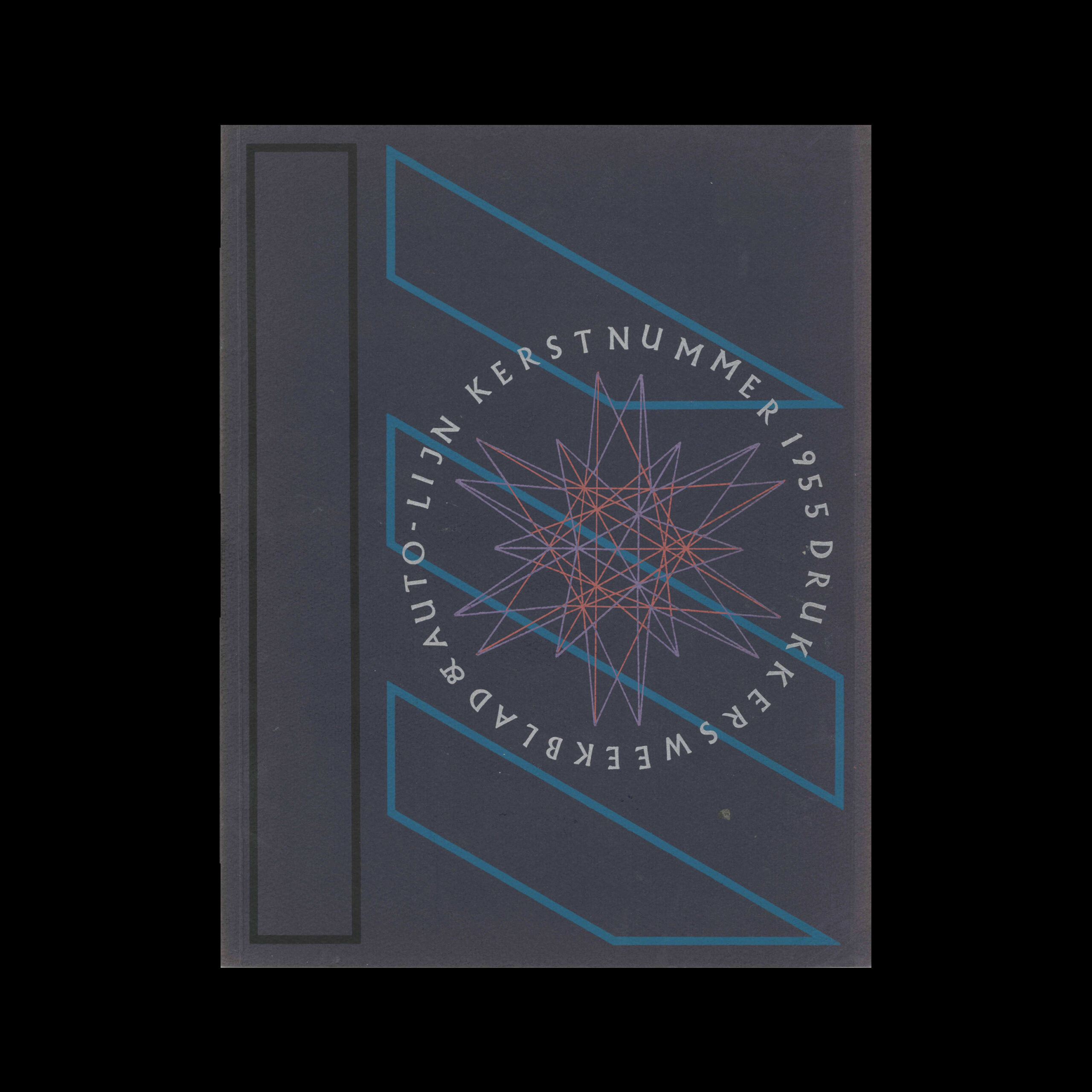
Drukkersweekblad en Autolijn Kerstnummer 1955, 1955

Information

Details

Linked Information

Drukkersweekblad en Autolijn Kerstnummer 1955, 1955
More graphic design artefacts
From the design archive:
More graphic design history articles

Members Content

The typographic designs produced for the National Theatre by Ken Briggs are not only iconic and depict the Swiss typographic style of the time, but remain a key example of the creation of a cohesive brand style.
In minor printed matter we constantly meet the new typography, but it is relatively rare to find posters designed on the new lines. And yet poster-designing is a field where new typographical methods might be employed with great effect.
I have been reproached for this, and I will surely be reproached again. I have also been reproached for reading more and more obscure works whose readership must be limited to a handful of specialists and a few hobbyists like myself. It’s a heavy passion or a passion that sucks.

Members Content

Omnibus was Published by the journalism working group of the Technical University of Braunschweig. A square publication measuring 290mm. The publication included features on politics, arts and culture. With advertisements carefully selected to be in keeping with the visual aesthetic. Content also included exhibition information and a fine example of concrete poetry, among artists such as Schröder-Sonnenstern and Sine Hansen.