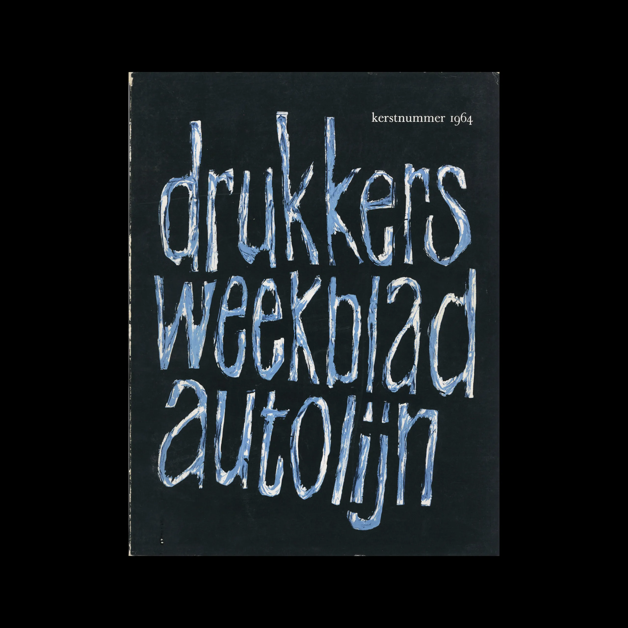
Drukkersweekblad en Autolijn Kerstnummer 1964, 1964

Information

Details

Linked Information

Drukkersweekblad en Autolijn Kerstnummer 1964, 1964.  Cover design by Pieter Brattinga
Drukkersweekblad en Autolijn Kerstnummer 1964, 1964. Cover design by Pieter Brattinga
More graphic design artefacts
From the design archive:
More graphic design history articles

Members Content

The 1960s was an era characterised by political, social, and cultural shifts. The counterculture movement emerged as a response to the perceived failures of the mainstream establishment, sparking a wave of activism and alternative ideologies. And with these an array of printed matter. Counterculture publications, often referred to as the "underground press," became powerful platforms for dissent, expression, and the exploration of new ideas.

Members Content

The identity manual consisted of 130 pages of information and brand usage with Arie J. Geurts heading up the project as design director, (who later headed up his own design studio in Los Angeles). The identity uses minimal colour and focuses on a consistent brand blue in all communications.
Support American Bauhaus on Kickstarter to pre-finance the project and its production: www.kickstarter.com/projects/908813786/american-bauhaus

Members Content

His distinctive style echoes the artistic expressions of fellow Italian designers Giovanni Pintori and Erberto Carboni. Tovaglia's mastery in taking concepts and translating them into visually compelling narratives is evident in this selection of advertisements I have scanned from Gebrauchsgraphik, 10, 1955.