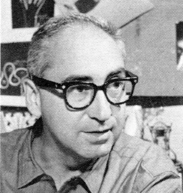
Saul Bass

Idea 219, 1990-3

Information

Cover Design: Saul Bass

Content includes:
The World Masters: 1 Saul Bass
K. Domenic Geissb殄ler
A Series of Teacher and His Students Vol. 4: Prof. Gert Wunderlich and His Students Prof. Gert Wunderlich
Poster Designer of Portugal Joao Machado
Andre Thijssen
Graphic Art Exhibition of Susumu Endo Shinichi Segi
‘The Best’ New Zealand Graphic Design Awards 1989
Lewis Moberly Takeo Yao
Richard Kehl Rebecca Segerstrom-Sato
The Trick Shigeo Fukuda
Nicolaus Ott + Bernard Stein Shigeru Watano, Tachiyo Matsuzaki
The 2nd Katsumi-Masaru-Award Winner Takenobu Igarashi
Woods + Woods, fresh-but never trendy
Ishikawa Design Recommendation Project Haruaki Matsuyama
Sergio Liuzzi Guimaraes & Rogerio Martins
David Anson Russo’s Illustrated Letters Rebecca Segerstrom-Sato
Joe Ciardiello
’89 The Art Directors Club Hall of Fame Shinichiro Tora
Kumamoto Design Award Takeo Yao
Series 17-1: Art in New York Today / Jonathan Lasker Shoichiro Higuchi

Details

Saul Bass studied at the Art Students League with Howard Trafton and at Brooklyn College under Gyorgy Kepes. After freelancing as a designer and art director in New York, he moved to the West Coast in 1946 to oversee art activities for Buchanan & Co. In 1950, he joined Foote, Cone & Belding in Los Angeles, and by 1952, he had established his own studio. As a designer and consultant, Bass took on a wide range of projects for both industries and advertising agencies.

Linked Information

Idea 219, 1990-3. Cover design by Saul Bass
Saul Bass studied at the Art Students League with Howard Trafton and at Brooklyn College under Gyorgy Kepes. After freelancing as a designer and art director in New York, he moved to the West Coast in 1946 to oversee art activities for Buchanan & Co. In 1950, he joined Foote, Cone & Belding in Los Angeles, and by 1952, he had established his own studio. As a designer and consultant, Bass took on a wide range of projects for both industries and advertising agencies.
More graphic design artefacts
From the design archive:
More graphic design history articles
When Fritz Gottschalk and Stuart Ash joined forces in Montreal, it was a partnership ideally suited to the city's hybrid environment. Gottschalk's training in graphic design in Switzerland, Paris and London was rigid, his background European; Ash, Canadian born and educated, was trained in the North American fashion, though he was influenced by his work with European designers

Members Content

Bäumer gave the company a unique brand image amplifying its graphical image after a time of post-war economic recovery. This style of advertising composition can be seen across many 1960s campaigns, especially from other German designers such as Anton Stankowski.

Members Content

A total of 24 posters were created for the campaign during 1964, using the arrow symbol as a key features, representing power, motion and speed. The handmade lithographs use up to 19 colours, which were individually printed at large scale. The posters also utilise the brand colours red and yellow from Shells corporate identity.

Members Content

The identity manual consisted of 130 pages of information and brand usage with Arie J. Geurts heading up the project as design director, (who later headed up his own design studio in Los Angeles). The identity uses minimal colour and focuses on a consistent brand blue in all communications.