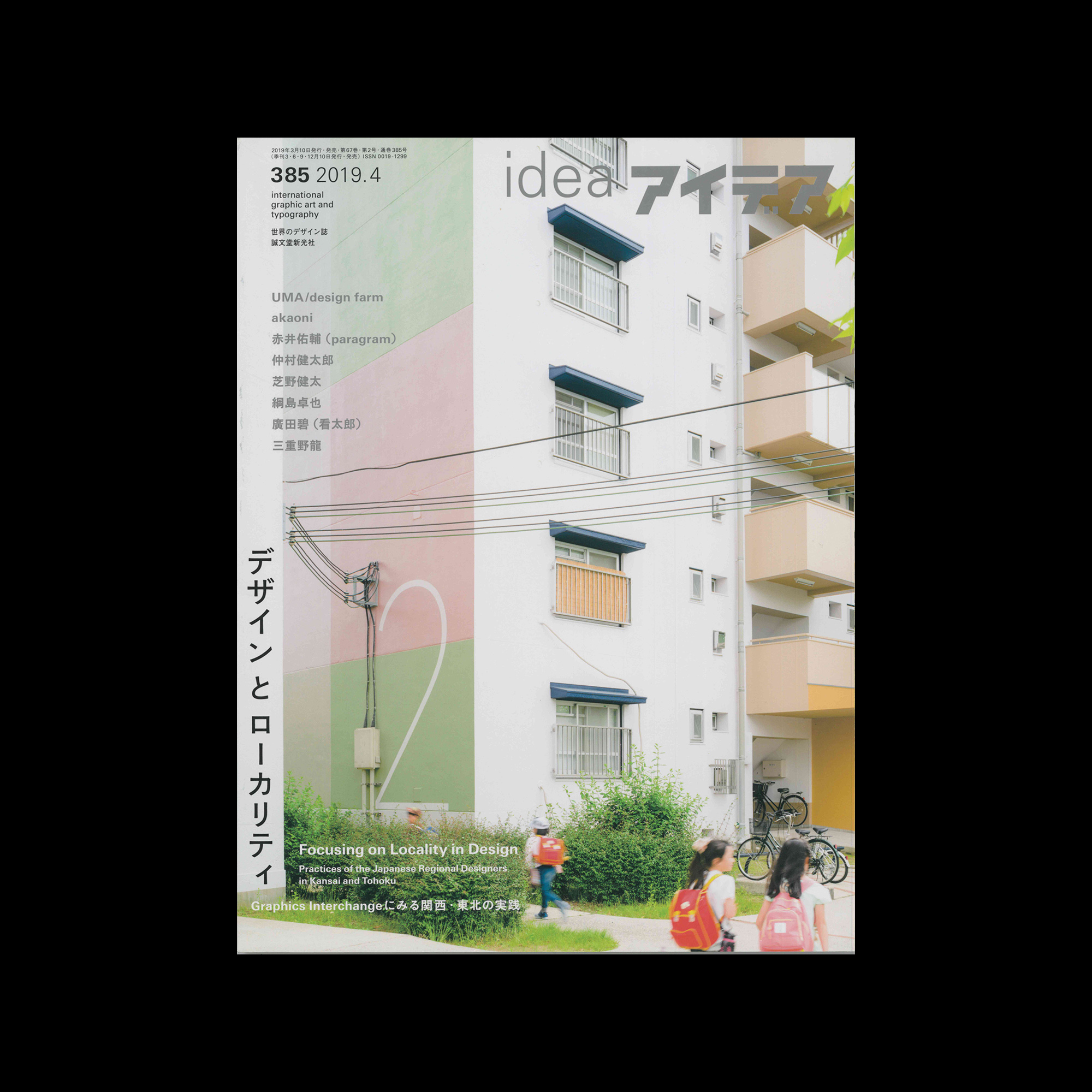
Idea 385, 2019-4

Information

Focusing on Locality in Design
Practices of the Japanese Regional Designers in Kansai and Tohoku

Details

Linked Information

Idea 385, 2019-4
Idea 385, 2019-4
More graphic design artefacts
From the design archive:
More graphic design history articles

Members Content

The best poster designs from Die besten Plakate des Jahres 1956 with a translated foreword by Jakob Rudolf Welti. Featuring the work of Herbert Leupin, Carl B. Graf, Carlo Vivarelli and Emil Ruder.
Theo Häussler's commercial art is distinguished by its clear and disciplined form and its distinct advertising message.

Members Content

The 1960s was an era characterised by political, social, and cultural shifts. The counterculture movement emerged as a response to the perceived failures of the mainstream establishment, sparking a wave of activism and alternative ideologies. And with these an array of printed matter. Counterculture publications, often referred to as the "underground press," became powerful platforms for dissent, expression, and the exploration of new ideas.
Members Content

The typographic designs produced for the National Theatre by Ken Briggs are not only iconic and depict the Swiss typographic style of the time, but remain a key example of the creation of a cohesive brand style.