


by Jerry Jankowski (Author), Grant Kessler (Photographer)
‘The War is over, the economy’s booming, and the supermarket shelves are groaning under the weight of thousands of items. New products and packaging—aerosol sprays, TV dinners, canned beer, and molded plastics—abound, and the package designer’s task has never been more challenging, or more fun. Designers and pop culture buffs alike will revel in this outstanding portfolio of package design from the mid-1940s to mid-1960s, a veritable social history of postwar consumer culture. In more than 150 color photos, author Jerry Jankowski presents favorite pieces of the period — a surrealist perfume bottle by Salvador Dali, a Bing Crosby ice cream carton, “Astronaut: The New Game of Outer Space” (for boys), “Let’s Do Dishes” (for girls) — chosen for their strong graphics, classic motifs, social commentary, or quirky humor. Readers will recognize familiar classics like the boldly designed package for Brillo soap pads and an early incarnation of the Frisbee. All are cultural time capsules from a rich era of design, reflecting an image of a nation caught somewhere between the Old West and the Space Age.’


Advertising Design, Design Archive Feature
The transformation of Radio Free Berlin's publicity from dark and provincial to striking and imaginative. Cultural announcements and radio programs designed by Hans Förtsch, Sigrid von Baumgarten, and Reinhart Braun
Read Article
Design Archive Feature, Members Only Content, Poster Design, Regional Histories
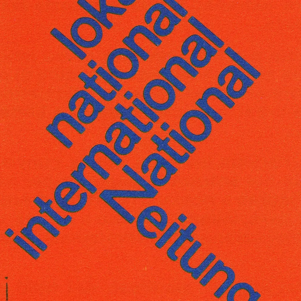
The 1960 awards presented 420 poster entries from Swiss designers. Notable winners included Robert Büchler's typographic poster for the Museum of Applied Arts Basel and J. Müller-Brockmann’s Der Film poster for the Museum of Applied Arts and Gerstner + Kutter's asymmetric typographic poster for National-Zeitung SA Basel.
Read Article
Design Archive Feature, Ephemera, Members Only Content, Regional Histories
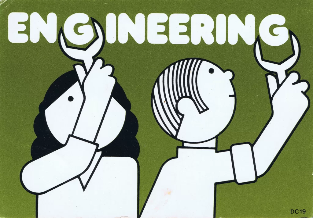
The designer is unstated on these postcards, which were designed during the mid to late 1970s, but these playful illustrations alongside what looks to be Frankfurter Bold definitely fit the criteria of friendliness and efficiency
Read Article