

The First Six Books of The Elements of Euclid, Taschen, 2010

‘Red, yellow, blue – and of course black – are the colours that Oliver Byrne employs for the figures and diagrams in his most unusual 1847 edition of Euclid, published by William Pickering and printed by Chiswick Press, and which prompt the surprised reader to think of Mondrian. The author makes it clear in his subtitle that this is a didactic measure intended to distinguish his edition from all others: “The Elements of Euclid in which coloured diagrams and symbols are used instead of letters for the greater ease of learners.” Byrne is not content to trust solely in the supposed intuitive “logical” structure of Euclid’s axioms and theorems – who doesn’t know the first famous sentences of Euclid’s Elements: “I. A point is that which has no parts. II. A line is length without breadth”? -, but translates them into colourful diagrams and symbols. He thereby thinks in terms of the school classroom: he compares his colours to the dyed chalks in which figures are drawn on the blackboard.’

Details

  • Format Book
  • Year 2010
  • Client/Publisher Taschen
  • Size 218mm x 255mm

Linked Information

The First Six Books of The Elements of Euclid, Taschen, 2010
More graphic design artefacts
More graphic design history articles
Pino Tovaglia’s Advertisements for Finmeccanica

Advertising Design, Design Archive Feature, Members Only Content, Regional Histories

Pino Tovaglia’s Advertisements for Finmeccanica

His distinctive style echoes the artistic expressions of fellow Italian designers Giovanni Pintori and Erberto Carboni. Tovaglia's mastery in taking concepts and translating them into visually compelling narratives is evident in this selection of advertisements I have scanned from Gebrauchsgraphik, 10, 1955 and Graphik – Werbung + Formgebung, 07, 1955.

Read Article
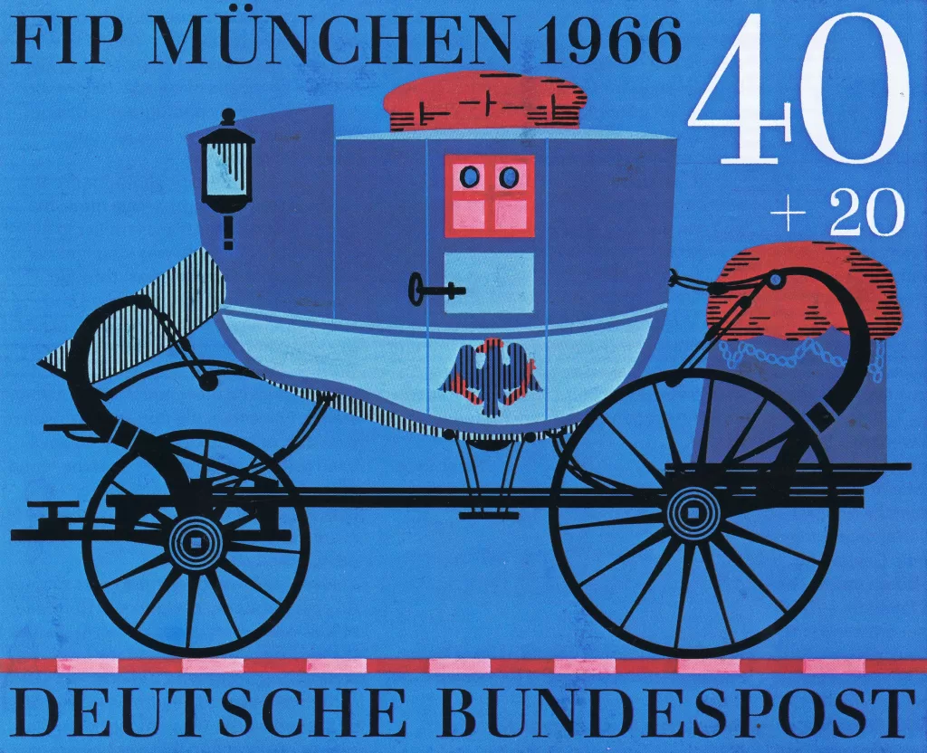
Karl Oskar Blase and his Stamp Designs for Deutsche Bundespost

Design Archive Feature, Designer Profiles, Ephemera, Members Only Content

Karl Oskar Blase and his Stamp Designs for Deutsche Bundespost

He designed stamps from around 1955 and in the book Karl Oskar Blase, Briefmarken-Design, Verlag für Philatelistische Literatur, 1981, he was described as one of the most influential stamp designers in Germany.

Read Article
The first comprehensive survey of Fred Troller!

Book Reviews & Press Releases

The first comprehensive survey of Fred Troller!

Unit Editions launches Fred Troller Design on Volume – the first comprehensive survey of the work of a pioneering designer who brought Swiss modernism to America in the 1960s, via influential projects for clients including IBM, American Airlines and Geigy.

Read Article