I orginally wrote this essay fior idea No. 401 Wayfinding for City Spaces: Bridging navigation and signage with design Published: 2023/3/10
I am a design eccentric and I am fascinated by visual culture. In particular, the history of graphic design in print. Print in all its aspects, from technique to output, from small illustrated postal stamps to large format typographic prints. From large sans serif lettering spanning across billboards to small decorative hand-drawn logos on drinks labels from the twenties, graphic design dominates our lives. Design can bring beauty, organisation and a sense of calmness, it can bring destruction, hatred and spread propaganda. Supermarkets are the design museums of the present and the museums are the documentation of the past.
Graphic design continues to be documented and an increase in individualised documentation and curated social media accounts are furthering our knowledge of design from a worldwide historic standpoint. I would not feel complete without the collected design that spans the shelves of my archive. It’s my identity, my passion and my hobby.
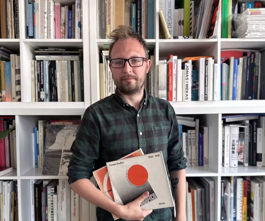
I have formally collected design ephemera for over a decade. What started as a hobby and a need to gather research materials for visual nourishment and my studio design practice, matured into the creation of a documented framework that preserves graphic design history. Currently, my collection contains over 5,000 pieces of printed material from rare design periodicals and common theatre brochures to mid-century folded maps and German film posters. The collection is housed at my place of work, (Out of Place Studio at Assembly Bradford, UK), and has been expanding year after year, fueled by a combination of personal interests and design exploration.

This is the first of a series of articles published in Idea Magazine based on my archive and history of graphic design, this article introduces some of the prominent designers whose I have archived and collected magazines and information about other inspirational design archives
Design Reviewed is the identity I gave my archive a few years ago. It was a play on words for re-viewing fragments of visual culture from the past whilst reviewing them as a critic of design. Formalising the archive with its own name, provided a named output for my independent research and artefacts, separate from my design practice and established the archive’s focal point to be less focused on myself, thus furthermore having a heightened particularism to the individual designers and collected artefacts. As all printed matter is designed, albeit not always well, a certain level of curation is required when hunting for new additions. Both space and financial aspects limit the vast expansion of visual material, which is why I am currently focused on collecting early to mid-century design periodicals with the occasional book and piece of ephemera to accompany them.

Currently, the majority of my archive represents designers from Britain, Germany, the Netherlands and Japan. 5,000 artefacts sound like an excessive number, though the bulk of the archive is collected periodicals. Shelves of magazines such as Graphis, Gebrauchsgraphik and IDEA, chronologically placed on display with back issues spanning several decades, documenting graphic design history from around the world. Periodicals themselves have always been a major source of design inspiration, and I frequently revisit the historic information to find references and visual stimuli. I hope to complete many full runs over the next few years too. These printed tombs of historical information represent a set month, season or year of design, not only by the written content but by the selected advertisers, materials and cover designs. The editors worked tirelessly for decades providing a significant contribution to the field, Walter Herdeg, who was the founder of Graphis magazine in 1944, often made little money, and occasional losses on the publication, but contributed massively to the design profession, introducing unknown design/ers to readers, whilst showcasing the best of graphic design in the era.
Some of the rarer collected periodicals I have acquired over the last decade include a vast run of early issues of IDEA magazine. I currently have over 250 issues and hope to continue to grow the back catalogue until one day, a complete run will sit on the shelves in chronological order. Many of the greatest designers have been featured on the covers and pages of the magazine and the array of graphic design content provides the reader with a holistic view of graphic design across continents, styles and output. I first found the IDEA whilst visiting Amsterdam, a small shop selling books and several issues of the magazine, one of the issues were number 319. I have always found collages inspirational and experimented a lot with the medium at university. This was a perfect issue to get me hooked on the magazine. I later found a collection of almost a hundred issues on an online auction, lots of which were damaged or full of notes. I have been replacing the damaged issues over the last few years with issues of better condition, whilst expanding the back catalogue by ordering issues from bookstores in Japan.

Another favourite collected set of periodicals includes a full run of Typographic New Series, edited and designed by Herbert Spencer and published by Lund Humphries. Typographica remains one of the most collectable design periodicals, and each issue had a print run of 3,000 issues. The British publication featured designers such as Franco Grignani, Paul Schuitema, Chermayeff and Geismar and Alexander Rodchenko. A modernist publication exploring both Avant Garde and mid-century design, a total of sixteen issues were published in the new series from 1960 – 1967.
Gebrauchsgraphik is another journal which I have collected over the last few years. The magazine was originally released in 1924 – 1944 and had a reincarnation from 1950 – 1996. Edited by H.K. Frenzal and published monthly, there were a few hundred issues printed. The pot-war reincarnation of Gebrauchsgraphik echoes quite closely the Western content featured in Graphis magazine. These issues were edited by Eberhard Hölscher and designs from Switzerland and Germany featured heavily, whilst showcasing the post-war American advertising and British publicity. View a snapshot of issues from each decade, showcases and documents an array of styles evident of the time, comparisons of the design show the impact of the International Typographic Style, the shift in advertising illustration and the advancement and usage of photography in design.
Although there’s a certain level of dopamine hit I gain when sourcing and acquiring rarer volumes, for me, it is of higher importance to share and document unseen work, both online and in the archive, by designers who may not have been documented or accurately referenced online. The unsung heroes of the past. Where time permits, I scan and share a selection of pages/images from publications which may not have been featured online and provide additional details for those seeking to further their research, whilst referencing the source of the individual images and designers featured.
Notable designers, in which the archive has a breadth of design work include Ken Garland, Oldřich Hlavsa, Wim Crouwel, Jurriaan Schrofer and Karl Oskar Blase. All of these designers were pioneers of the field and embraced sans serif typefaces, the Neue Typographie and had a clear hierarchical structure in their work, whilst having a distinct design style which is both evident and mastered in their design output.

I admire the individuals and organisations who utilise digital technology to document and curate visual matter. They provide a preservation framework for the history of graphic design. Some of my favoured examples of this documentation include the vast expanding collection featured in Letterform Archive’s online archive, the Hans Hillman digital archive – an accessible collection of his work conceived and implemented by Katharina Sussek and Jens Müller of Studio Vista, the Alliance Graphique Internationale online collection and most recently, the Peoples Graphic Design Archive, a crowd-sourced, inclusive online archive.
My ongoing vision for my collection is to create a fully-accessible, unique design archive that offers an eclectic insight into graphic design’s history, both online and in-person. And in particular, an archive with a full spectrum from the last century, showcasing the advancement of technology, shifts in style and representation of demographics. With the goal of becoming self-sufficient by publishing my periodicals and writing through the utilisation of the artefacts. Whilst collecting design ephemera, I continue to document graphic design history by adding scanned covers and details into an online database, to grow an accessible platform, allowing people from all over the world to digitally view fragments from the archive. I hope by sharing fragments of design history, I can inspire people to collect, design and be inspired by the beauty of the printed page.
A decline in funding for public libraries and the increases in degree tuition at universities in England make education less accessible. This has made the online resource even more imperative in furthering people’s understanding of graphic design history, whilst providing much-needed inspiration from a historic standpoint. Furthermore, by curating collections of artefacts paired with small essays, we can understand the design process, trends and styles that have made the standpoint on art and design history. Without the preservation undertaken by designers, historians and collectors many of these pieces of history would be lost. The People’s Graphic Design Archive is paramount in this, their online archive ‘recognizes and preserves graphic design’s and culture’s expansive and inclusive history.’
By collecting and curating visual material I often find gaps in my archive where information and documentation currently aren’t well-documented in design history books. I revisit older printed publications and find more relations to a designer’s portfolio, such as frequently used colours, typefaces and sizes. Long-term, I use this method as a way of starting design discourse, gathering materials, photographing, and having enough materials around me to inspire a piece of writing as well as influence creativity.

As well as using and documenting the archive on a personal level, it is utilised for teaching and workshops. Various studios, universities and individuals have been inspired by the collection, and by viewing and researching design artefacts, they can further their understanding of design theory, practice and historical context.
I find viewing the archive helps me to relax whilst being productive, almost a positive procrastination in between intense days of design and being a parent. When I feel a little stressed it gives me a good reminder of why I love graphic design and the collection helps me to find focus in my design work. I am sure most people collect something, from Pokemon cards to sneakers or diecast models, and the more we collect, the more we learn and the more we learn the more we can inspire others.


