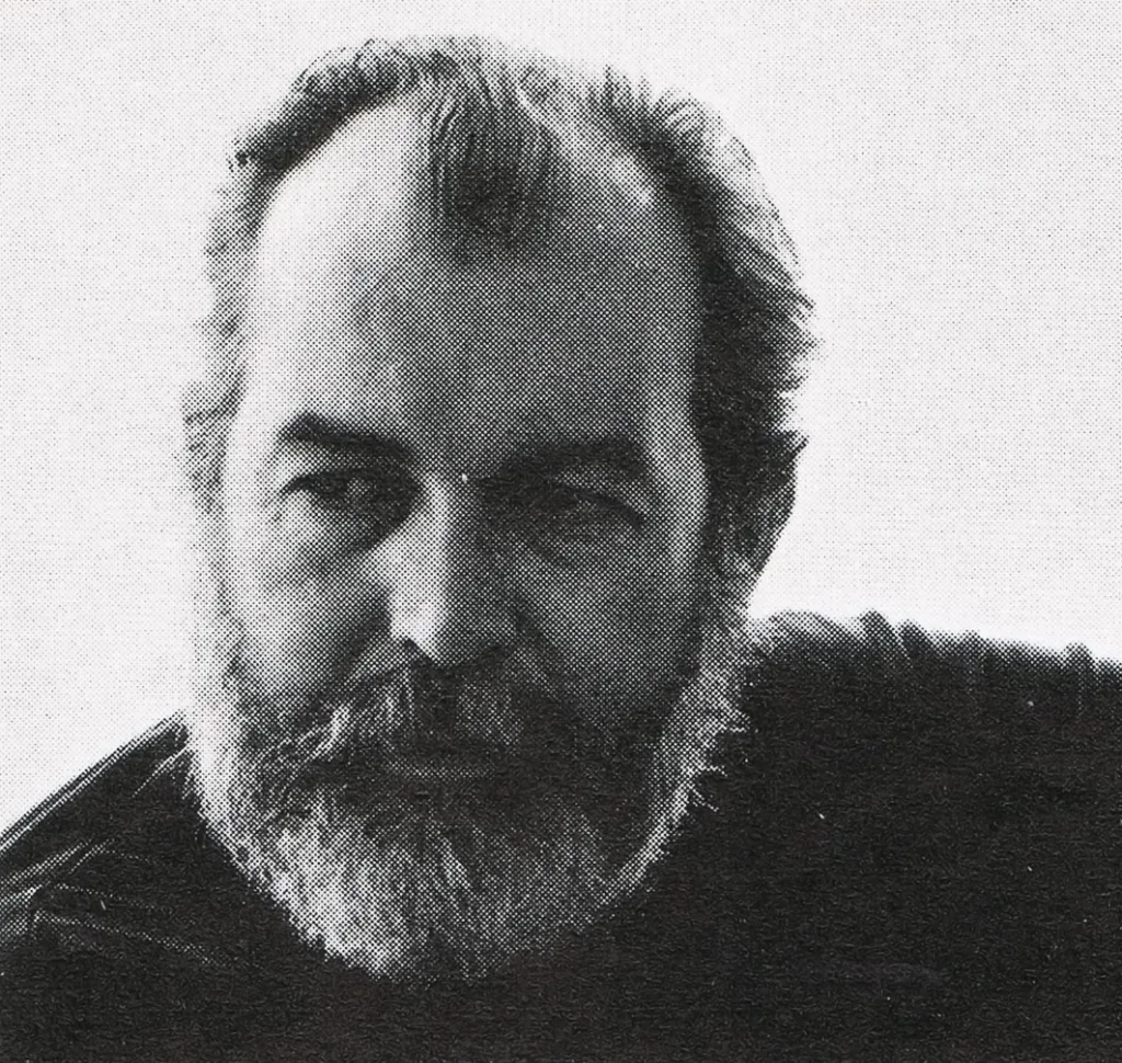
Rudolph de Harak

Designer: Rudolph de Harak

Rudolph de Harak ran his own design studio in New York, where he worked across design disciplines including the design of  trademarks, posters, brochures, book, magazine and record covers, wall graphics, institutional advertising, industrial design, furniture and street decorations, sculptures, exhibitions; environmental graphics and signs.  He taught at many American institutes and also created the United States pavilion for Expo 70 in Osaka; the series «Man, his planet, his space» (Canada at Expo 67) and the entire decoration of the ground floor of an office skyscraper in New York (127, John Street), including the facade writings, external decorations, benches and steel sculptures.

Articles Featuring the Work of Rudolph de Harak

Members Content

Rudolph de Harak designed over 50 record covers for Westminster Records as well as designing covers for Columbia, Oxford and Circle record labels. His bright, geometric graphics can easily be distinguished and recognised.

Artefacts Featuring the Work of Rudolph de Harak

From the design archive:

More from Design Reviewed

Members Content

A 1,500 essay on the transformative era of graphic design from the 1970s to the 1990s. Moving beyond the constraints of modernism, designers like Wolfgang Weingart and April Greiman redefined visual communication through bold experimentation with type, colour, and early computer graphics. This essay highlights how postmodernism and New Wave design introduced complexity, individuality, and digital innovation in to graphic design.

Members Content

Yoshio Hayakawa is one of Japan’s most influential post-war poster designers. His work represents a fusion of traditional Japanese art and European modernism often using soft, poetic brushstrokes and refined colour palettes and capturing the elegance of Japanese aesthetics while integrating the clean lines and bold visual language of Western design.

Members Content

The Bauhaus approach to design emphasised simplicity, functionality, and the integration of modern technologies and materials. A century later, many of the principles taught at the school remain fundamental to contemporary design practices.