First of all, could you tell me a bit about yourself, have you always been a designer, what’s your journey in the field?
Talking about myself as a designer is something that requires a powerful dialogue with my life experiences. In a radical way, I apply an exercise in which design forms become projections of life, extensions of meaning that constantly involve senses.
Let’s think about the impact of our mind on reading the word “system”. Many of us would feel discomfort, others would go straight to the point and easily translate the rule into something concrete. My approach instead would be transversal, occasionally disoriented and uncontainable. How can a rigid system become the attitude of an individual? How can a system become freedom? It is all about turning a method into a point of view, generating life from design pieces.
At the age of eight, I discovered the world of music. The black and white on the piano brought lightness to my soul; but the theoretical exercise and the harmonic notions made it incredibly boring. I loved that system, but it didn’t belong to me.
At the age of eighteen, I discovered the world of graphic design. The black and white on the grid gave me the same sense of lightness; but this time the theoretical exercise and harmonic notions made it all enchanting. It was the discovery of the “other” dimension of the movable type mixed with the black and white on Josef Müller-Brockmann’s works that captured me. It was the beginning of a journey made of meaning and salvation.
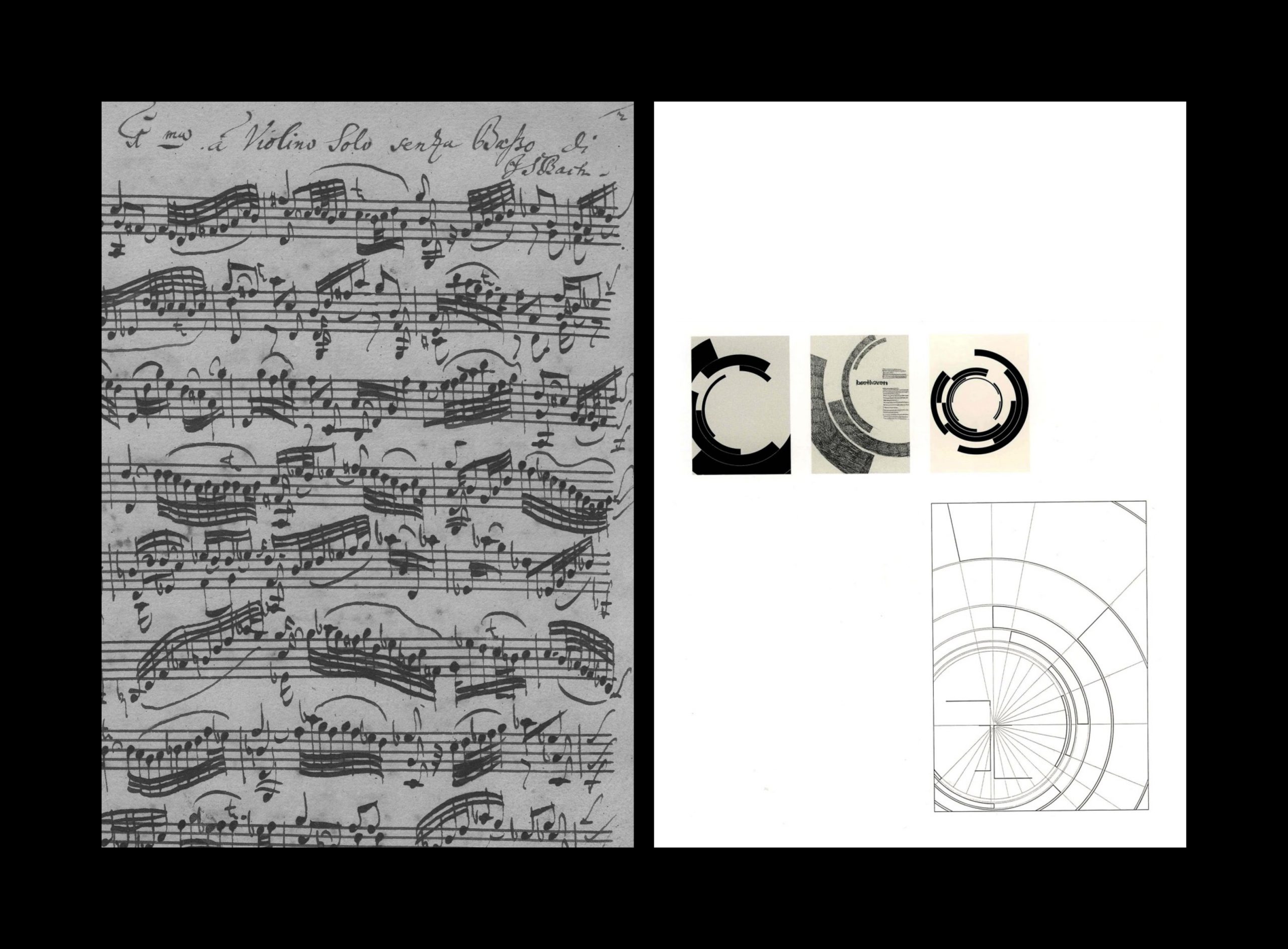
On the right: Josef Müller-Brockmann, Beethoven Poster, 1955.
Driven by an uncontrollable feeling, during my bachelor in Sicily I used to travel a lot trying to deepen this dimension. I once took a plane to Berlin for a single day in order to walk in the footsteps of Kandinsky, Klee and Schlemmer. In front of the door of the last Bauhaus (1933), I could almost hear the sound of the performances and the lowercases of Bayer’s alphabet coming to life, although they never wanted to scream.
When I returned home, my eyes became a powerful tool to translate those feelings into shapes. Thanks to Albe Steiner, I learned the “grammar of seeing”: it’s not about having a specific field of investigation, but moving in a fluid way through the same field. A sense of universality that makes his way thanks to the awareness of the discipline, which does not forget, does not exclude but accompanies with grace and dedication.
In Milan, during my Master’s studies, I bought a piano; what I missed was not the music but the generative essence of harmony. Living design in the era of uncertainty meant looking for a solid ground to me: not only having a look at modern times, but also highlighting the infinite consistency of humans across the ages.
Between the pages of that poetic declaration, greys and semitones started to replace the simplicity of the black and white; the investigation shifted to the creation of logotypes, books and platforms that reflected the complexity of design in its tangible and intangible dimensions.
Today I am on my way to a new awareness: the acceptance of a new “me” made up of pure forms and concreteness. After three years I returned to Berlin and, sitting in the office, I can finally see the colours, both in design and life. Pentagram is giving me this new perspective.
In the meantime, I truly believe in the power of research, such as the one I carry out with LogoArchive and by myself. When everything is aligned, life itself becomes meaningful, and the journey takes shape in relation to a greater system.
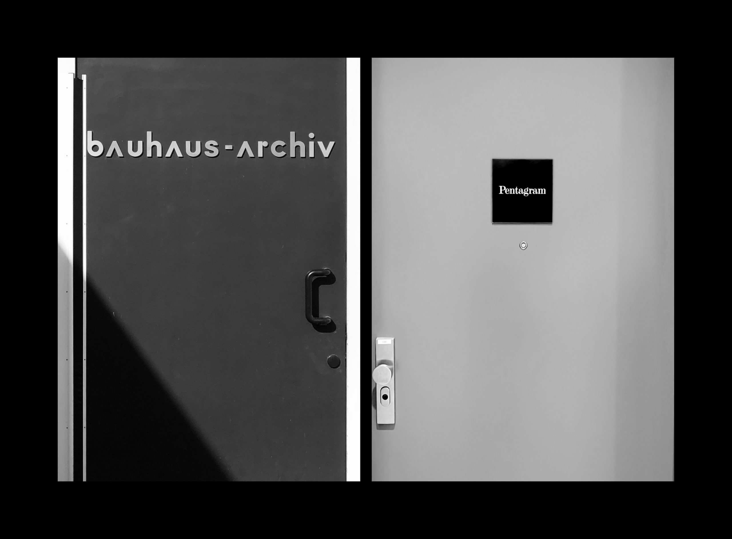
On the right: Pentagram Design Office (Berlin), 2022.
Who is your biggest historical influence in design?
Again, to retrace the steps of a figure who has accompanied me during my years of designing, I will have to use, literally, my own steps.
Believing in a methodology in the process of designing has led me to project the same sense of discipline into my everyday life: wake up early, go for a long run and rush to work. The dialogue between freedom and system is back, and this time it is defined by the principles of pictograms.
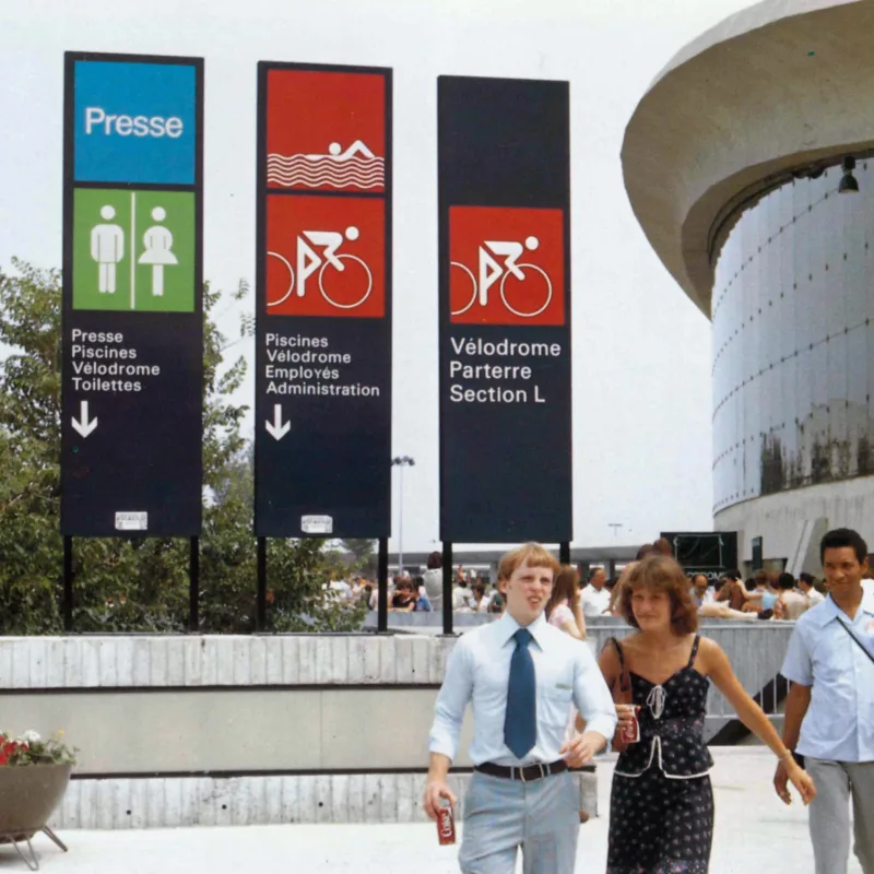
I want to take you back to 1972, when, under the name of Otl Aicher (1922-1991), the corporate design of the Munich Olympics was able to mark a real political statement: not using words and actions, but creating a visual grammar made of grids, typefaces and bright institutional colours.
In order to mark the end of the German’s ethnic and racial traits, Aicher and his team replaced the violence of the red and gold with a rainbow palette and the figurative representations with a well-defined set of pictograms.
Those choices have a specific root in the Hochschule für Gestaltung Ulm’s model, and in particular, in Thomas Maldonado’s experimental approach, who through his formal research showed an interest in systemic complexity: flat planes of muted colours in irregular but precisely defined forms, organised asymmetrically on a diagonal axis to create an overall dynamic tension.
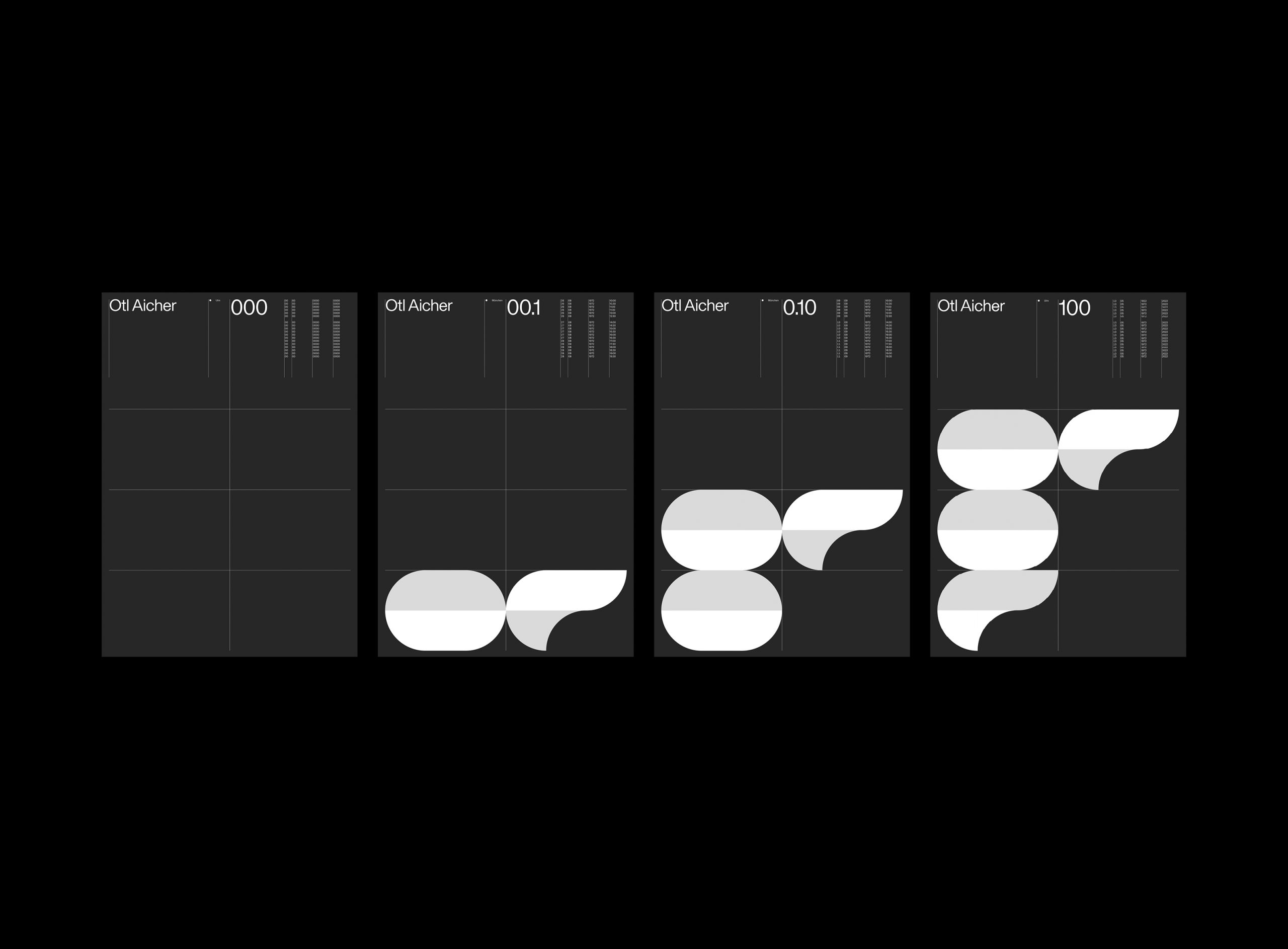
A design work becomes a modern image of the world, but also a portrait of my own life. Like one of the pictograms used to show the sports disciplines, in fact, I have always imagined my body and mind inside a cage: an isometric grid that organises notions and actions in rigid modules, but, at the same time, that does not lose the power and the energy provided by its diagonals.
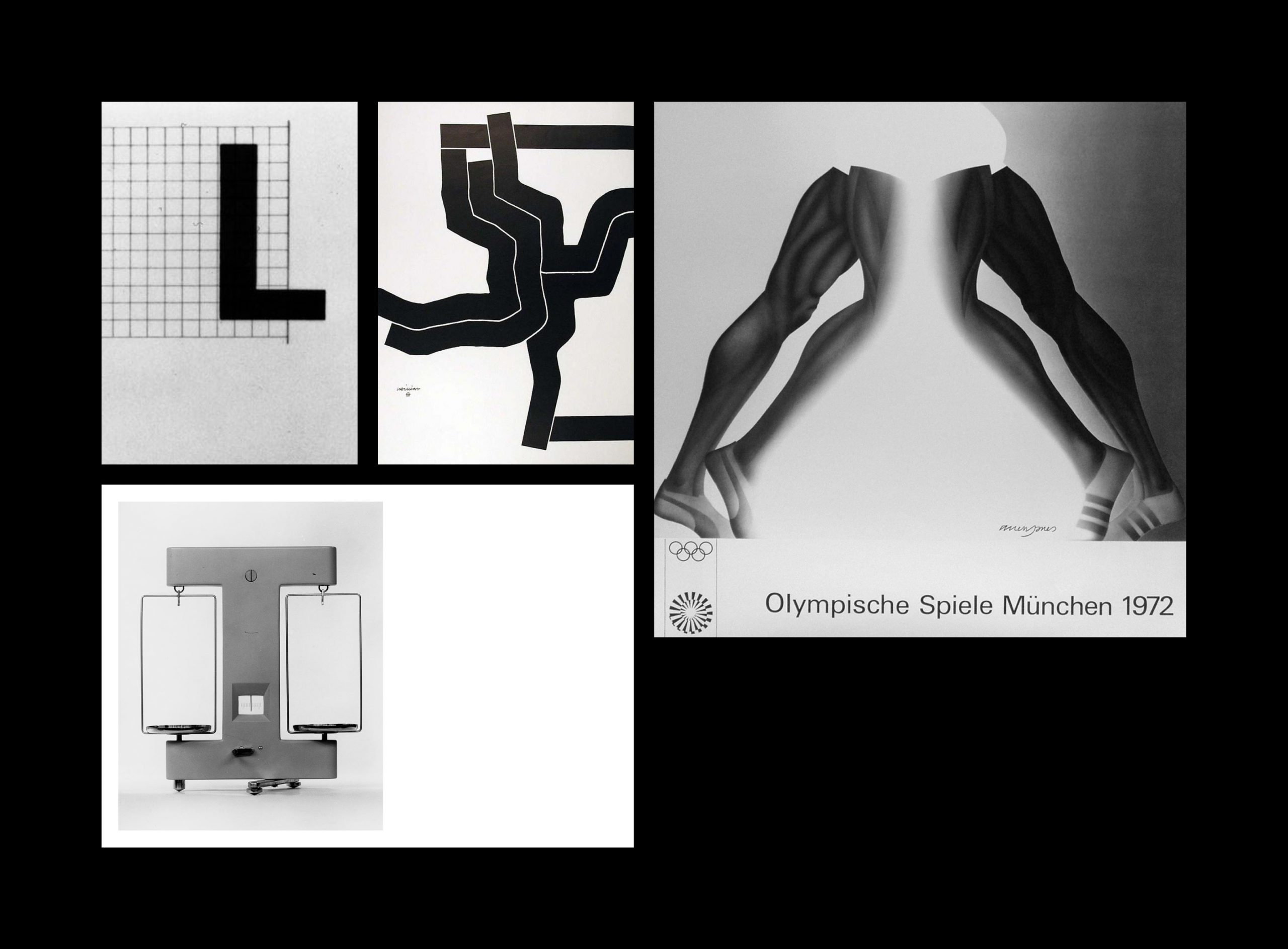
Unconsciously, I answered the question I had previously proposed: it is possible to turn a system into freedom, even in a time when everyone is struggling for aesthetics (often mistaken for intellectual pursuits). According to Armin Hofmann’s unconventional formula of design (Graphic Design Manual: Principles and Practice), I have always preferred an educational, meta-level, almost romantic approach to one that is flat and soulless.
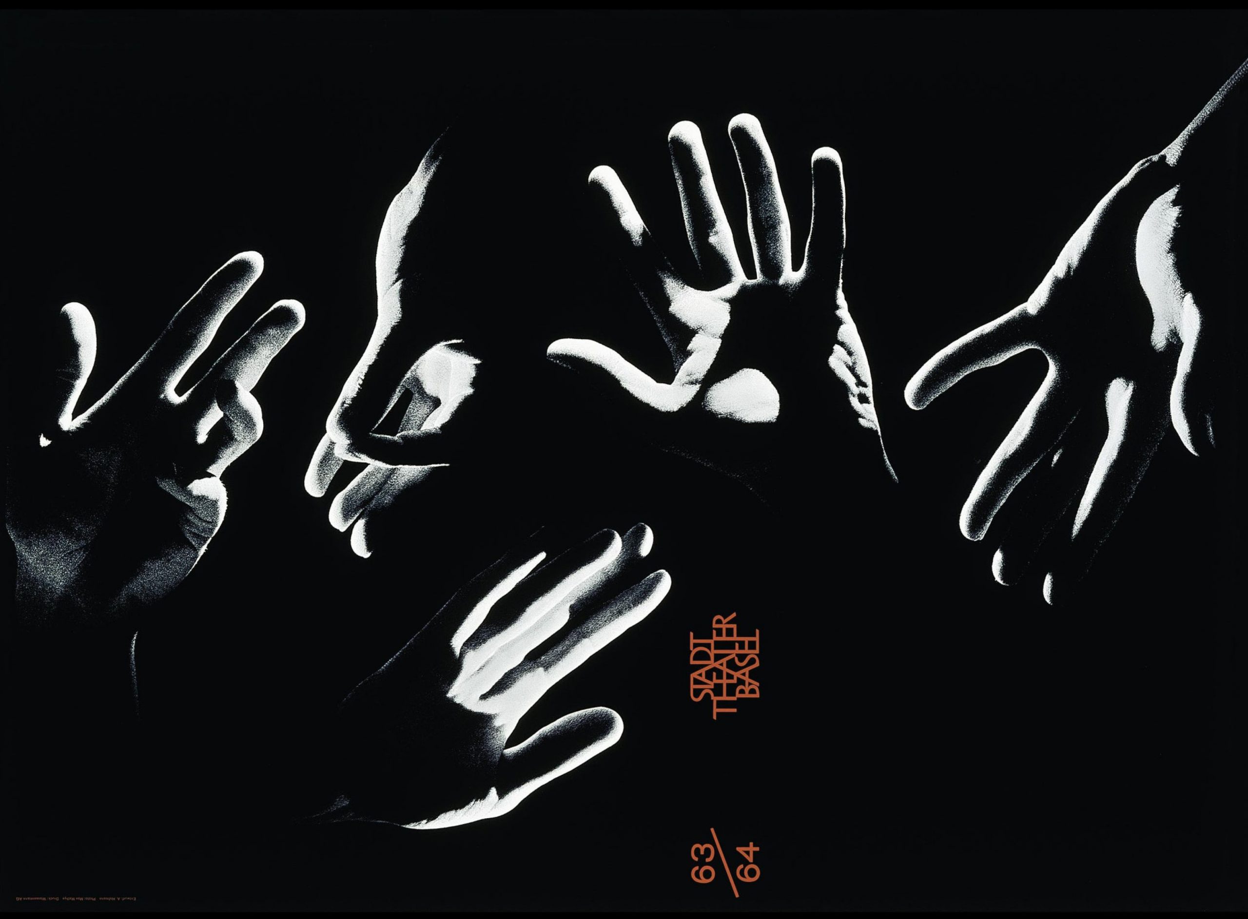
At Pentagram, from the first day, I worked on projects that require the same approach: you start with a basic element and then you define an entire application system. The best part of this work is to look at the whole system and realise that design doesn’t need redundancies, but just a careful eye at the real nature of the project.
Let me share something with you: I want to respond to my need for universality by developing my own universal language. I don’t know what it will be like yet, but I know for sure that it must adapt to the spirit of our time and highlight its complexities. It is quite a challenge, isn’t it?
It was interesting to hear about your ‘Radici’ project, could you tell me more about that?
Every graphic designer, like every man, fights to express the spirit, discover the essence, and manifest its soul. Using visual grammars, he is able to render visible the lines of the invisible languages. However, there is a big difference between a graphic designer and a sensitive graphic designer: the latter bornes the gift of mediation.
“Mediation”, as Andrea Emo writes in “The Incomparable Voice of Silence” is “the occasion in which we suddenly see some light of intuition or revelation, without being able to stop it. Generally we look for more durable means of expression, in which the representation of ourselves and our time can be a long-term process. […] the more expressive it is, the more it seems external and heterogeneous to the essence and soul.”
In botany, a plant is presented in its dual action of support (centralised approach), and of transport (non-centralised approach), distinct functions but involved in the same process of active-organic maintenance.
Therefore, if it’s difficult for a botanist to compare plants with simpler reproductive systems with those of a more complex ones, for a mediating botanist the same action becomes simple: they love to look at the roots (the basic element of their field of investigation) as a link between heaven and earth.
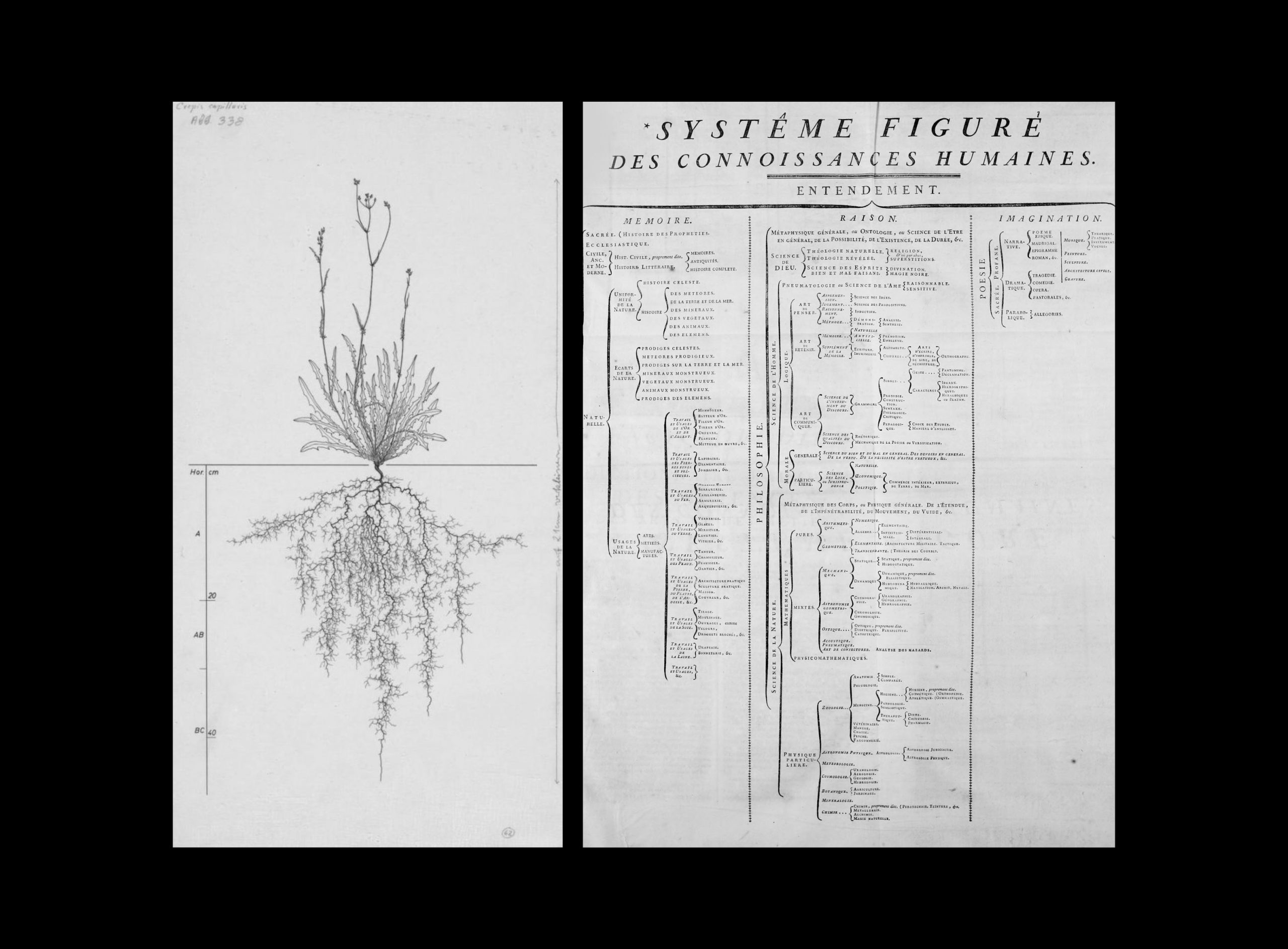
On the right: Denis Diderot and Jean le Rond d’Alembert, Classificatory-disciplinary order adopted in the Encyclopédie (1751-1772), a structure that organises man’s knowledge in three macro-areas: Memory made of History, Reason dedicated to Philosophy and Imagination capable of creating poetry.
My first roots were born in 2017. In my first book “Character as the Form of the Poetic Dimension of Man” (Il Carattere come Forma della Dimensione Poetica dell’Uomo) I intended the word “typeface” both as a letter of the alphabet and as the behaviour of a person.
The tangible aspect of typography leads me to believe in a dimension that belongs to a speculative metaphysics. Immanuel Kant (1724-1804) called this level of knowledge “noumenon”, explaining that it doesn’t reduce objects to mental states and limits (phenomenon), but, on the contrary, extend its domain intuitively in a non-sensible intuition (thing-in-itself).
Since a designer is the main actor in the process of translating meanings into shapes, he is also able to link noumenaand phenomena by a grounding relation: on one hand, the noumenal world, that of man, which becomes an explicit invitation to sensation, feeling and true delight; on the other, the phenomenal world, the one of typography, which becomes a tool for reconstructing an intellectual process through movable type, in the past, and digital fonts, today.
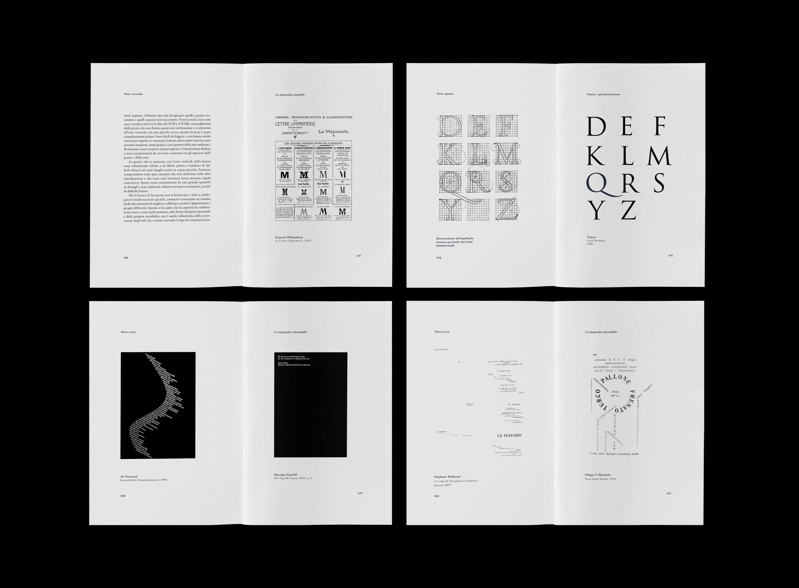
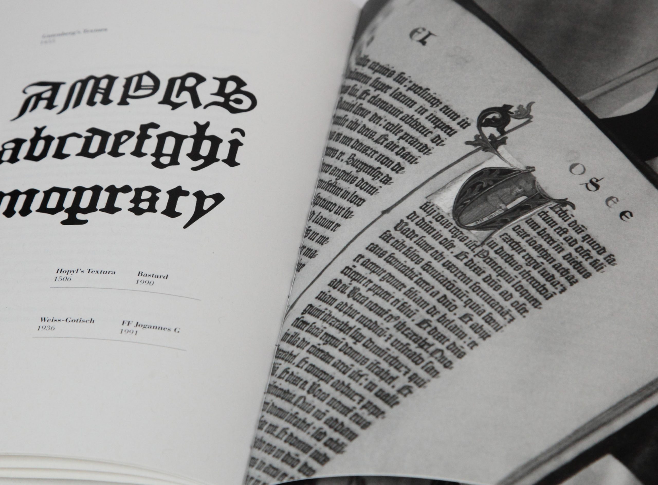
Now, if we move the same consideration from the typographic sphere to all the categories of Graphic Design, we realise how complex the situation becomes. In the absence of a manifesto, intended as a declaration of a point of views and intents, the nature of postmodern projects results often unknown, of nebulous origin. The crumbling of the design culture urges for a new sensitive tool able to hierarchize the visual grammars and order the relative contents, despite their inner complexities.
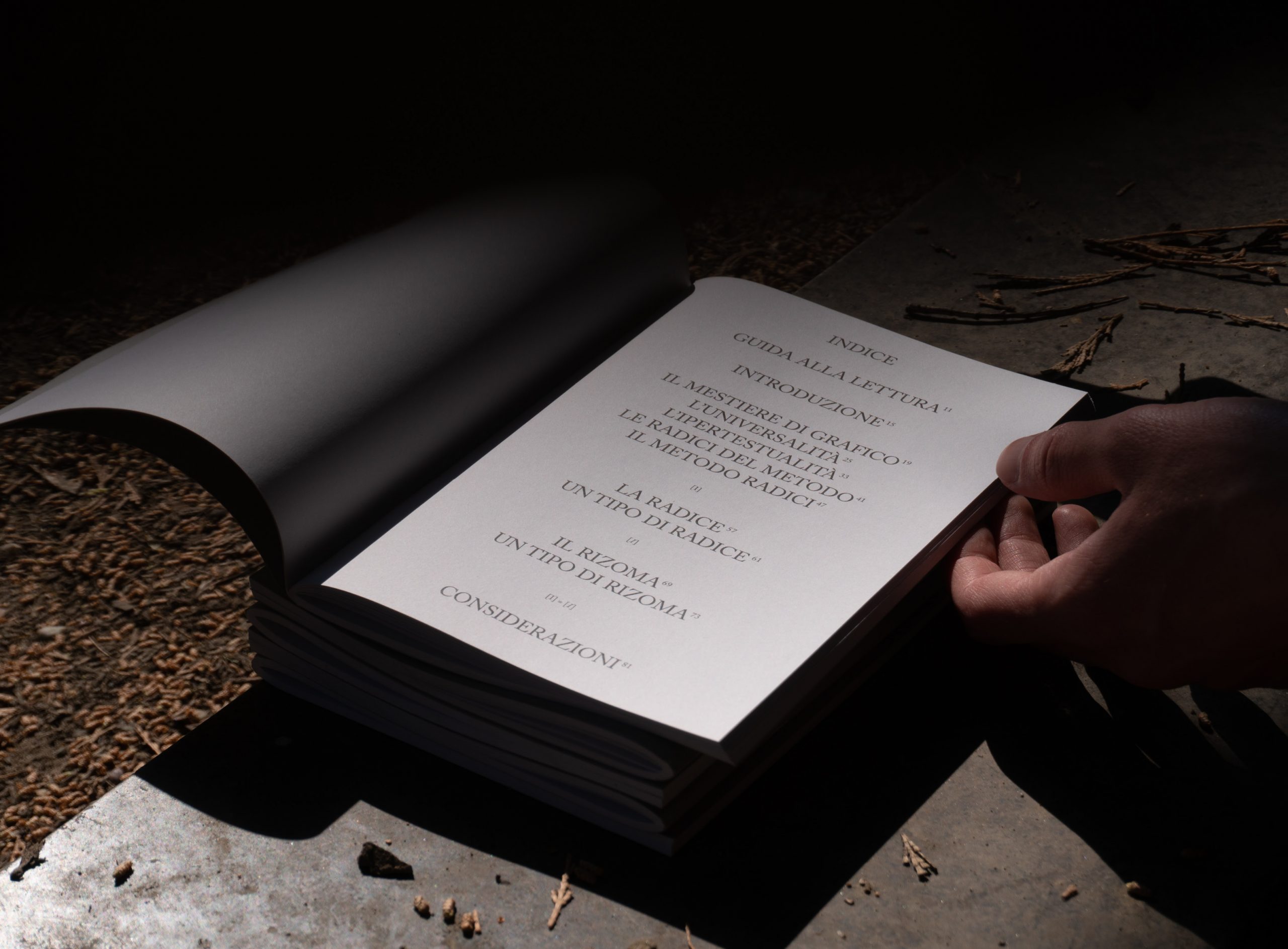
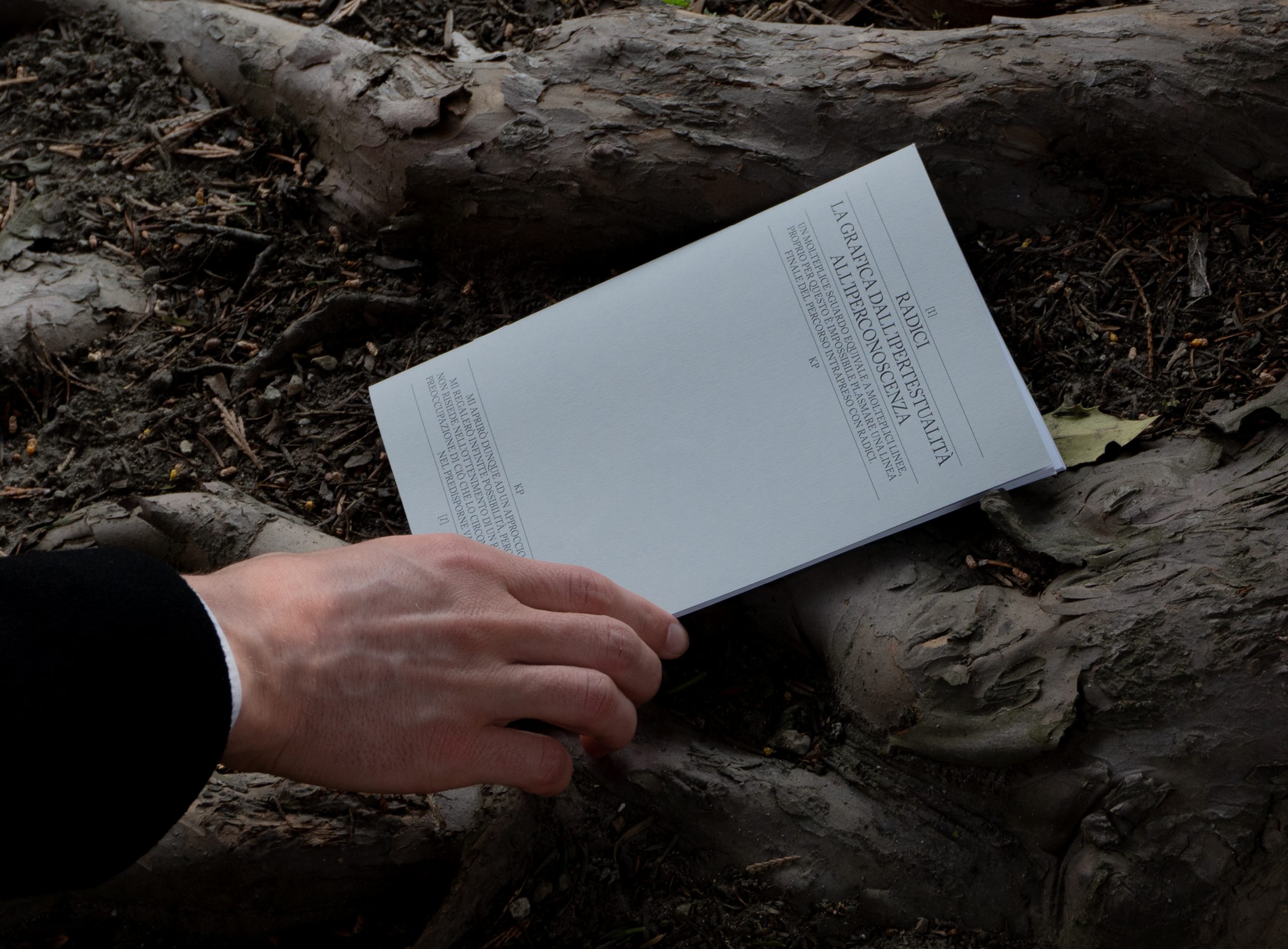
I respond to the challenge of my times. The same generative feeling that led me to buy a piano during my time in Milan, inspired me to think about “Radici, Graphic Design from Hypertextuality to Hyperknowledge” (Radici, La Grafica dall’Ipertestualità all’Iperconoscenza): an operative method to reconstruct the space of graphic research.
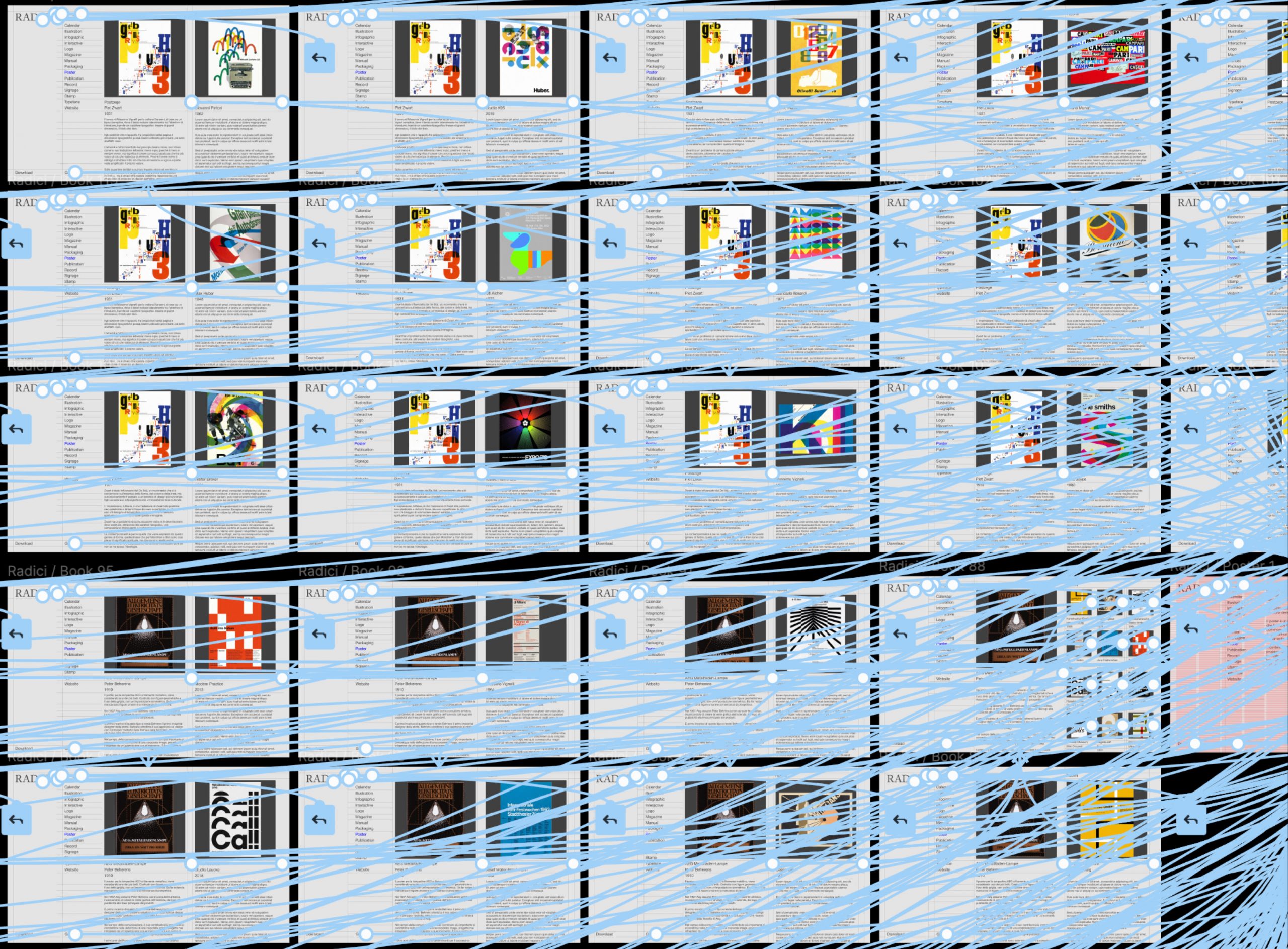
In the dual form of research (book) and experimentation (digital app), Radici investigates the evolution of graphic design in its infinite ramifications, showing the endless connections between its protagonists: Roots [I], projects which belong to the modern knowledge, and Rhizomes [/], projects which belong to the the postmodern fragmentation.
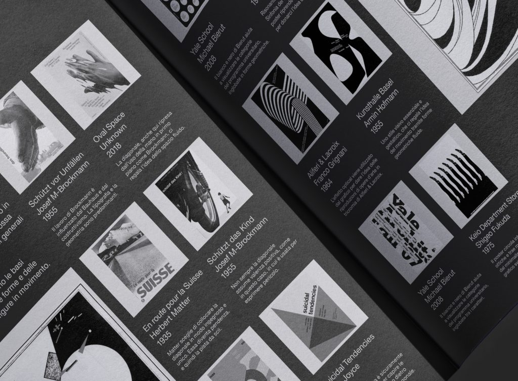
The connections are given by common elements that, over the years, appeared more relevant than the others, eventually leading to constants. Emblematic, for example, the root that concerns the use of diagonals: an effective a-symmetric composition able to break the rhythm of the image without compromising simplicity.
Passing from the political connotation of Constructivism (Lazar Markovich Lissitzky), to its ability to generate vanishing points in futuristic and monumental atmospheres (Cassandre), to the free-balanced denotation in Switzerland (Herbert Matter), the diagonal has always had a great influence on visual communication. (Alfred Hohenegger, La Presenza Della Diagonale Nell’arte / Architettura / Comunicazione Visiva, 1986).
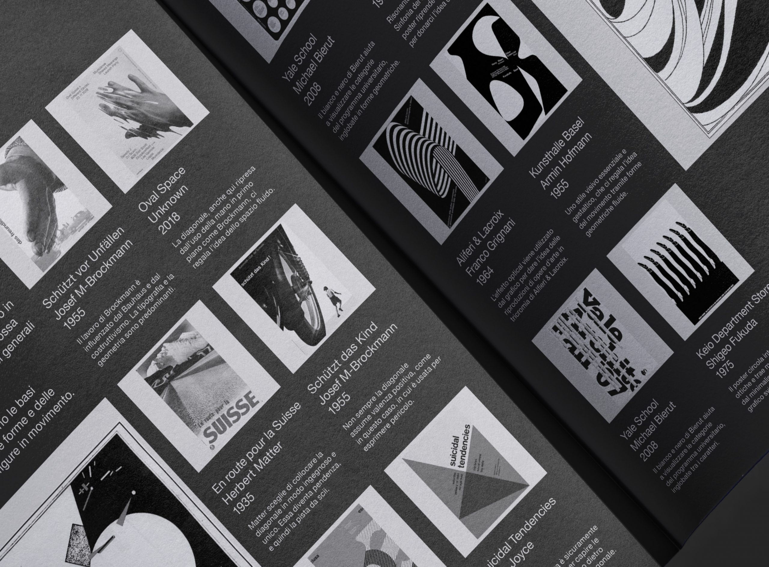
In order to find an answer to the numerous questions, I refer back to guides that, within the same crisis of epistemological tools, made a rigorous structure problematic by trusting in their own tools. To sum up: personalities who gave shape to complexity. Among the pages of my essay, I present writers, critics and philosophers able to find their own core, and then extend it to existential factors (such as Leonardo Da Vinci’s technical projects and their vital implications).
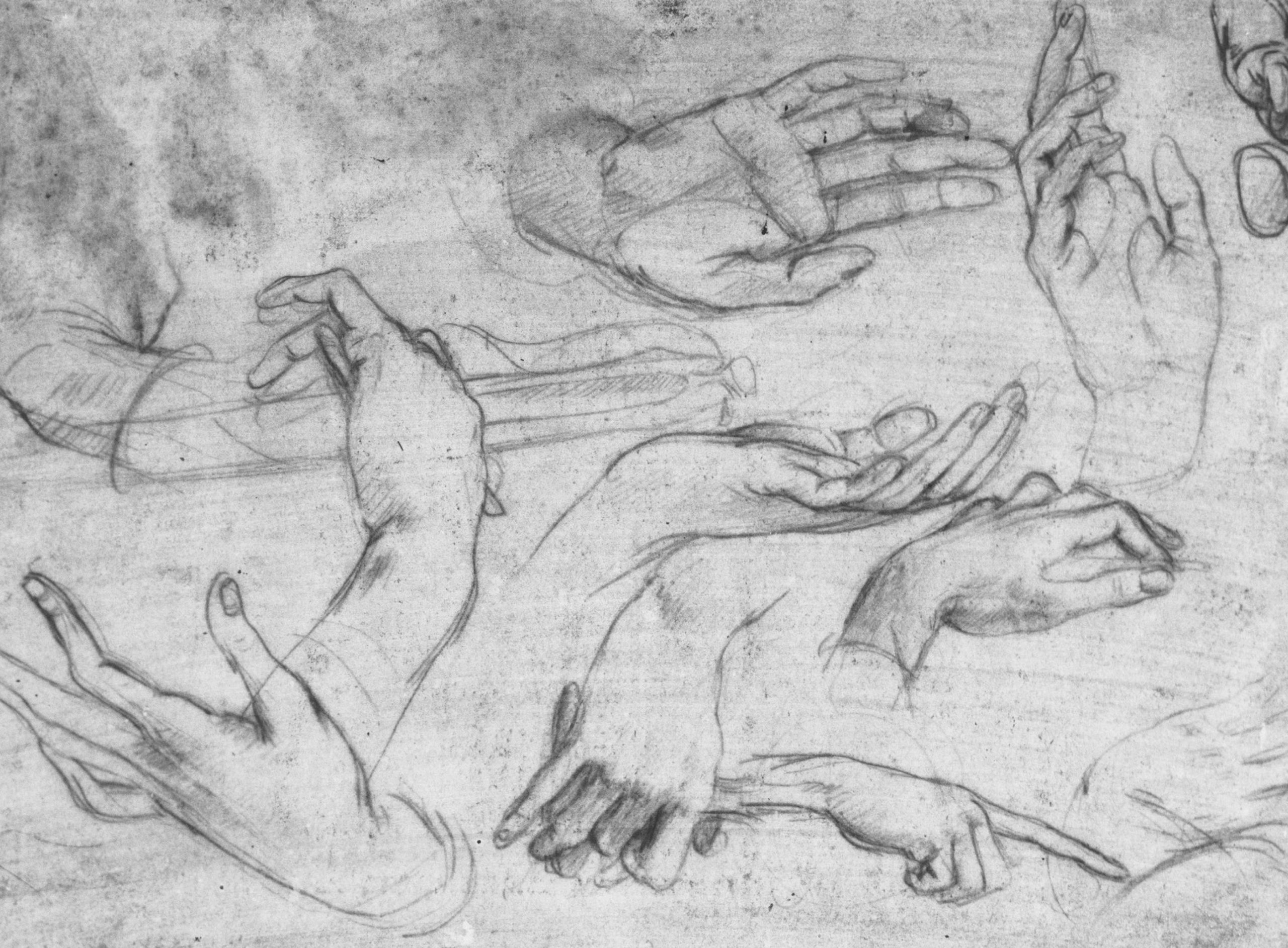
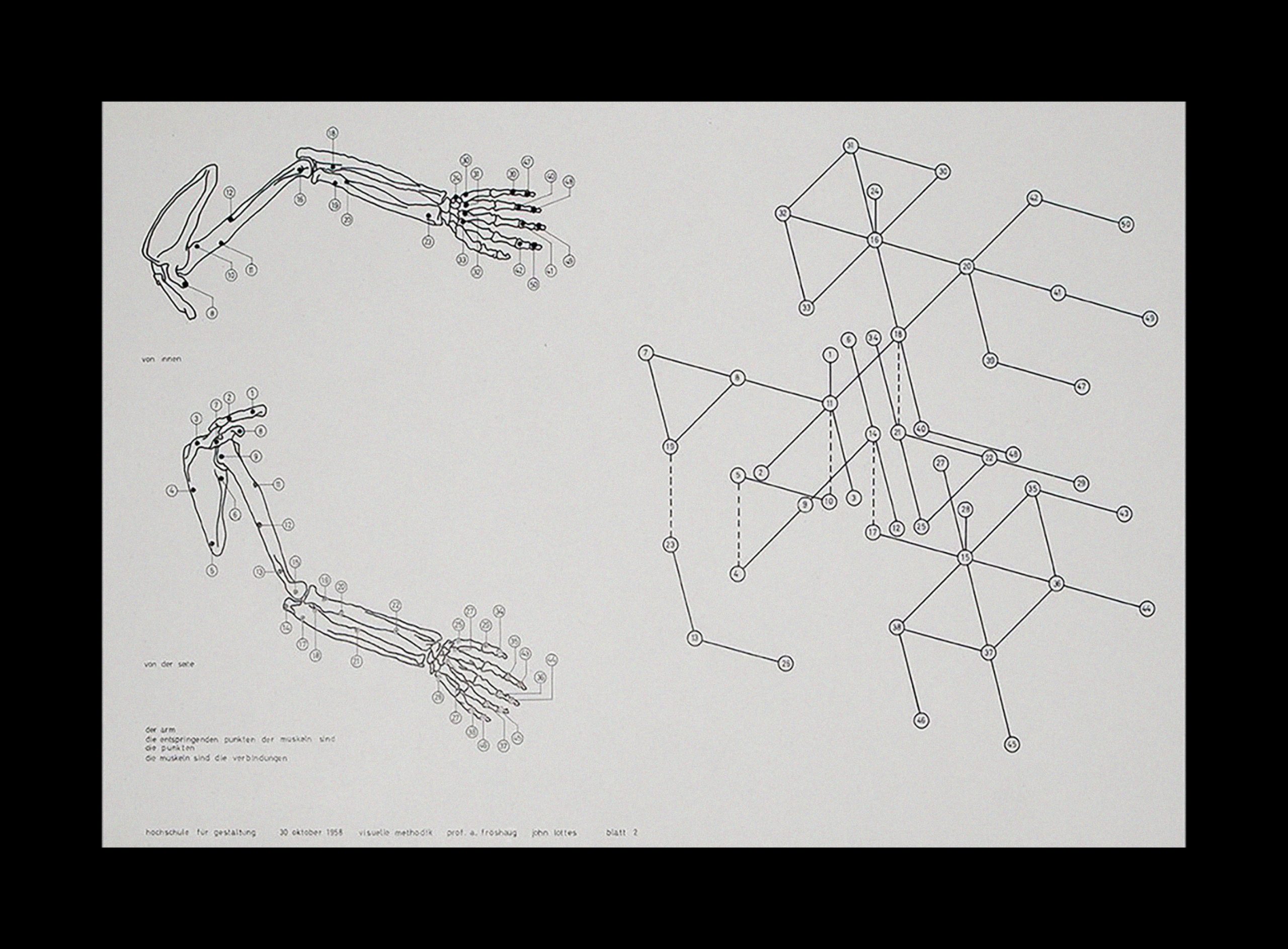
The core of my research manifested itself in the form of the hypertext, the only digital driver able to replace the ideas of centre, margin, hierarchy, and linearity with the ones of multicollinearity, nodes, links and networks. Acting in cyberspace, it becomes the mediator of a material constellation of knowledge, the same actions of plants on earth.
Experimenting with the hypertext allowed me to make the structure visualise itself. Unlike other digital platforms such as Instagram and online libraries, where the overflow of windows and contents produces a lack of attention and semantic disconnection, Radici acts in a dialoguing and an active level. In fact, both in the book and the app, the contents flow in parallel: the grid is studied to make the notes accompany the text and the click allows one to discover the roots of each project.
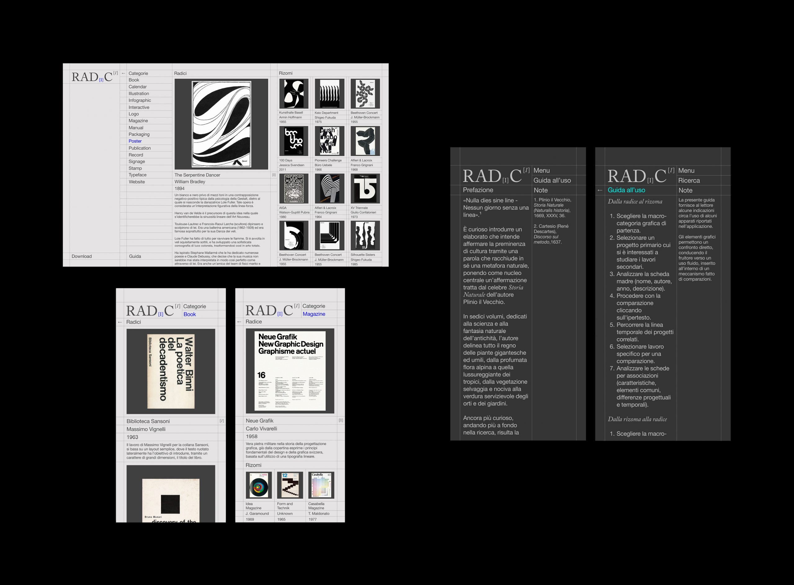
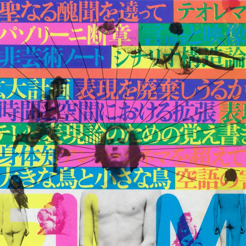
During the research process, Design Reviewed was a great help in tracking modern roots, which often concern books, magazines and posters, all filled in specific categories.
Although, given the difficulty of accepting the validity of each connection, my project still presents some gaps. It is imperfect.
The acceptance of imperfection has always accompanied my life, but at the same time it gave me strength and life-force. Kant confirms this theory by presenting a model that crosses the limits of obscurities and extravagances with a good dose of contradiction, beauty and humanity.
“Before I begin to shape my roots, I intend to address the word “perfection”. For years I struggled myself trying to achieve it, convinced that it was the key to everything, the essence of happiness; I crossed tunnels, reached dead ends, and then, I realised that the most significant journeys are those which are made up of pleasant imperfections.”
(Radici, p. 3, 2021)
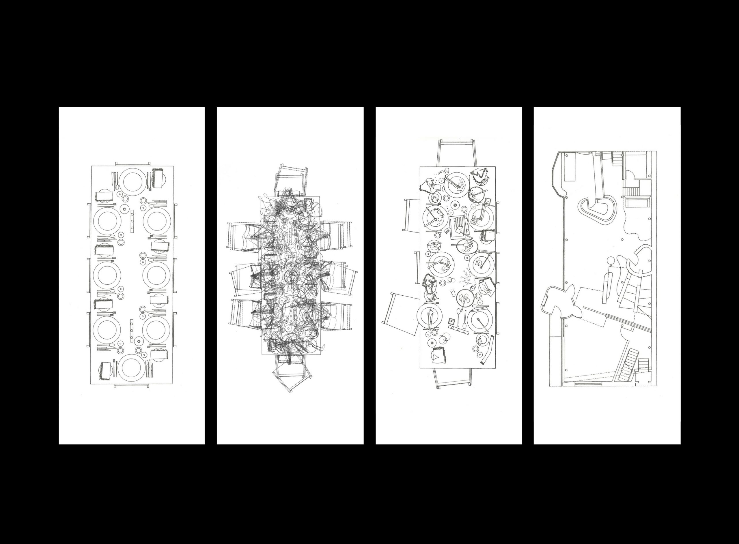
Is there a book or set of magazines you are on the hunt for or would love to be in your collection?
Well, I believe that Radici has already made you aware of the multiversal approach that distinguishes both my method and me as a person; consequently, it is difficult to give a straight answer.
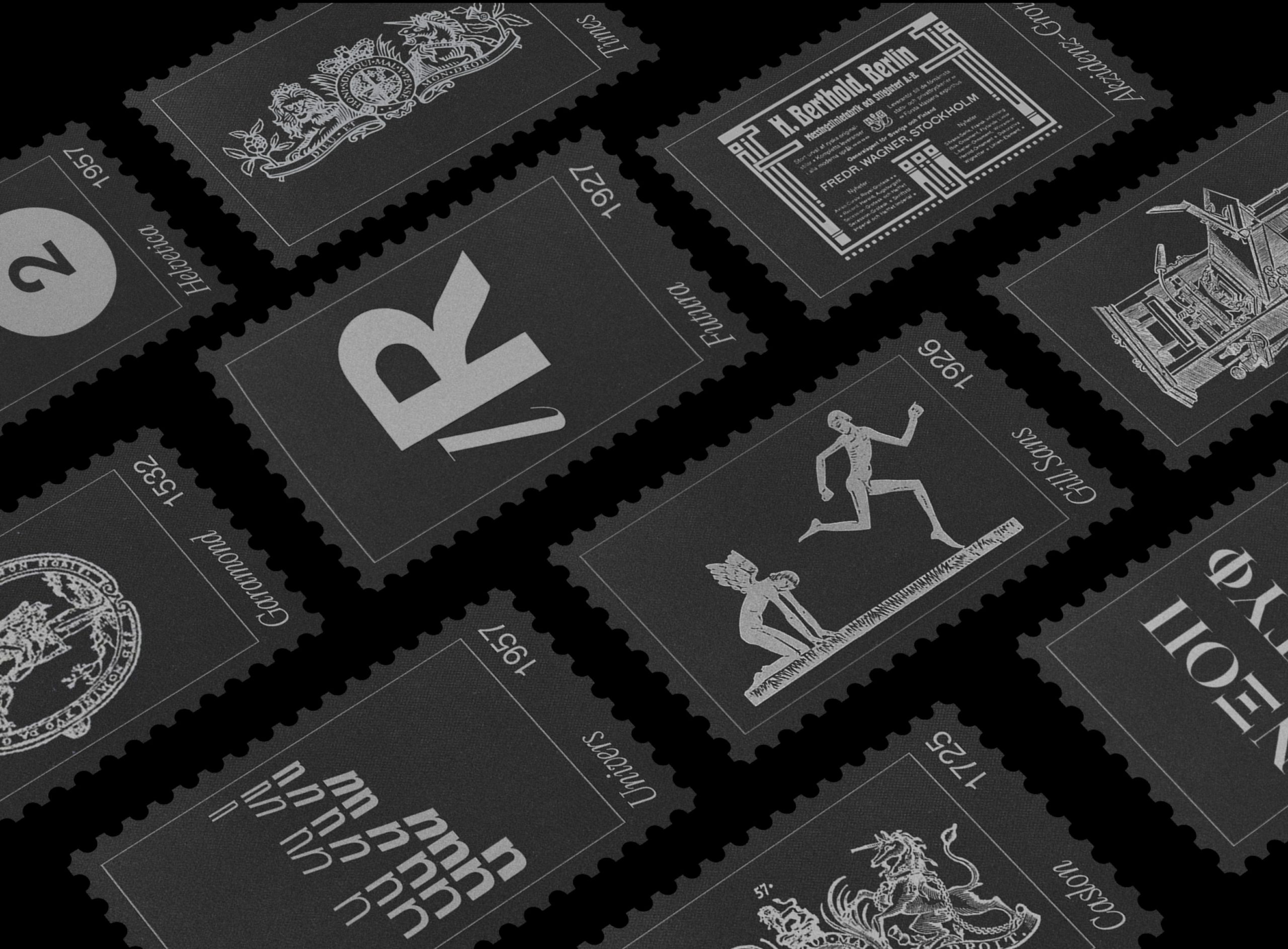
I’ve been travelling a lot lately, and, from each place I visit, I always try to pick up something. I’m always on a lookout for city maps, postcards and stamps. They mark the ground of my discovery and the diary of my graphic experience, as well as they teach me a lesson every time I hold them in my hands (think about the London Underground Map and how it all starts with the tubes).
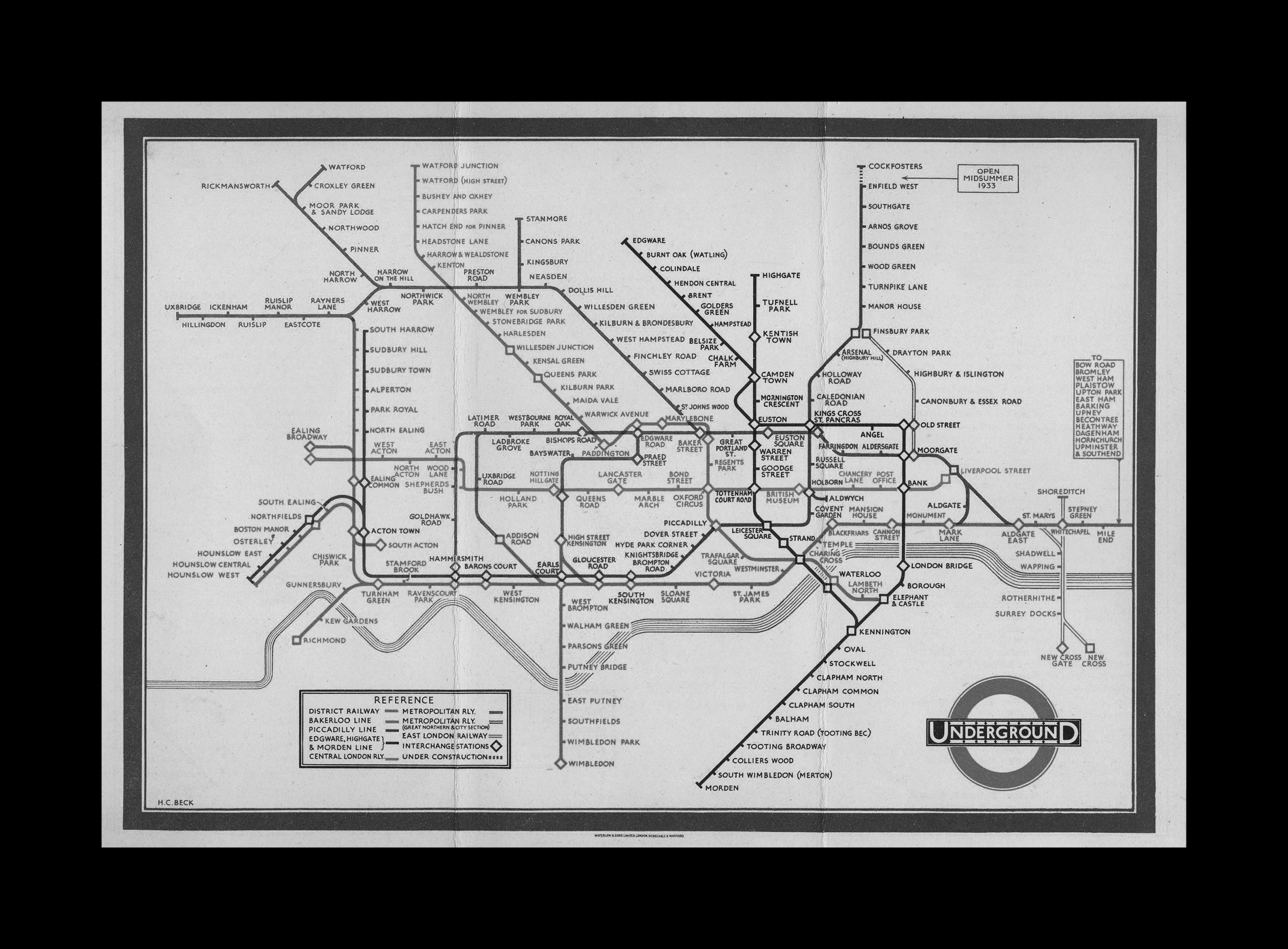
A book is different, it is not just about choosing the right one, as it may be for any reader. For a designer it is the revelation of something more senseless than sensible, a fluctuation of thoughts driven by beautiful typefaces. It is no coincidence that Borges considers the universe and a library the same thing.
In the early stages of Radici, I spent a lot of time in the libraries looking for my “lines of meaning” (Jorge Luis Borges). In particular, I wanted to find a book that could help shape my project both in its conservative and fragmented nature.
Looking around, I came across projects with a clear postmodern structure: simple enough to pose as an excel sheet (extensive use of white space, a thin grid, and, more often, a blue text that reflected the same sense of the hypertex); complicated enough to operate in a mirror effect (a liquid space where static identities no longer find space). I didn’t need a theoretical book, but a practical manual of human infographics.
“The Visual Display of Quantitative Information” by Edward R. Tufte, is, ultimately, the book with which I would begin to fill the library of my new apartment in Berlin, considering that all the others are still in Italy.
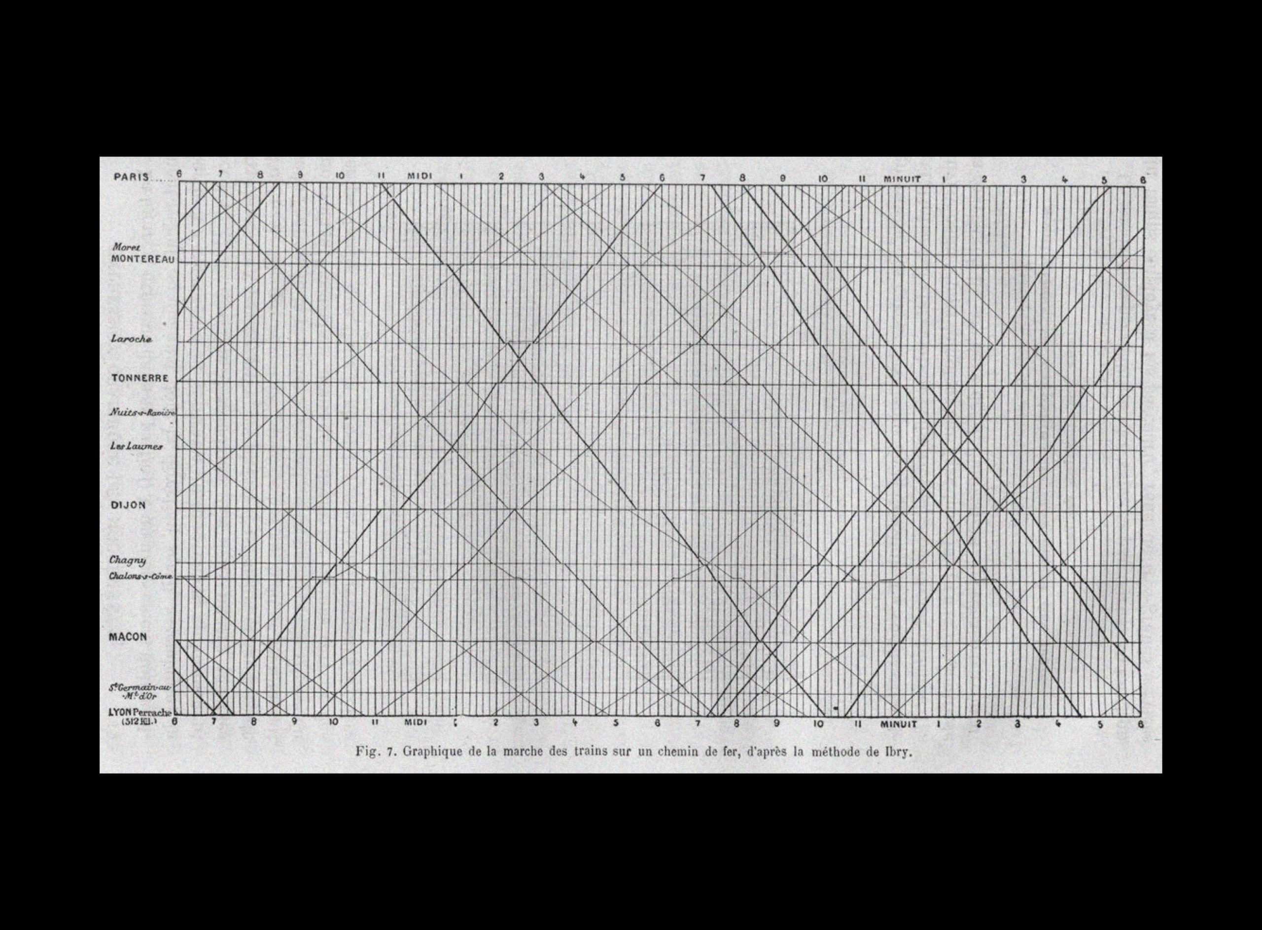
Leafing through the pages in my school library, I immediately understood that it was the perfect book: “In this section, it is discussed how the lack of graphical integrity can be detected, and methods on how to create integer graphics are presented.”
In both the editions, Tufte offers a detailed analysis of graphic data and multivariate design, without losing the humanistic trait that makes it as beautiful physically as it is intellectually. Although Tufte’s book was first published in 1983, in fact, if we use it as a lens to investigate the nature of the same postmodern projects, we notice how this sense of radicality finally takes on its meaning.
The reason is clear to the author himself: “when you look closely at a project, every point within it takes on an overall value from which you can extrapolate trends and patterns.”
My research was multiversal, but man was always at the centre; I finally had a way to prove it.
Do you lean towards a period/region of design, what’s your favourite?
I’ve always loved the word “learn”. Like a tree full of roots, the person I am today has a lot to do with the lessons I learned in the past; therefore, now it’s my turn to “share my experience and opinions, and to make them available to colleagues, students and others who may be interested.” (Ken Garland’s “First Things First’” manifesto, 1964)
One of my professors, amongst his many stories, loved to say that the neutrality of Switzerland between the two wars has certainly marked its neutrality in design, photography, architecture and art (fields that continually influence each other and generate new roots).
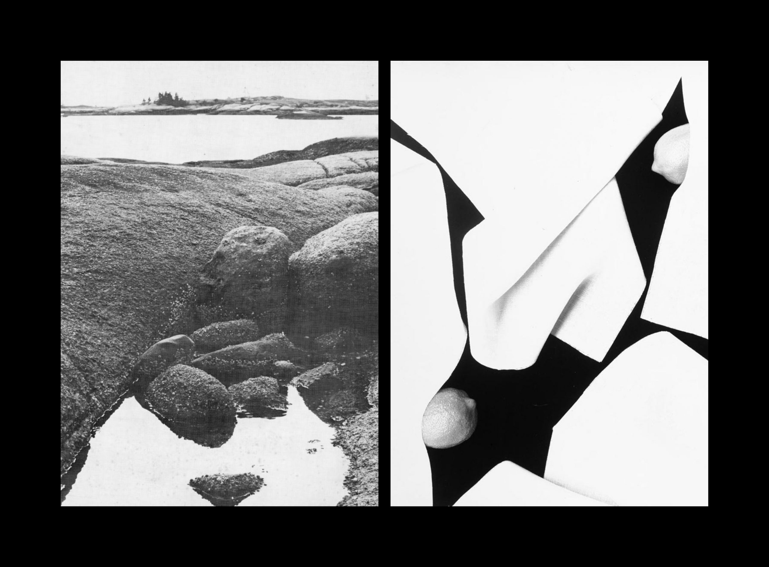
On the right: Herbert Matter, Large folded announcement card for Selected Photographs, 1979.
By travelling across physical and temporal miles, the International Typographic Style, especially in its Swiss influencefrom the 1950s, permanently demolished the wall between aesthetics and reason. It extended its roots from the Modern Movement, by creating contents that can be easily recognized and understood (as we saw before with the exemplary case of the work by Otl Aicher); to now in the present, by demonstrating a model of simplicity which stands against “the interference of the designer’s subjective feelings or propagandist techniques of persuasion.” (Josef Müller-Brockmann)
During a book presentation in Zurich (2021) I had an intuition that brought me to discover a different facet of this sense of neutrality. I was looking at “Acaralate 25E” by Markus Löw, a chemical product for a Basel based company. That peculiar packaging from the 1950s and 1960s, it’s miles away from the object-obsessed culture and its tangle of elements; yet, it is able to bring out the same sense of consistency, readability and pureness as a magazine from the same period.
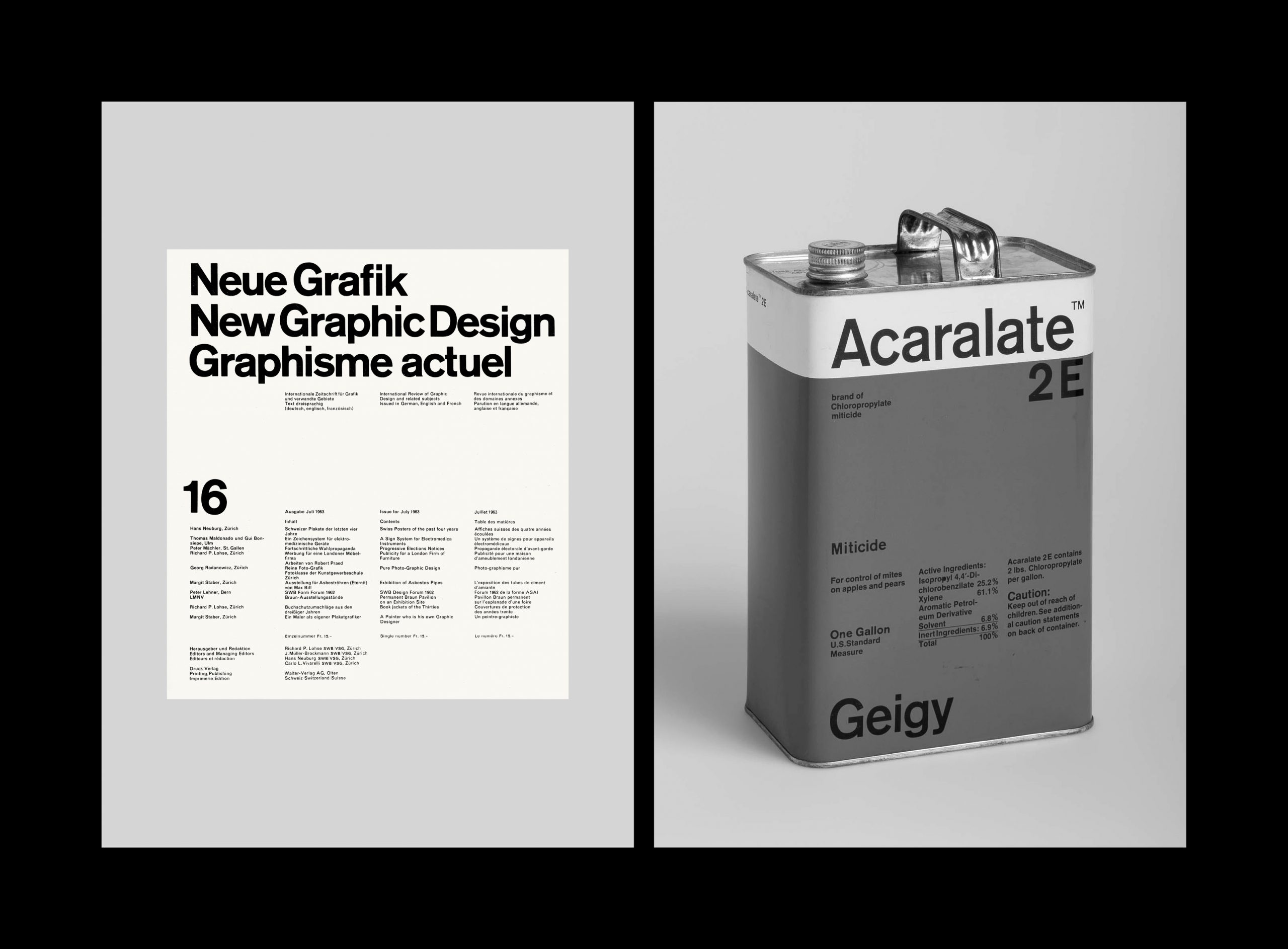
On the right: Markus Löw (Studio Geigy), Acaralate 25E, 1967.
Due to several restrictions applied in the United States, in fact, the packaging had to follow some specific legal requirements: cans of goods had to be labelled on all sides and the amount of text and type size had to be stipulated regardless of the graphic design. Furthermore, as in Basel, it was essential to differentiate the products by colour.
Moving on to research, I discovered that, despite the strict method, Markus Löw and Studio Geigy never exhausted their design possibilities; instead, they opened up to playful veins and humoristic features that aimed to lay the groundwork of American and international design history.

This is how the new generative roots are formed: they still believe in design principles and strategies of the past, but, at the same time, they move into new “terrains” with the power of algorithmic and technological systems. The limitless possibilities begin to take shape and show face.

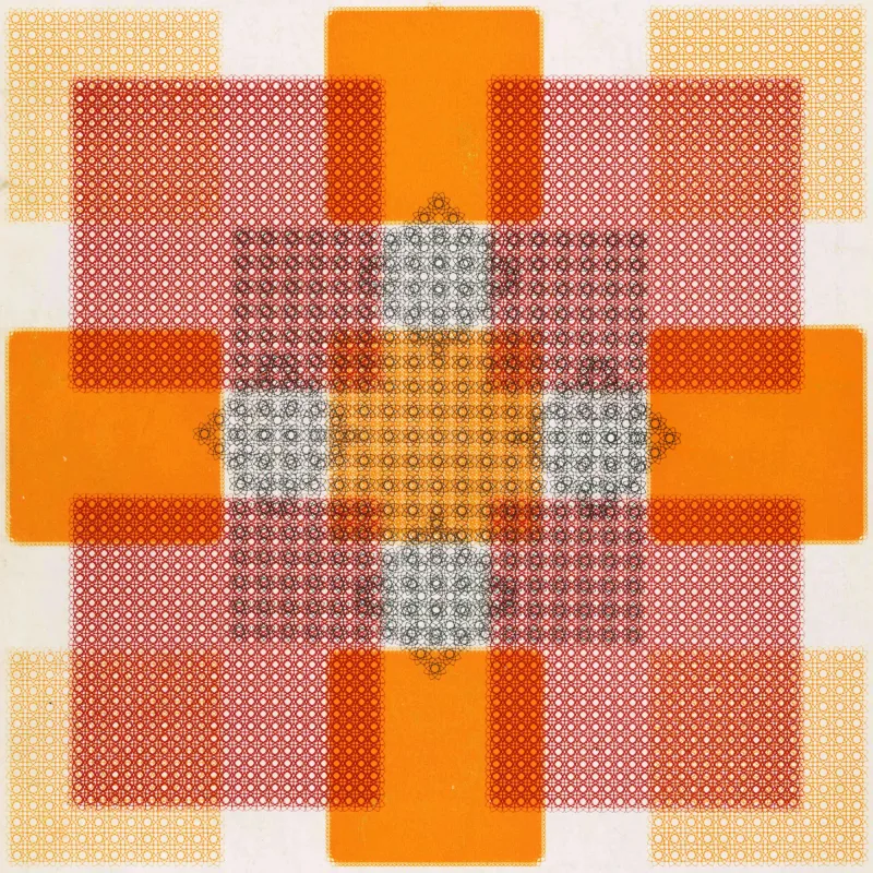
On the right: Nigel Cottier, Letterform Variations, 2021.
During my first days in Berlin, I was sitting at the window reading Grid System (1981) by Josef Müller-Brockmann. In front of me, another window of similar proportions, whose glass panes reflected the whites while the grilles reflected the blacks.
In that calm atmosphere, in reality, everything was “out of the grid”: I was facing an unknown reality in which all the elements were involved in a psychic vibration, a flexible grid where blacks and white were playing new music. Yet, for the first time, everything was perfectly aligned.
An invisible line connects a book grid (system) to an object grid (freedom), as an invisible line connects a window grid (life) to a book grid (design). There is a hidden reason that surrounds our design choices, especially the most unusual and complex ones of our postmodern manifesto. Applying the rule of nature: a tree is able to adapt itself to the ground, while permitting to change with the seasons; to have solid roots which grows in contexts. The same principle, in all these years, it’s the man and his sensibility.
![Katia Pecoraro: The dualism between system and freedom, design and life. 22 On the left: Thomas Thomitzek, Hinterhaus, Berliner Impressionen, 2011. On the right: Le Corbusier’s Modulor (1942) is invisible in the building, yet it reappears as a repetitive element that occurs at many different scales, repeated in little segments of houses to large segments of urban plans, yet it is rarely an explicit form. Thus Le Corbusier’s statement that the plan is the generator will be seen to be different from the diagram as the generator. (Diagram: An Original Scene of Writing, Diagram Diaries [Peter Eisenman / 1999])](https://designreviewed.com/wp-content/uploads/2022/06/design-reviewed-images21-scaled.jpg)
On the right: Le Corbusier’s Modulor (1942) is invisible in the building, yet it reappears as a repetitive element that occurs at many different scales, repeated in little segments of houses to large segments of urban plans, yet it is rarely an explicit form. Thus Le Corbusier’s statement that the plan is the generator will be seen to be different from the diagram as the generator. (Diagram: An Original Scene of Writing, Diagram Diaries [Peter Eisenman / 1999])
Recently I reprinted Radici, adding a short preface, which reads:
“A multiple look is the equivalent of multiple lines, for this reason it is impossible to shape a final line of the path taken with Radici. I will therefore open myself to a future approach, I will give my work endless possibilities, to become something else. The answer lies not in a single result, but in the desire to investigate and to prepare variants.”
(Radici, perfection, 2022)
