montages5

Feature by

Designer Profile: Ken Garland

Ken was born in 1929, in Southampton and grew up in a small market town in North Devon. He was a principled man, with strong values and views against the hyper-consumerism we live with today. Ken studied at the London Central School of Arts and Crafts in the 1950s and was taught by Herbert Spencer, Anthony Froshaug and Jesse Collins. Whilst at the School he studied alongside designers Ken Briggs, Alan Fletcher and Colin Forbes.
Ken Garland Photograph: Unit Editions
Ken Garland
Photograph: Unit Editions

Ken was born in 1929, in Southampton and grew up in a small market town in North Devon. He was a principled man, with strong values and views against the hyper-consumerism we live with today. Ken studied at the London Central School of Arts and Crafts in the 1950s and was taught by Herbert Spencer, Anthony Froshaug and Jesse Collins. Whilst at the School he studied alongside designers Ken Briggs, Alan Fletcher and Colin Forbes.

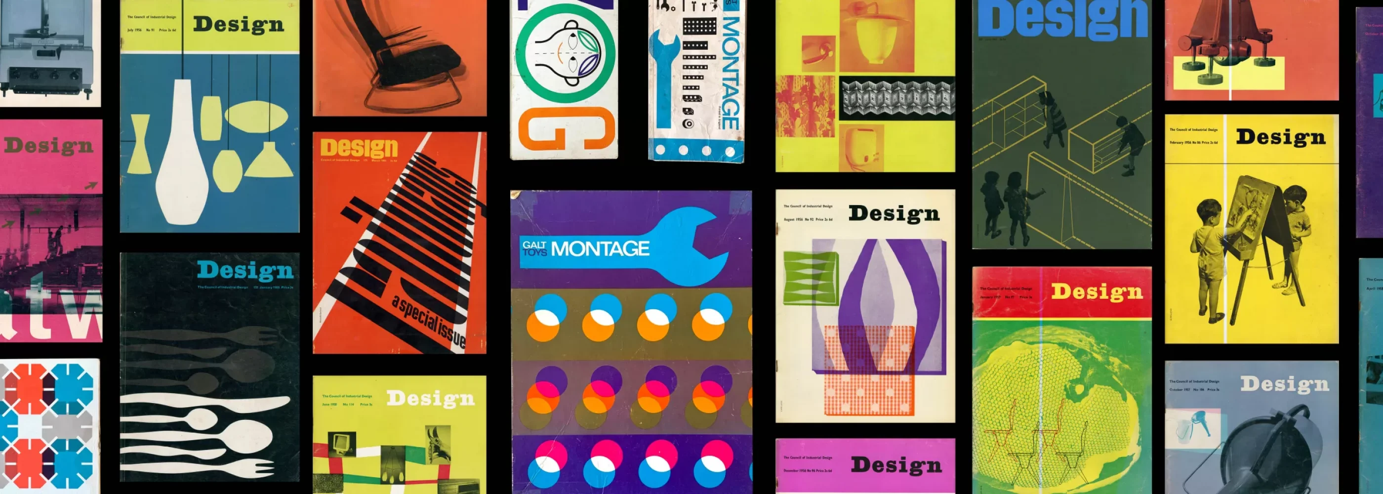
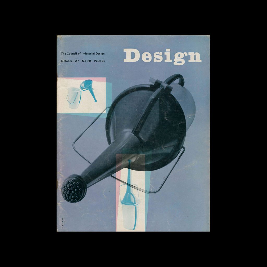
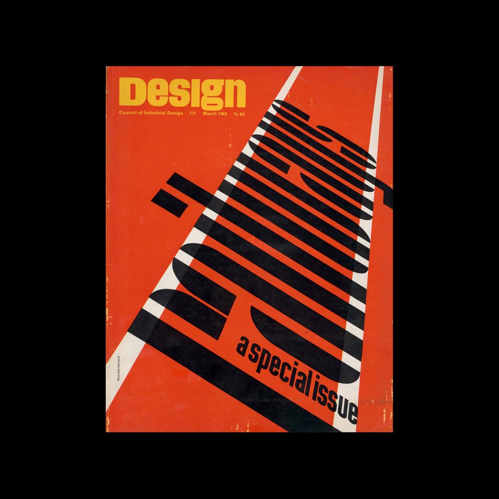
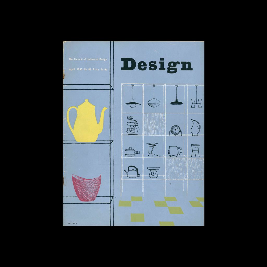
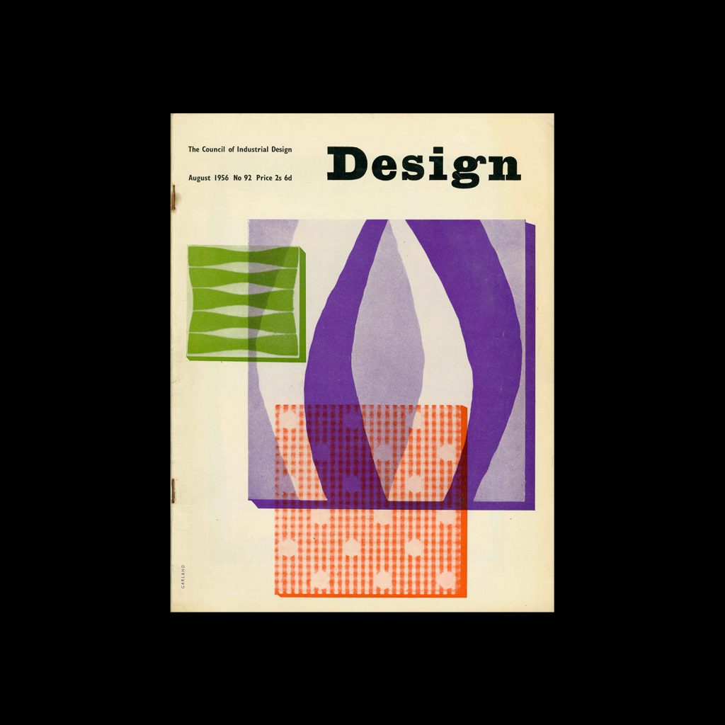
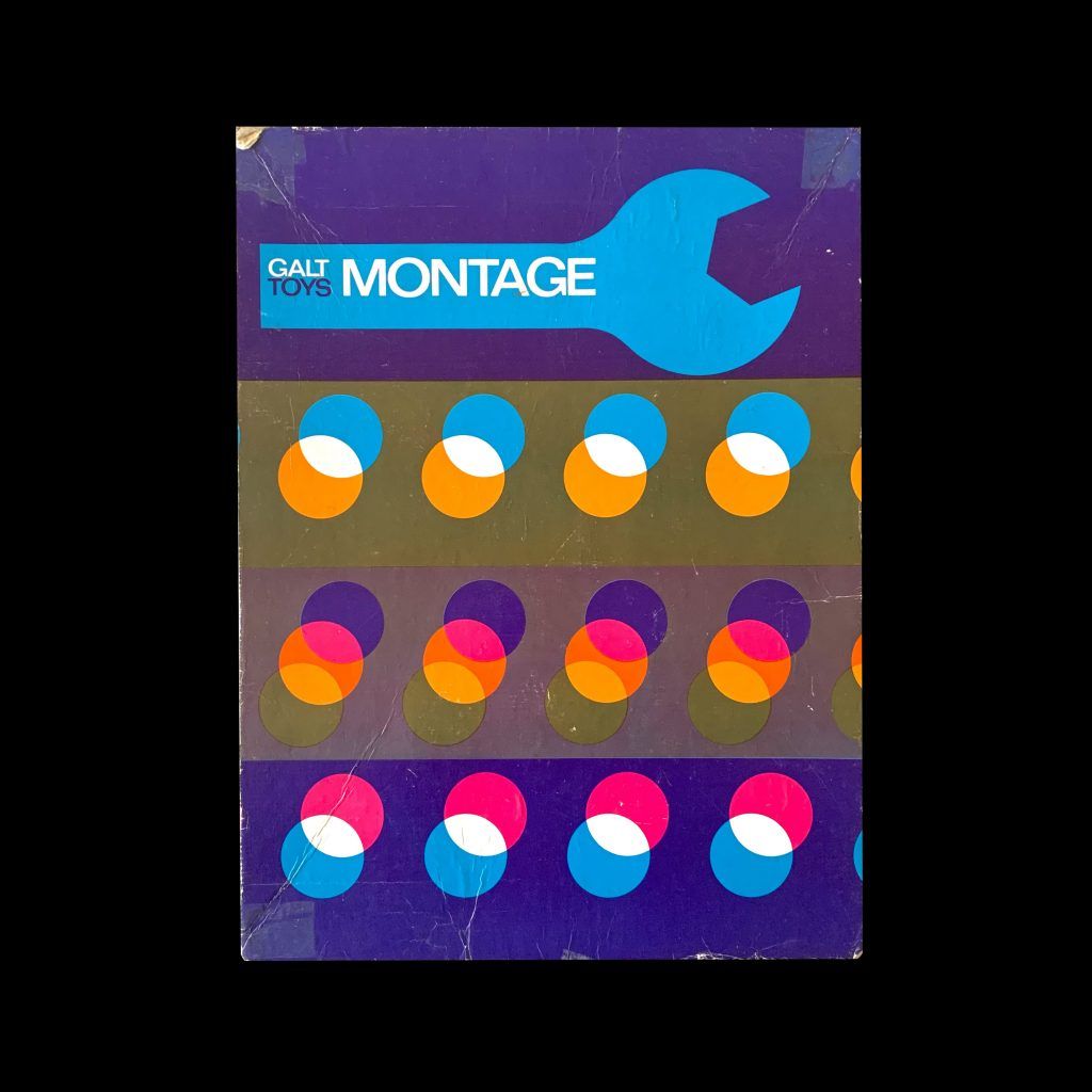
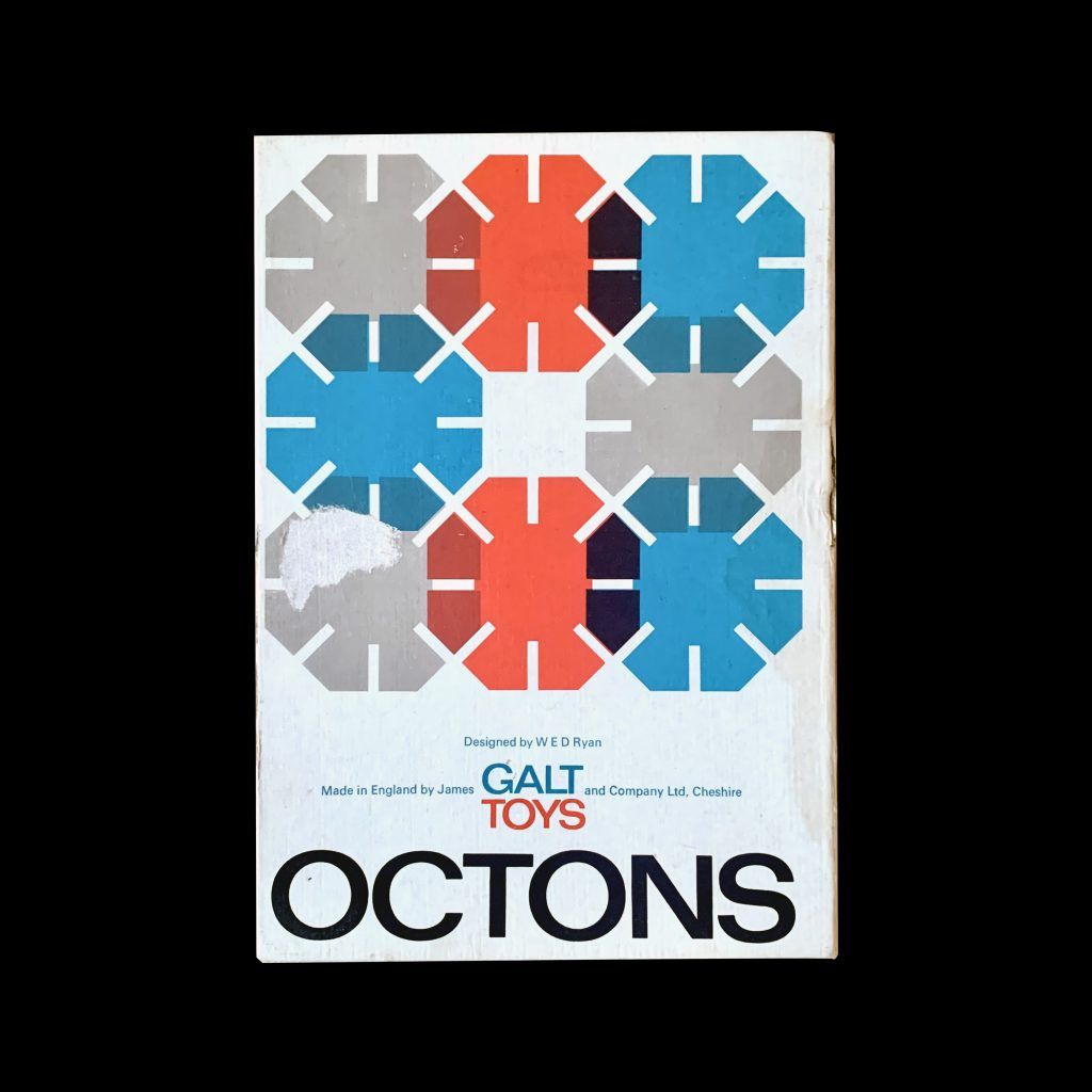
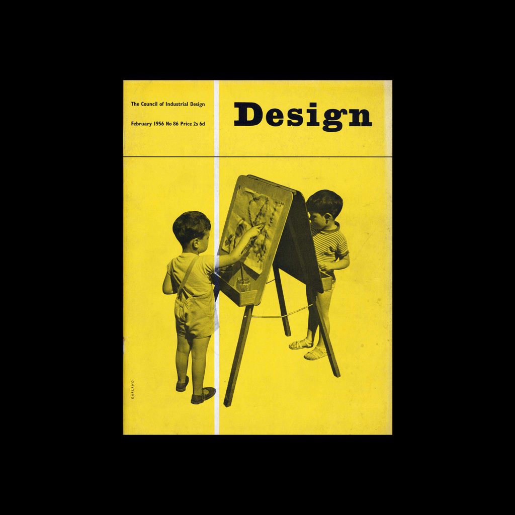
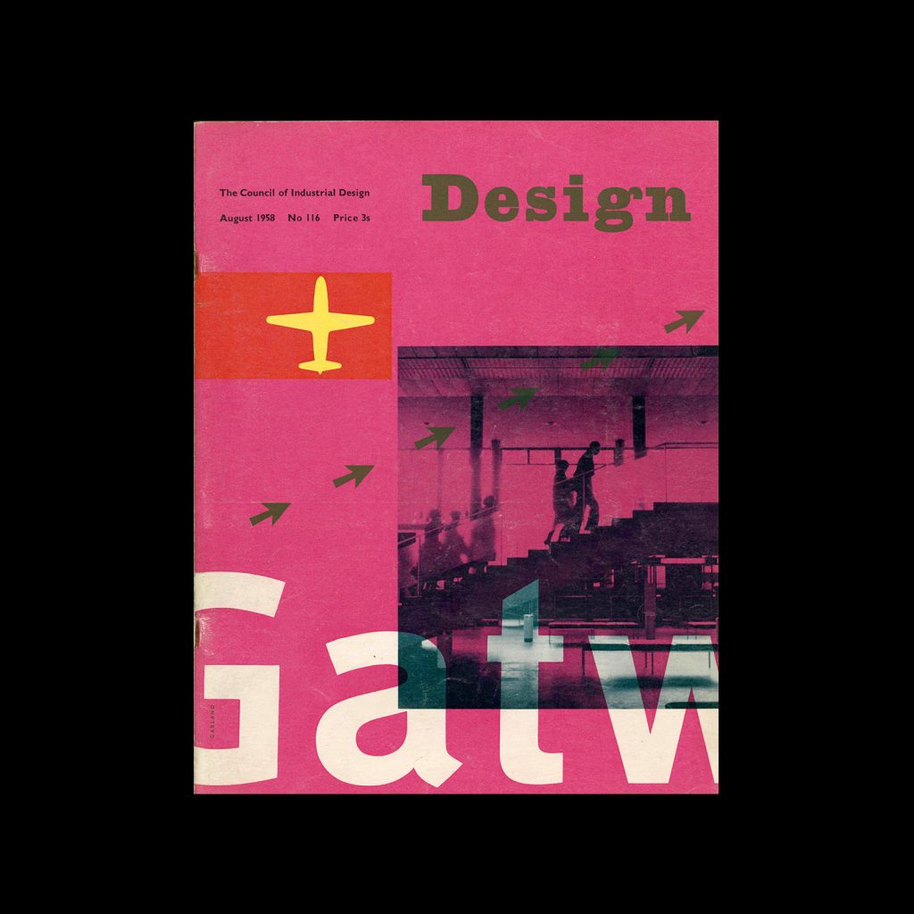
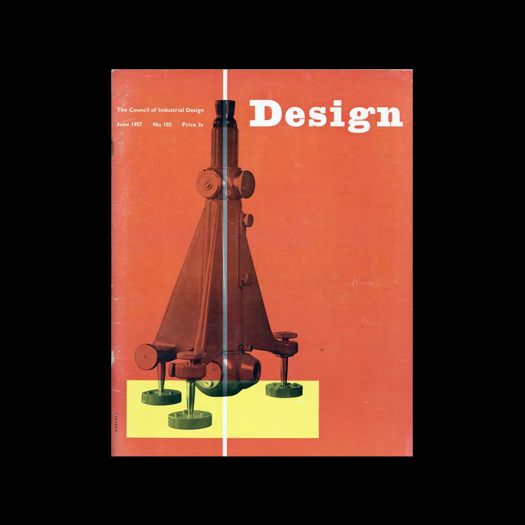
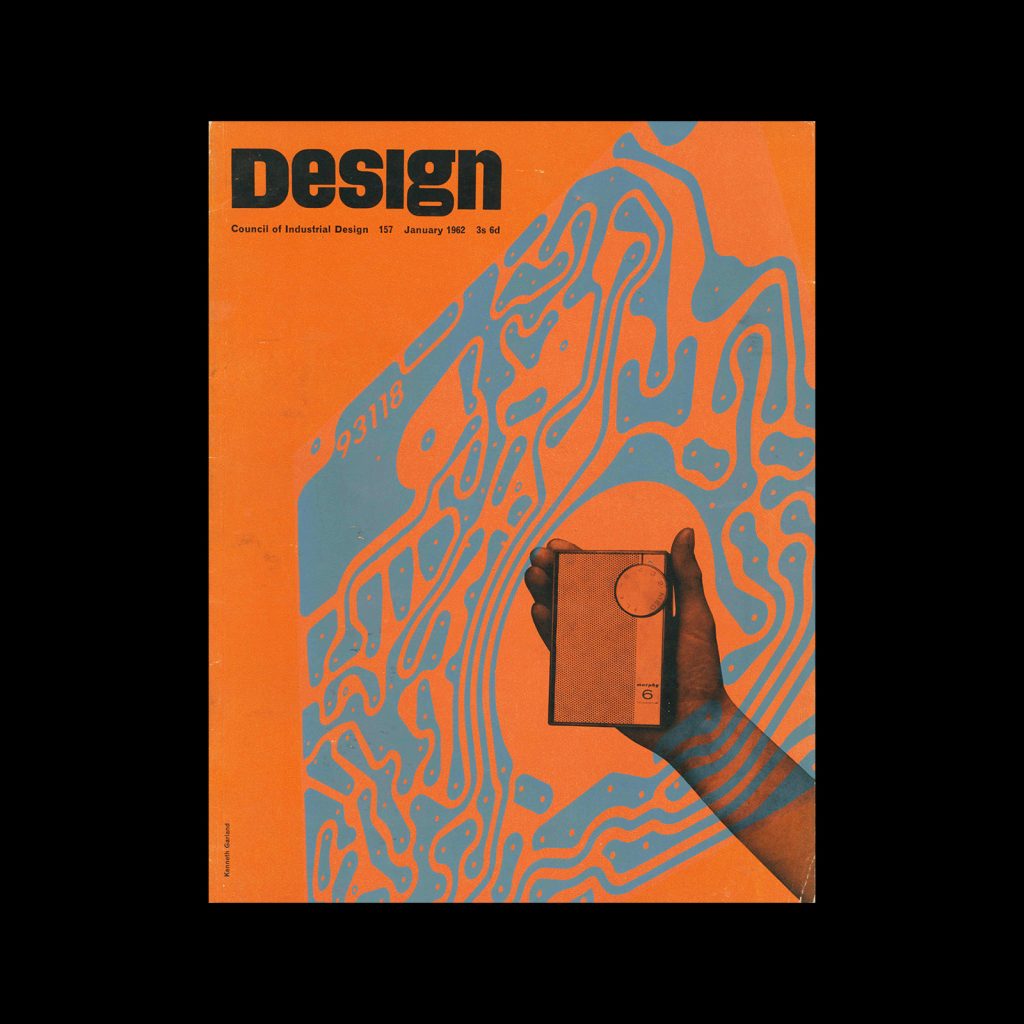
He launched his design agency Ken Garland Associates in the early 60s in Camden and worked and lived there for over half a century. Their longest client retainer lasted 20 years, this was for James Galt and Company. He produced a range of design from magazine covers for Design, published by the Council of Industrial Design, posters for CND to packaging design for Galt Toys.

Articles on the web

AGI: http://2017.agi-congress.com/speakers/ken-garland

From CND to Hollywood: the ruthlessly brilliant designs of Ken Garland: https://www.theguardian.com/
artanddesign/2020/sep/07/ken-garland-graphic-designer-cnd-manifesto-hollywood

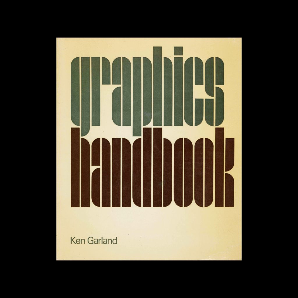
Unit Editions: Ken Garland book — free to download as a PDF

Eye Magazine: Articles about Ken Garland

view more of the archive

Items in the archive | Designed by: Ken Garland

More articles

Members Content

Kiyoshi Awazu (粟津) was a renowned Japanese graphic designer, known for his contributions across various creative fields including poster design, architecture, set design, filmmaking, and illustration. His unique style was commissioned by theatre groups, design and architecture magazines and various organisations for the covers of book covers and posters.
The background of Kamekura's mark designs is his boldness in eliminating all the waste, combining simplification derived from Japanese traditional family crests and Western intellectual mechanics of formation with a sharp modern sense of composition.
Mark Bloom has designs for globally recognised brands, produces some of the finest, most accessible modern typefaces and heads up Mash Creative and CoType Foundry. His type foundry has always been a port of call for our studio's brand projects and he continues to develop these, each with a fantastic print specimen.

Members Content

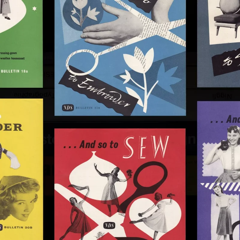
Both the And So To Embroider & And So to Sew bulletins were published by the Needlework Development Scheme. Established in 1934 and operating until 1961, the scheme was a partnership between educational establishments (Scottish art schools, Aberdeen, Dundee, Edinburgh and Glasgow) and industry.

Members Content

The best poster designs from Die besten Plakate des Jahres 1956 with a translated foreword by Jakob Rudolf Welti. Featuring the work of Herbert Leupin, Carl B. Graf, Carlo Vivarelli and Emil Ruder.

Members Content

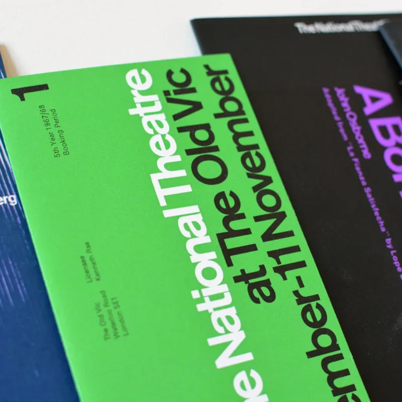
The typographic designs produced for the National Theatre by Ken Briggs are not only iconic and depict the Swiss typographic style of the time, but remain a key example of the creation of a cohesive brand style.

Members Content

Industrial design was an American design magazine featuring furniture, ceramics, housewares, appliances, automobiles, buildings, radios, projectors, televisions, and many other objects designed for the postwar middle class. First published in the 1950s by Charles Whitney with Alvin Lustig as art director.

Members Content

Dick Elffers, had been the chosen designer for the printed matter of the Holland Festival for much of the festival's years, he used a painterly style for his work with the festival between 1954 and 1965 and later a more abstract style between 1969 and 1972. As well as publicity design, Elffers was commissioned to design the summer stamps to promote the Holland Festival in 1972.