Volume launches the first major retrospective of American graphic design polymath and mid-century modernist master, Rudolph de Harak

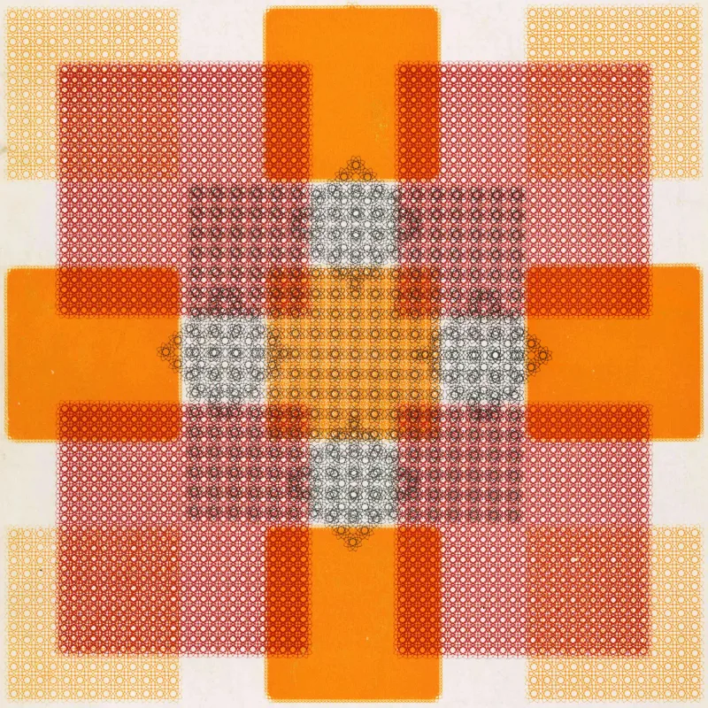
In the ambitious new monograph Rational Simplicity: Rudolph de Harak, Graphic Designer, Volume shines a light on the complete arc of the exceptionally rich and varied career of Rudolph de Harak, showcasing his vibrant, graphic, formally brilliant work, which blazed a colourful trail through the middle decades of the twentieth century.

Share:

Press release by Volume, a publishing platform for creators and lovers of books on visual culture.

Mid-century modern furniture has long been admired by design aficionados and has spawned a million mediocre reproductions, but what of the often overlooked graphic design of the era? In the ambitious new monograph Rational Simplicity: Rudolph de Harak, Graphic Designer, Volume shines a light on the complete arc of the exceptionally rich and varied career of Rudolph de Harak, showcasing his vibrant, graphic, formally brilliant work, which blazed a colourful trail through the middle decades of the twentieth century.

de harak 5
Volume launches the first major retrospective of American graphic design polymath and mid-century modernist master, Rudolph de Harak 9

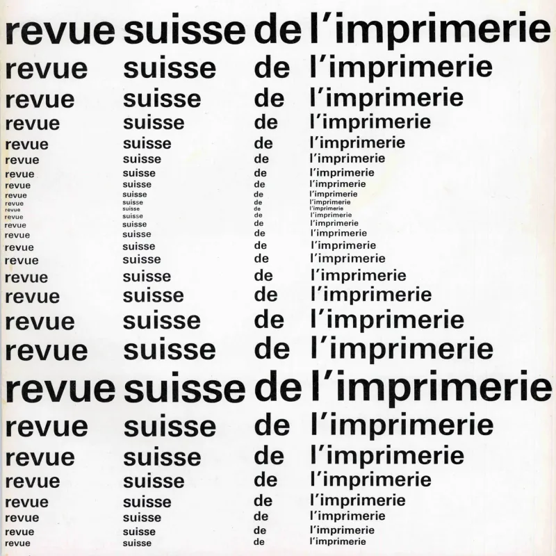
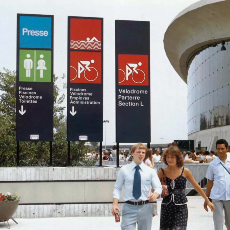
Born in Culver City, California, in 1924, de Harak lived and worked the majority of his career in New York City before his death in 2002. Influenced by masters of Modernism, in both art and architecture, in a prolific career that spanned five decades, and included seminal designs for record sleeves, magazine covers, exhibitions, building facades, posters, furniture, corporate identities, pictograms, and even the famous paper shopping bags for the Metropolitan Museum of Art. His book covers for the McGraw-Hill publishing company in the 1960s easily rival the famous Penguin covers of that era.

“This extraordinary volume, long overdue, reveals the mind of a true master” .

– Jessica Helfand, founder of Design Observer

While informed by a highly systematic approach, de Harak’s brand of Modernism brims with colour and invention, wit and warmth. “I tried to evolve forms that in feeling covered the entire emotional spectrum, and also were impeccable in their sense of order,” he said. “This to me was Modernism, and toward that end I wanted to create constellations so rich that they in themselves would communicate content.”

de harak 43
Volume launches the first major retrospective of American graphic design polymath and mid-century modernist master, Rudolph de Harak 10

This large-format publication features over 400 pages, and is printed in six colours on two paper stocks. Volume will also offer a cloth-covered, limited-run collector’s edition, with a slipcase featuring a motif from the album cover for Ivor Novello’s Music Hall Songs (1960). For true superfans of de Harak’s work, 100 of the 250 collector’s edition copies also come with a set of four unique 12 x 12 inch seriagraphs, each numbered on archival paper and reproduced only for this publication.

For more information on Rational Simplicity or Volume contact press@vol.co

More graphic design articles

Members Content

Kohei Sugiura’s work spans an impressive range of mediums, including record jackets, publication covers, posters, exhibition catalogues, and stamps. He perfectly merged functionality and data visualisation with aesthetics. Drawing on his background in architecture, Sugiura applied a systematic, programmatic methodology to graphic design, similar to the approach of Swiss designer Karl Gerstner. 
A short free-to-access feature on Swiss Design. The movement was influenced by Bauhaus and De Stijl, sought clarity and visual unity, making it a powerful force in global graphic design that remains influential today.

Members Content

In December 1924, the Netherlands introduced children's stamps (Kinderzegels). Over the years, these stamps have featured designs by some of the most prominent Dutch designers, including Gerard Kiljan, P. Koch, Gerrit Noordzij, Otto Treuman, Robert Deodaat Emile ‘Ootje’ Oxenaar, Dick Bruna, Jan van Toorn, and Karel Martens.

Members Content

Takenobu Igarashi was born in 1944 in Tokyo and is best known for his typographic work as both a sculptor and designer. His work in over 30 permanent museum collections and continues to inspire designers today.

Members Content

Just like people, cities are complex systems. Planners and designers play a key role in making them function smoothly through well-designed signage systems and visual identities. These elements must not clutter the environment but instead serve to inform, direct, and warn the public effectively.  

Members Content

Notes on transit and network map design, including the iconic London Underground map by Harry Beck, the importance of visual clarity, and the role of accessible design in timetable design.

Members Content

A 1,500 essay on the transformative era of graphic design from the 1970s to the 1990s. Moving beyond the constraints of modernism, designers like Wolfgang Weingart and April Greiman redefined visual communication through bold experimentation with type, colour, and early computer graphics. This essay highlights how postmodernism and New Wave design introduced complexity, individuality, and digital innovation in to graphic design.

Members Content

Yoshio Hayakawa is one of Japan’s most influential post-war poster designers. His work represents a fusion of traditional Japanese art and European modernism often using soft, poetic brushstrokes and refined colour palettes and capturing the elegance of Japanese aesthetics while integrating the clean lines and bold visual language of Western design.