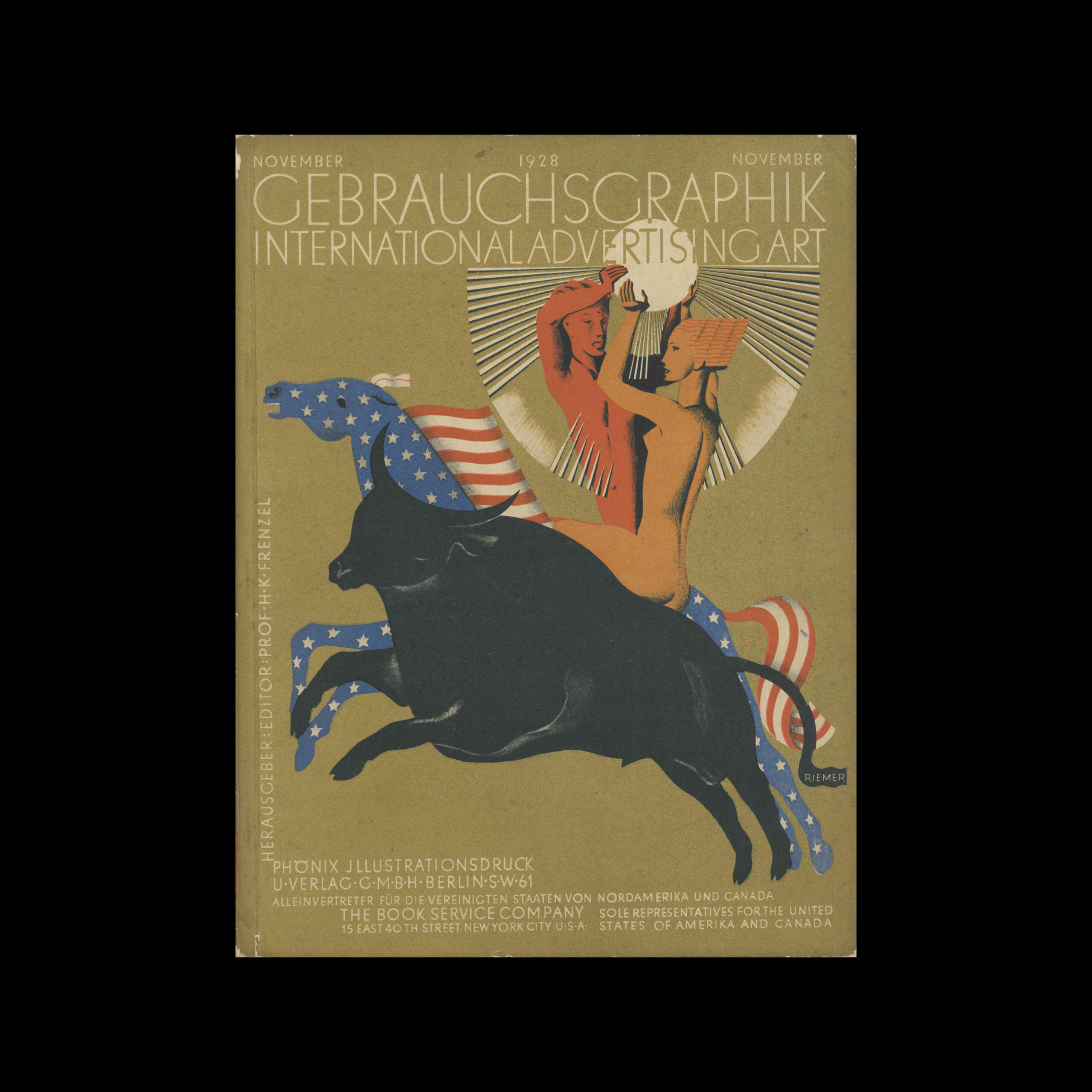
Gebrauchsgraphik, 01, 1929

Information

Details

Linked Information

Gebrauchsgraphik, 01, 1929 Cover design by Wladimir Bobritzky
More graphic design artefacts
From the design archive:
More graphic design history articles
Unit Editions launches Fred Troller Design on Volume – the first comprehensive survey of the work of a pioneering designer who brought Swiss modernism to America in the 1960s, via influential projects for clients including IBM, American Airlines and Geigy.
I came across two sample books containing printed examples of the work executed by the students in the Composing and Machine Departments of the Polytechnic School of Printing, between 1907 and 1910. I couldn't resist adding these to the archive.

Members Content

A total of 24 posters were created for the campaign during 1964, using the arrow symbol as a key features, representing power, motion and speed. The handmade lithographs use up to 19 colours, which were individually printed at large scale. The posters also utilise the brand colours red and yellow from Shells corporate identity.
Founded in 2015, Triest Verlag für Architektur, Design und Typografie have published notable works on graphic design history, including biographies of Othmar Motter, studies on Eugen Gomringer’s typography and poetry, Ernst Keller’s teachings. Thier latest book The Birth of a Style, focuses on the influence of the Basel Educational Model on the evolution of Swiss graphic design into the renowned international style.