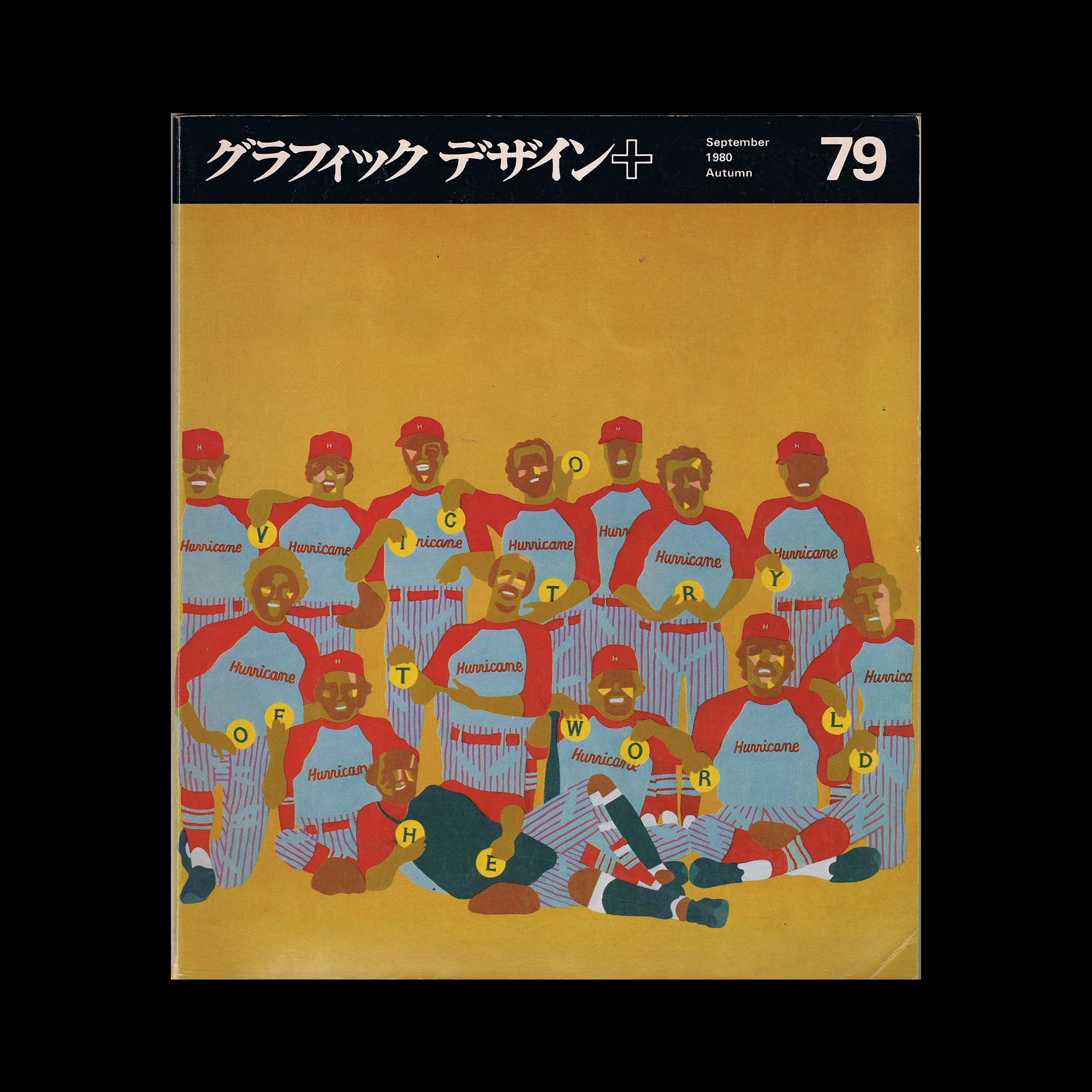
Graphic Design 79, 1980

Information

Content includes:
In the shadow of the Aomori pig: The world of the sketch artist / Toshiharu Oikawa
Japan Style Exhibition / Masaru Katsumi
Outlook for new artists around the world ’80
: Costumes for “Casta Diva”: The encounter between Béjart and Issey Miyake / Masaru Katsumi
Marzena Kawalerowicz/Warsaw / Masaru
Katsumi Illustrations by Kazutaka Shimoda / Mutsuo Sakai
Records of the 14th SDA Award Judging Japan Sign Design Association
The Earth is One / Aaron Marcus
Swedish posters 1895-1979 / Paul Lipschutz
Working on Takeo’s “Handmade Paper of the World” / Kei Mori News
from the activities of the Japan Graphic Designers Association Inc. Donated books: Editorial notes

Graphic Design / グラフィックデザイン, delved into the world of graphic design and visual culture. The magazine featured a broad range of content, including coverage of cutting-edge Japanese design and its history, as well as international graphic design.

Details

Linked Information

Graphic Design 79, 1980
Graphic Design 79, 1980. Cover design by Masayoshi Nakajo
Graphic Design / グラフィックデザイン, delved into the world of graphic design and visual culture. The magazine featured a broad range of content, including coverage of cutting-edge Japanese design and its history, as well as international graphic design.
More graphic design artefacts
From the design archive:
More graphic design history articles
House style can give identity to the diverse products or activities of a firm. It stimulates loyalty, helps to reduce costs, and has advertising value.

Members Content

A selection of poster designs from Die besten Plakate des Jahres 1958 with a translated foreword by Maria Netter. Featuring the work of Müller-Brockmann, Celestino Piatti, Donald Brun and Armin Hofmann.

Members Content

A total of 24 posters were created for the campaign during 1964, using the arrow symbol as a key features, representing power, motion and speed. The handmade lithographs use up to 19 colours, which were individually printed at large scale. The posters also utilise the brand colours red and yellow from Shells corporate identity.
A new interpretation of the work of Bramante, suggesting an agenda for contemporary architectural practice.