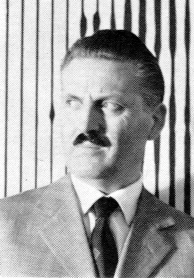
Franco Grignani - Italian Graphic Designer

Pirelli, Rivista d’informazione e di tecnica, vol 20, no 3, 1967

Information

‘This is a detail of “Structural Impact” one of the paintings that Franco Grignani exhibited in the recent exhibition at the Pirelli Center. Grignani arrived at painting through a meditated and difficult itinerary from architecture to graphics to photography. The value of his experiences has already had significant confirmations from the most attentive and open critics.’

Details

Franco Grignani (1908-1999) was one of the twentieth century’s most important Italian graphic designers. He based his studio in Milan and collaborated with Studio Boggeri. His clients included Pirelli, Penguin Books, and Alfieri & Lacroix.

Linked Information

Pirelli , Rivista d'informazione e di tecnica, vol 20, no 3, 1967. Cover design by Franco Grignani
Pirelli, Rivista d’informazione e di tecnica, vol 20, no 3, 1967. Cover design by Franco Grignani
Cover art by Italian designer, Franco Grignani using his Structural Impact painting, 1967.
Franco Grignani (1908-1999) was one of the twentieth century’s most important Italian graphic designers. He based his studio in Milan and collaborated with Studio Boggeri. His clients included Pirelli, Penguin Books, and Alfieri & Lacroix.
More graphic design artefacts
From the design archive:
More graphic design history articles

Members Content

Paul Rand, one of the most acclaimed American designers is known for his iconic corporate identities, playful illustration and commercial art. Paul wrote the preface for Yusaku Kamakura's book, Trademarks of the World, 1958. He states his influence of Japanese art and design, trademarks as a universal language and his struggles with English grammar.
I have known Rob for over a decade and I have been a huge admirer of his work. He specialises in reverse gilded glass sign making, typographic murals and traditional sign-writing.

Members Content

The stamps for the 1970 editions were designed by Jan Slothouber and William Graatsma in collaboration with the Centre for Cubic Constructions (CCC) in Heerlen.  Every stamp displays a different corner point of the same block, highlighting eight distinct corner points, with four chosen for their unique identities.

Members Content

Perusing an issue of Der Druckspiegel from 1962, I found these fantastic examples of Swiss Design, produced for the University Ball at the University in St. Gallen, Switzerland, in 1961. The advertising matter included posters, newspaper advertisements, cinema slides, invitation cards and a booklet.