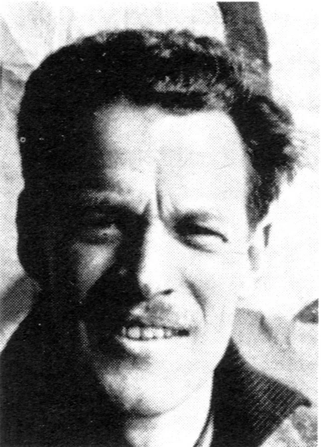
Jan Bons - Dutch Designer and Illustrator

The Studio, Programme 1967-68

Information

Details

Jan Bons studied painting and advertising art at the Academie voor Beeldende Kunsten in The Hague from 1936 to 1937, and then continued his studies for a year at the Nieuwe Kunstschool in Amsterdam. Throughout his profession, Bons stood out as a versatile designer, he illustrated books and designed posters and exhibitions. As well as working on large-scale murals and sculptures. Bons loved the profession and his work, it’s no surprise that his extensive portfolio boasts hundreds of posters and brochures, for many clients, in particular, the cultural sector. Amongst Bons’s long-term clients include theatre groups De Appel in The Hague and Studio in Amsterdam.

Linked Information

The Studio, Programme 1967-68. Designed by Jan Bons


The Studio, Programme 1967-68. Designed by Jan Bons
Jan Bons studied painting and advertising art at the Academie voor Beeldende Kunsten in The Hague from 1936 to 1937, and then continued his studies for a year at the Nieuwe Kunstschool in Amsterdam. Throughout his profession, Bons stood out as a versatile designer, he illustrated books and designed posters and exhibitions. As well as working on large-scale murals and sculptures. Bons loved the profession and his work, it’s no surprise that his extensive portfolio boasts hundreds of posters and brochures, for many clients, in particular, the cultural sector. Amongst Bons’s long-term clients include theatre groups De Appel in The Hague and Studio in Amsterdam.
More graphic design artefacts
From the design archive:
More graphic design history articles
In the late 1960s, IBM was one of the world’s pre-eminent corporations, employing over 250,000 people in 100 countries. While Paul Rand’s creative genius has been well documented, the work of the IBM staff designers who executed his intent outlined in the IBM Design Guide has often gone unnoticed.

Members Content

The advertising has a certain contrast of hand-drawn and mechanical. Produced entirely in black, it reminds us that the absence of colour can be highly effective. Hans Michel and Günther Kieser's illustrations bring a sense of both playfulness and a stylistic approach to a corporate client.
The versatility of the arrow sign knows no bounds – from thin lines exuding delicacy to thick, heavy-set lines conveying stability and weight. Depending on its construction, the arrow sign can speak with individuality, even possessing psychological and emotional expression.
Triest Verlag für Architektur, Design und Typografie are a Swiss independent publisher producing specialist design books in the realms of typography, graphic design and architecture. Their books provide valuable insights and the print production is of exceptional quality. I interviewed the founders, to find out more about their books.