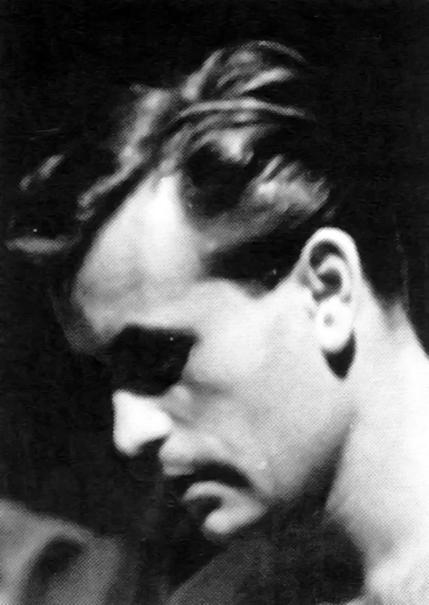
Jiří Rathouský - Czech Graphic Designer

Typografia, ročník 71, 09, 1968

Information

Details

Linked Information

Typografia, ročník 71, 09, 1968. Cover design by Jiří Rathouský


Typografia, ročník 71, 09, 1968 back cover
More graphic design artefacts
From the design archive:
More graphic design history articles
House style can give identity to the diverse products or activities of a firm. It stimulates loyalty, helps to reduce costs, and has advertising value.
The versatility of the arrow sign knows no bounds – from thin lines exuding delicacy to thick, heavy-set lines conveying stability and weight. Depending on its construction, the arrow sign can speak with individuality, even possessing psychological and emotional expression.
Simon Dixon is the co-founder of DixonBaxi and has been at the forefront of exceptional design from the start of his carreer. This year, DixonBaxi, celebrated twenty years in business, and their team of forty work with clients such as WWE, MAX, Premier League, Channel 4 and Netflix.
In the ambitious new monograph Rational Simplicity: Rudolph de Harak, Graphic Designer, Volume shines a light on the complete arc of the exceptionally rich and varied career of Rudolph de Harak, showcasing his vibrant, graphic, formally brilliant work, which blazed a colourful trail through the middle decades of the twentieth century.