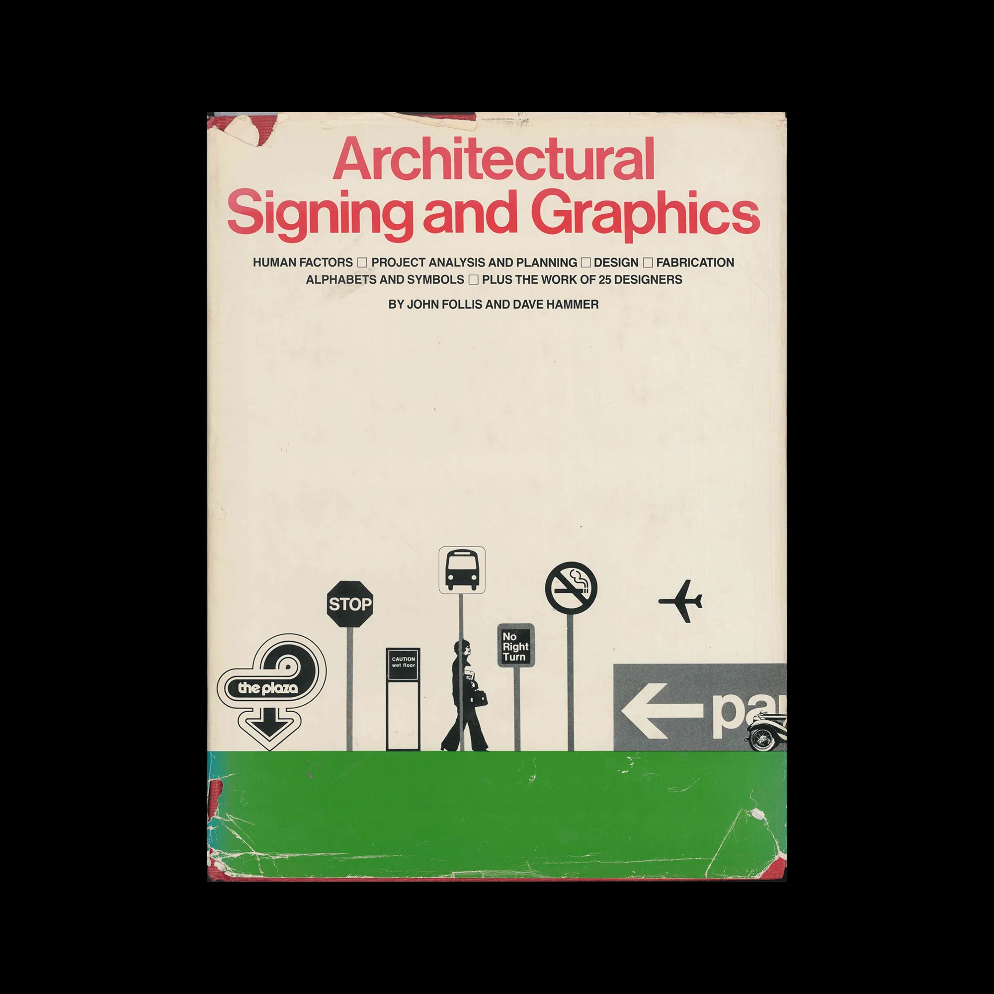
Architectural Signing and Graphics, Whitney Library of Design, 1979

Information

(Preface) ‘The importance of signing as an essential, integrated design element in total environmental planning has been recognized only since the 1960s, even though it has been a practical necessity ever since traders and artisans first opened urban shops. Large architectural complexes require effective systems of visual communication. Signing systems were developed to help people find their way around airports, shopping centers, civic buildings, hospitals, parks, and cultural centers to identify, inform, and direct them in the use of both interior and exterior space.

An effective signing and graphics system functions not as a separate entity but as an integral part of its environment. This highly illustrated handbook, written by one of the first designers to specialize in this emerging design discipline, John Follis, and his associate Dave Hammer, provides the detailed, practical information needed to create a total signing and graphics system for any environment. It investigates ways to integrate signing into architecture and establishes guidelines for solving esthetic and functional problems.’

Details

Linked Information

Architectural Signing and Graphics, Whitney Library of Design, 1979
More graphic design artefacts
From the design archive:
More graphic design history articles

Members Content

Rudolph de Harak designed over 50 record covers for Westminster Records as well as designing covers for Columbia, Oxford and Circle record labels. His bright, geometric graphics can easily be distinguished and recognised.

Members Content

Erik Nitsche's notable book series, the New Illustrated Library of Science and Invention comprised twelve volumes and they are a fantastic example of how to design a perfect non-fiction book!

Members Content

Omnibus was Published by the journalism working group of the Technical University of Braunschweig. A square publication measuring 290mm. The publication included features on politics, arts and culture. With advertisements carefully selected to be in keeping with the visual aesthetic. Content also included exhibition information and a fine example of concrete poetry, among artists such as Schröder-Sonnenstern and Sine Hansen.

Members Content

In 1997 Tadanori Yokoo showcased 31 new silkscreens at the Ginza Graphic Gallery in Tokyo. Many of these works were previously unseen, and I was fortunate enough to discover a feature in a back issue of Idea magazine that showcased the full collection of silkscreen posters.