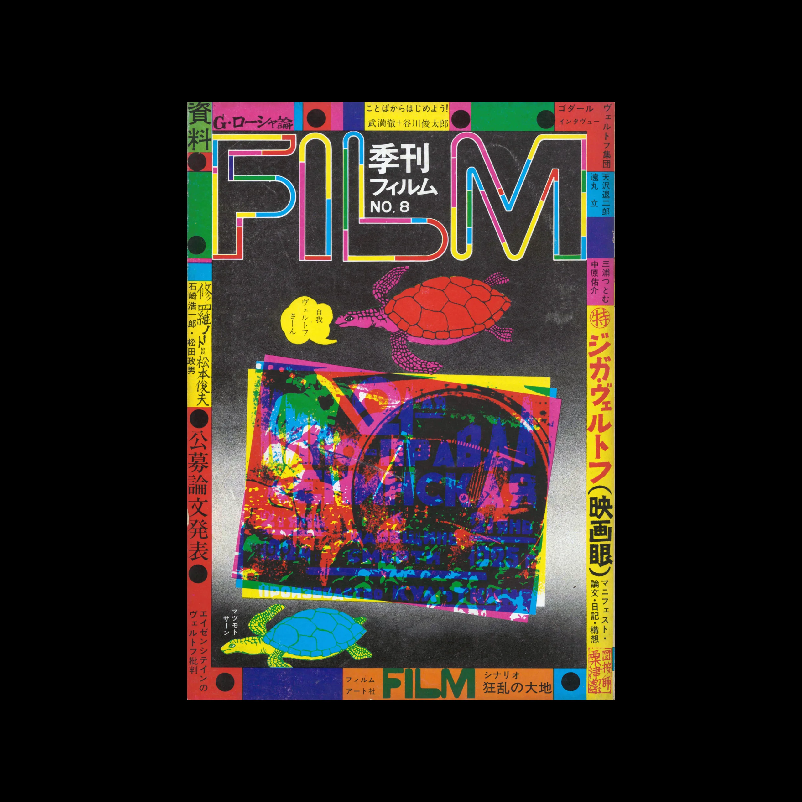

Kiyoshi Awazu - Japanese Graphic Designer

FILM Quarterly, 08, 1971. Cover design by Kiyoshi Awazu

Information

Quarterly Film was launched in 1968 by Film Art Company as a quarterly film magazine.
The seven members of the editorial board are Kiyoshi Awazu, Takahiko Iimura, Toru Takemitsu, Hiroshi Teshigahara, Yusuke Nakahara, Shunsuke Matsumoto, and Koichi Yamada.
They are outstanding representatives of avant-garde art, experimental films, and film criticism of the time. It was issued for the purpose of introducing new film movements overseas.

Details

Kiyoshi Awazu was a renowned Japanese graphic designer, known for his contributions across various creative fields including poster design, architecture, set design, filmmaking, and illustration. A self-taught artist, Awazu developed a distinctive and eclectic graphic style, characterized by vibrant colour schemes, the use of motifs from both traditional Japanese art and modern pop culture, and the integration of supergraphics and expressive typography.

Linked Information

FILM Quarterly, 08, 1971. Cover design by Kiyoshi Awazu
Kiyoshi Awazu was a renowned Japanese graphic designer, known for his contributions across various creative fields including poster design, architecture, set design, filmmaking, and illustration. A self-taught artist, Awazu developed a distinctive and eclectic graphic style, characterized by vibrant colour schemes, the use of motifs from both traditional Japanese art and modern pop culture, and the integration of supergraphics and expressive typography.
More graphic design artefacts
From the design archive:
More graphic design history articles

Members Content

A fantastic example of Swiss design for brand systems is the brand and advertising by Siegfried Odermatt commissioned by Grammo Studio in Zurich.

Members Content

Franco Grignani (1908-1999) was one of the twentieth century’s most important Italian graphic designers. Scanning the inner pages of Gebrauchsgraphik 04, 1962, I have managed to collate a selection of the advertisements created in the 1950s and early 1960s, showcasing his groundbreaking design work.

Members Content

A total of 24 posters were created for the campaign during 1964, using the arrow symbol as a key features, representing power, motion and speed. The handmade lithographs use up to 19 colours, which were individually printed at large scale. The posters also utilise the brand colours red and yellow from Shells corporate identity.
Every year the 20 best posters are selected in Germany and once more brought to the attention of the public. We do not publish all the twenty posters today; instead we add some which failed to be distinguished and which nevertheless are distinguished.