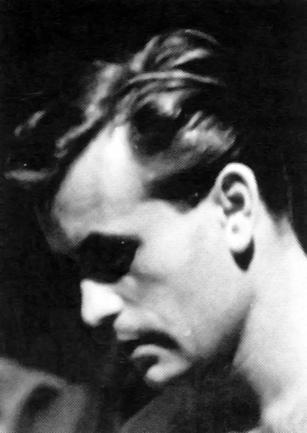
Jiří Rathouský - Czech Graphic Designer

Typografia, ročník 70, 09, 1967

Information

Published by the Polygraphic Research Institute, a specialized publishing and publishing center.
Chief editor: Ing. Vladimir Drbohlav.
Editor: Bojka Benešová.
The graphic design of the cover uses materials From the work of Karel Dyrynk designed by Sona Valoušková and Jiří Rathouský.
Graphic editing of the text part (except advertisements) by Soña Valousková.
Prepared for printing by František Fantyš.

Details

Linked Information

Typografia, ročník 70, 09, 1967. The graphic design of the cover uses materials From the work of Karel Dyrynk designed by Sona Valoušková and Jiří Rathouský


Typografia, ročník 70, 09, 1967. Back Cover


Typografia, ročník 70, 09, 1967. The graphic design of the cover uses materials From the work of Karel Dyrynk designed by Sona Valoušková and Jiří Rathouský
More graphic design artefacts
From the design archive:
More graphic design history articles

Members Content

The identity manual consisted of 130 pages of information and brand usage with Arie J. Geurts heading up the project as design director, (who later headed up his own design studio in Los Angeles). The identity uses minimal colour and focuses on a consistent brand blue in all communications.

Members Content

The 1960 awards presented 420 poster entries from Swiss designers. Notable winners included Robert Büchler's typographic poster for the Museum of Applied Arts Basel and J. Müller-Brockmann’s Der Film poster for the Museum of Applied Arts and Gerstner + Kutter's asymmetric typographic poster for National-Zeitung SA Basel.

Members Content

Rudolph de Harak designed over 50 record covers for Westminster Records as well as designing covers for Columbia, Oxford and Circle record labels. His bright, geometric graphics can easily be distinguished and recognised.
The versatility of the arrow sign knows no bounds – from thin lines exuding delicacy to thick, heavy-set lines conveying stability and weight. Depending on its construction, the arrow sign can speak with individuality, even possessing psychological and emotional expression.