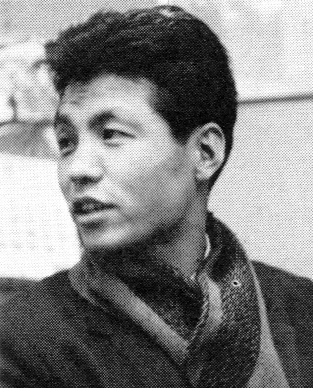
Toshihiro Katayama - Japanese Graphic Designer

Quarterly Design No.7 Autumn 1974

Information

Content includes:
① 15 photographers exhibition / Mutsuro Sakata
② Book review / Design for survival / Ko Miyauchi
③ New issue introduction Photographs and art
④ New issue introduction Sandwich silencer / Takeshi Hisada
⑤ Suburbs to be decolorized / Takeo Kitano
Max Bill prints
For the new prints of Max Bill / Toshiro Habara
Writer Series 6th Toshihiro Katayama’s modeling
Modeling by Toshihiro Katayama / Koji Taki
Mr. Katayama from the United States / Susumu Shingu
Mental topology traveler / Shutaro Mukai
Katayama and I / Tsunehisa Kimura
Yusaku Kamekura’s symbol mark / Kazumasa Nagai
Illustration by Haruo Takino / Ikko Tanaka
From a solo exhibition at Fujie Gallery
Sandwich silencer
Frank Lloyd Wright’s decoration / Photo: Shunji Okura
Warship and grassland / Shinichi Kusamori
Graphic image” 74
It’s a splendid salon, but the “critical place” is / Ryoichi Hirai
Series ③ Rational part of the horizon image of design Jacques Bertin’s “figure” semiotics / Koji Taki

Details

Toshihiro Katayama worked in several art and design disciplines from graphic design and sculpture to environmental works and sculpture. His design work features rhythms and patterns and has a resemblance to modern jazz and the studies of Josef Albers.

Linked Information

Quarterly Design No.7 Autumn 1974. Cover design by Toshihiro Katayama


Quarterly Design No.7 Autumn 1974


Quarterly Design No.7 Autumn 1974
Toshihiro Katayama worked in several art and design disciplines from graphic design and sculpture to environmental works and sculpture. His design work features rhythms and patterns and has a resemblance to modern jazz and the studies of Josef Albers.
More graphic design artefacts
From the design archive:
More graphic design history articles
House style can give identity to the diverse products or activities of a firm. It stimulates loyalty, helps to reduce costs, and has advertising value.
I have known Rob for over a decade and I have been a huge admirer of his work. He specialises in reverse gilded glass sign making, typographic murals and traditional sign-writing.
Mark Bloom has designs for globally recognised brands, produces some of the finest, most accessible modern typefaces and heads up Mash Creative and CoType Foundry. His type foundry has always been a port of call for our studio's brand projects and he continues to develop these, each with a fantastic print specimen.

Members Content

The typographic designs produced for the National Theatre by Ken Briggs are not only iconic and depict the Swiss typographic style of the time, but remain a key example of the creation of a cohesive brand style.